
Designing Products that Delight Users (Websites & Mobile apps)Oluwatunmise Adetayo
I help businesses craft user-centered interfaces for websites and mobile apps. I translate complex user needs into intuitive designs that are both beautiful and easy to use. This can include creating wireframes, mockups, and style guides to ensure a seamless and visually appealing user experience.
What's included
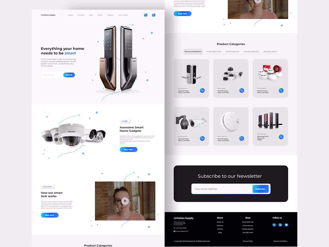
UI Design (Websites & Mobile apps)
Style Guide: A comprehensive document outlining the website or app's visual identity, including:
Color palette: Specifying the core colors used throughout the interface.
Typography: Defining the fonts used for headings, body text, buttons, etc.
UI Component Library: Showcasing reusable design elements like buttons, forms, and navigation bars, ensuring consistency across the interface.
Wireframes: High-fidelity, conceptual layouts of the website or app's screen structure and functionality.
Asset Files: Individual design elements like icons, illustrations, and custom graphics used in the user interface, typically provided in formats suitable for web development (e.g., .png, .svg).
Source File: The original editable source files (e.g., Figma) will be provided
Oluwatunmise's other services
Contact for pricing
Tags
Figma
Interaction Designer
Product Designer
Visual Designer
Service provided by
Oluwatunmise Adetayo Lagos, Nigeria
Designing Products that Delight Users (Websites & Mobile apps)Oluwatunmise Adetayo
Contact for pricing
Tags
Figma
Interaction Designer
Product Designer
Visual Designer
I help businesses craft user-centered interfaces for websites and mobile apps. I translate complex user needs into intuitive designs that are both beautiful and easy to use. This can include creating wireframes, mockups, and style guides to ensure a seamless and visually appealing user experience.
What's included
UI Design (Websites & Mobile apps)
Style Guide: A comprehensive document outlining the website or app's visual identity, including:
Color palette: Specifying the core colors used throughout the interface.
Typography: Defining the fonts used for headings, body text, buttons, etc.
UI Component Library: Showcasing reusable design elements like buttons, forms, and navigation bars, ensuring consistency across the interface.
Wireframes: High-fidelity, conceptual layouts of the website or app's screen structure and functionality.
Asset Files: Individual design elements like icons, illustrations, and custom graphics used in the user interface, typically provided in formats suitable for web development (e.g., .png, .svg).
Source File: The original editable source files (e.g., Figma) will be provided
Oluwatunmise's other services
Contact for pricing