
UI/UX and GraphicsJatinder Singh
I specialize in both graphics and UI/UX design, offering a comprehensive approach to crafting visually stunning digital experiences. What sets me apart is my ability to seamlessly blend creativity with technical expertise, ensuring that every design not only looks beautiful but also functions intuitively and effectively. Whether it's creating captivating visuals or designing user-friendly interfaces, I bring a unique skill set and a passion for innovation to every project.
What's included
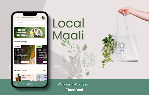
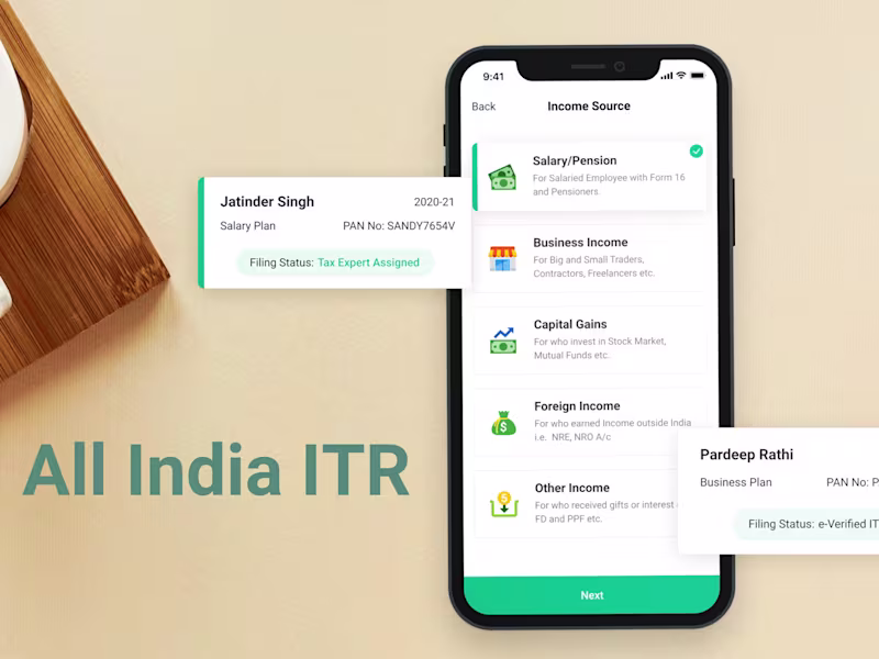
Mobile Application
The mobile application for Local Maali aims to revolutionize the gardening experience. Users can access a comprehensive plant database, receive personalized care instructions, purchase gardening supplies, and connect with local gardening experts for advice and services. The app offers a seamless interface, intuitive navigation, and robust features for an enhanced gardening journey.
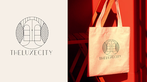
Logo For LuxeCity
For LuxeCity Luxury Real Estate, our logo design aims to embody sophistication, elegance, and exclusivity. Incorporating sleek typography with a minimalist yet luxurious icon, the logo will reflect the brand's premium status and appeal to high-end clientele. Our design will convey a sense of prestige and professionalism, establishing LuxeCity as a leader in the luxury real estate market.
Brand Guidelines:
1. Logo Usage:
- Maintain clear space around the logo to ensure visibility and impact.
- Use the provided color variations and ensure proper scaling for different applications.
2. Color Palette:
- Primary colors: Deep blue for sophistication and gold for luxury.
- Secondary colors: Neutral tones like grey and white for balance and elegance.
3. Typography:
- Primary font: Elegant serif or sans-serif font for a timeless and refined look.
- Secondary font: Clean and modern sans-serif font for versatility and readability.
4. Imagery:
- Use high-quality, aspirational imagery that aligns with the brand's luxurious aesthetic.
- Incorporate images of upscale properties and lifestyle elements to evoke desire and exclusivity.
5. Tone of Voice:
- Communicate with confidence, sophistication, and professionalism.
- Use language that conveys luxury, exclusivity, and exceptional service.
Showcase:
Our logo design for LuxeCity Luxury Real Estate captures the essence of luxury and sophistication. The sleek typography and minimalist icon exude elegance, while the color palette of deep blue and gold adds a touch of opulence. The logo reflects the brand's commitment to excellence and sets a high standard for luxury real estate marketing.
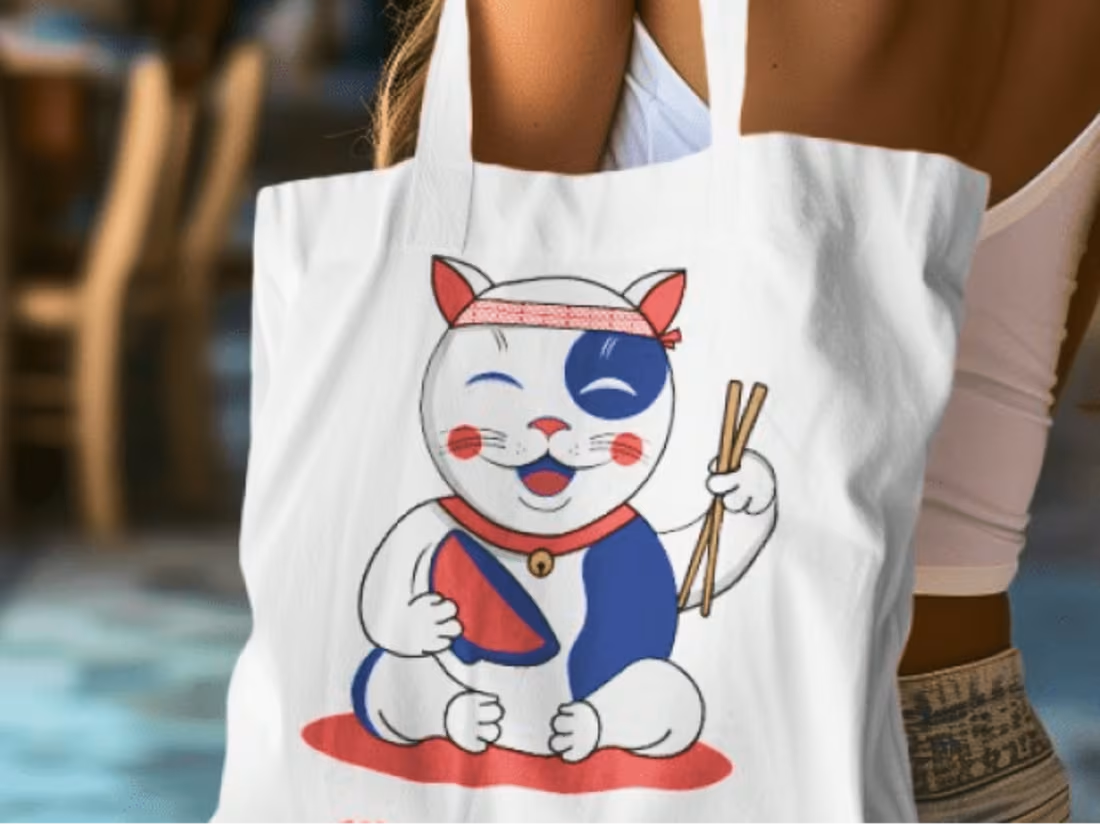
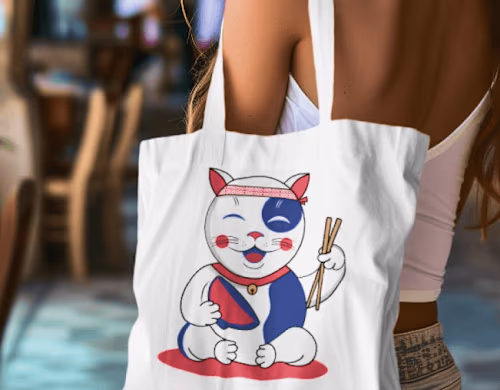
Cat Mascot Design
Deliverable Description:
1. Research:
- Conduct research on existing cat mascots in the restaurant industry to understand design trends and audience preferences.
- Analyze different cat breeds and their characteristics to determine the most suitable depiction for the mascot.
2. Golden Ratio Method:
- Use the golden ratio to establish proportions for the cat mascot, ensuring balance and harmony in its design.
- Apply the golden ratio to position the facial features, body proportions, and overall composition of the mascot.
3. Sketching and Concept Development:
- Begin sketching rough concepts based on the research findings and golden ratio guidelines.
- Explore various poses, expressions, and styles to capture the desired personality and appeal of the mascot.
- Refine the sketches iteratively, incorporating feedback from the client to ensure alignment with their vision.
4. Color Theory:
- Select a color palette that resonates with the restaurant's branding and ambiance.
- Consider the psychological effects of colors and their associations with traits such as warmth, friendliness, and playfulness.
- Use complementary colors to create contrast and visual interest in the mascot's design.
5. Finalization:
- Create a final digital rendering of the cat mascot, incorporating the chosen color palette and refined proportions.
- Ensure that the mascot is versatile and scalable for use across various marketing materials and platforms.
- Present the final design to the client for approval, making any necessary revisions based on their feedback.
By following these steps, we will deliver a cat mascot for the restaurant that not only meets the client's requirements but also resonates with their target audience and enhances their brand identity.
Jatinder's other services
Starting at$8 /hr
Tags
Adobe Illustrator
Adobe Photoshop
Figma
Miro
UI Designer
User Researcher
UX Designer
Service provided by
Jatinder Singh Delhi, India
UI/UX and GraphicsJatinder Singh
Starting at$8 /hr
Tags
Adobe Illustrator
Adobe Photoshop
Figma
Miro
UI Designer
User Researcher
UX Designer
I specialize in both graphics and UI/UX design, offering a comprehensive approach to crafting visually stunning digital experiences. What sets me apart is my ability to seamlessly blend creativity with technical expertise, ensuring that every design not only looks beautiful but also functions intuitively and effectively. Whether it's creating captivating visuals or designing user-friendly interfaces, I bring a unique skill set and a passion for innovation to every project.
What's included
Mobile Application
The mobile application for Local Maali aims to revolutionize the gardening experience. Users can access a comprehensive plant database, receive personalized care instructions, purchase gardening supplies, and connect with local gardening experts for advice and services. The app offers a seamless interface, intuitive navigation, and robust features for an enhanced gardening journey.
Logo For LuxeCity
For LuxeCity Luxury Real Estate, our logo design aims to embody sophistication, elegance, and exclusivity. Incorporating sleek typography with a minimalist yet luxurious icon, the logo will reflect the brand's premium status and appeal to high-end clientele. Our design will convey a sense of prestige and professionalism, establishing LuxeCity as a leader in the luxury real estate market.
Brand Guidelines:
1. Logo Usage:
- Maintain clear space around the logo to ensure visibility and impact.
- Use the provided color variations and ensure proper scaling for different applications.
2. Color Palette:
- Primary colors: Deep blue for sophistication and gold for luxury.
- Secondary colors: Neutral tones like grey and white for balance and elegance.
3. Typography:
- Primary font: Elegant serif or sans-serif font for a timeless and refined look.
- Secondary font: Clean and modern sans-serif font for versatility and readability.
4. Imagery:
- Use high-quality, aspirational imagery that aligns with the brand's luxurious aesthetic.
- Incorporate images of upscale properties and lifestyle elements to evoke desire and exclusivity.
5. Tone of Voice:
- Communicate with confidence, sophistication, and professionalism.
- Use language that conveys luxury, exclusivity, and exceptional service.
Showcase:
Our logo design for LuxeCity Luxury Real Estate captures the essence of luxury and sophistication. The sleek typography and minimalist icon exude elegance, while the color palette of deep blue and gold adds a touch of opulence. The logo reflects the brand's commitment to excellence and sets a high standard for luxury real estate marketing.
Cat Mascot Design
Deliverable Description:
1. Research:
- Conduct research on existing cat mascots in the restaurant industry to understand design trends and audience preferences.
- Analyze different cat breeds and their characteristics to determine the most suitable depiction for the mascot.
2. Golden Ratio Method:
- Use the golden ratio to establish proportions for the cat mascot, ensuring balance and harmony in its design.
- Apply the golden ratio to position the facial features, body proportions, and overall composition of the mascot.
3. Sketching and Concept Development:
- Begin sketching rough concepts based on the research findings and golden ratio guidelines.
- Explore various poses, expressions, and styles to capture the desired personality and appeal of the mascot.
- Refine the sketches iteratively, incorporating feedback from the client to ensure alignment with their vision.
4. Color Theory:
- Select a color palette that resonates with the restaurant's branding and ambiance.
- Consider the psychological effects of colors and their associations with traits such as warmth, friendliness, and playfulness.
- Use complementary colors to create contrast and visual interest in the mascot's design.
5. Finalization:
- Create a final digital rendering of the cat mascot, incorporating the chosen color palette and refined proportions.
- Ensure that the mascot is versatile and scalable for use across various marketing materials and platforms.
- Present the final design to the client for approval, making any necessary revisions based on their feedback.
By following these steps, we will deliver a cat mascot for the restaurant that not only meets the client's requirements but also resonates with their target audience and enhances their brand identity.
Jatinder's other services
$8 /hr