
Mobile & Web UI/UX Design for Higher ConversionsUbon Udonkang
I provide UI/UX Design services that are strategically built for business results, not just aesthetics. My unique value is bridging design vision with development reality, as I create interactive, developer-ready designs in Framer that eliminate friction and boost key metrics. I've designed experiences that have, for example, increased reduced processing time at Access Bank branches by 30%.

What's included
Research & Strategy
User Research Summary: A concise report on target users, their needs, pain points, and motivations (based on interviews, surveys, or existing data).
User Personas: 2-3 detailed profiles of your primary target users to guide design decisions.
User Flow Diagrams: Visual maps illustrating the steps a user will take to complete key tasks within the app.
Sitemap (for Web) or App Map (for Mobile): A clear structure detailing the hierarchy and navigation of all screens.
Low-Fidelity Design
Low-Fidelity Wireframes: Simple, structural layouts for all critical screens, focusing purely on content placement, functionality, and interaction design (usually delivered as static images or simple prototypes).
High-Fidelity Design
High-Fidelity Mockups: Pixel-perfect visual designs for all final screens, including typography, colors, imagery, and detailed UI elements, reflecting the final look and feel of the app.
Responsive Design/Breakpoints: Mockups demonstrating how the design adapts for key screen sizes (e.g., mobile portrait, tablet, desktop).
Interactive Prototype (in Figma/Framer): A clickable, high-fidelity prototype that simulates the user experience and app flow for testing and stakeholder review.
Design System & Assets
Style Guide/Design System: A document or file containing all reusable UI components (buttons, forms, navigation elements), color palettes, typography rules, and usage guidelines to ensure design consistency and efficient development handoff.
Design Assets Handoff: Cleanly organized source files (e.g., Figma or Framer files) with developer-ready specifications (CSS/code snippets, spacing, measurements) for all components and screens.
Documentation & Wrap-up
Design Rationale Document: A summary explaining the key design decisions, justifying choices based on user research and project goals.
Basic Accessibility Checklist: Confirmation that the design meets basic accessibility standards (e.g., color contrast, target sizes).
FAQs
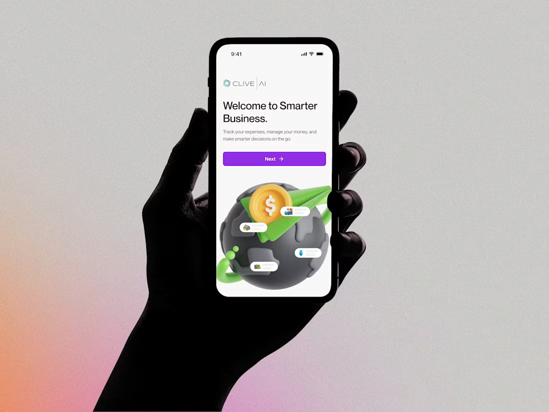
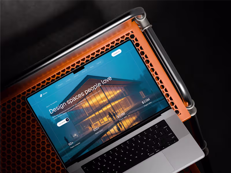
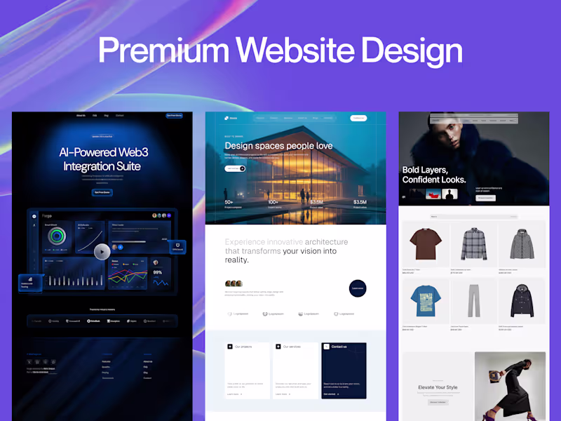
Example work

Starting at$1,500
Duration5 weeks
Tags
Balsamiq
FigJam
Figma
Jira
Whimsical Wireframes
Product Designer
UI Designer
UX Designer
Service provided by
Ubon Udonkang Lagos, Nigeria
- 9
- Followers
Mobile & Web UI/UX Design for Higher ConversionsUbon Udonkang
Starting at$1,500
Duration5 weeks
Tags
Balsamiq
FigJam
Figma
Jira
Whimsical Wireframes
Product Designer
UI Designer
UX Designer
I provide UI/UX Design services that are strategically built for business results, not just aesthetics. My unique value is bridging design vision with development reality, as I create interactive, developer-ready designs in Framer that eliminate friction and boost key metrics. I've designed experiences that have, for example, increased reduced processing time at Access Bank branches by 30%.
What's included
Research & Strategy
User Research Summary: A concise report on target users, their needs, pain points, and motivations (based on interviews, surveys, or existing data).
User Personas: 2-3 detailed profiles of your primary target users to guide design decisions.
User Flow Diagrams: Visual maps illustrating the steps a user will take to complete key tasks within the app.
Sitemap (for Web) or App Map (for Mobile): A clear structure detailing the hierarchy and navigation of all screens.
Low-Fidelity Design
Low-Fidelity Wireframes: Simple, structural layouts for all critical screens, focusing purely on content placement, functionality, and interaction design (usually delivered as static images or simple prototypes).
High-Fidelity Design
High-Fidelity Mockups: Pixel-perfect visual designs for all final screens, including typography, colors, imagery, and detailed UI elements, reflecting the final look and feel of the app.
Responsive Design/Breakpoints: Mockups demonstrating how the design adapts for key screen sizes (e.g., mobile portrait, tablet, desktop).
Interactive Prototype (in Figma/Framer): A clickable, high-fidelity prototype that simulates the user experience and app flow for testing and stakeholder review.
Design System & Assets
Style Guide/Design System: A document or file containing all reusable UI components (buttons, forms, navigation elements), color palettes, typography rules, and usage guidelines to ensure design consistency and efficient development handoff.
Design Assets Handoff: Cleanly organized source files (e.g., Figma or Framer files) with developer-ready specifications (CSS/code snippets, spacing, measurements) for all components and screens.
Documentation & Wrap-up
Design Rationale Document: A summary explaining the key design decisions, justifying choices based on user research and project goals.
Basic Accessibility Checklist: Confirmation that the design meets basic accessibility standards (e.g., color contrast, target sizes).
FAQs
Example work
$1,500