
Creating good experiences to show your services to the world!Rafaela Oyas
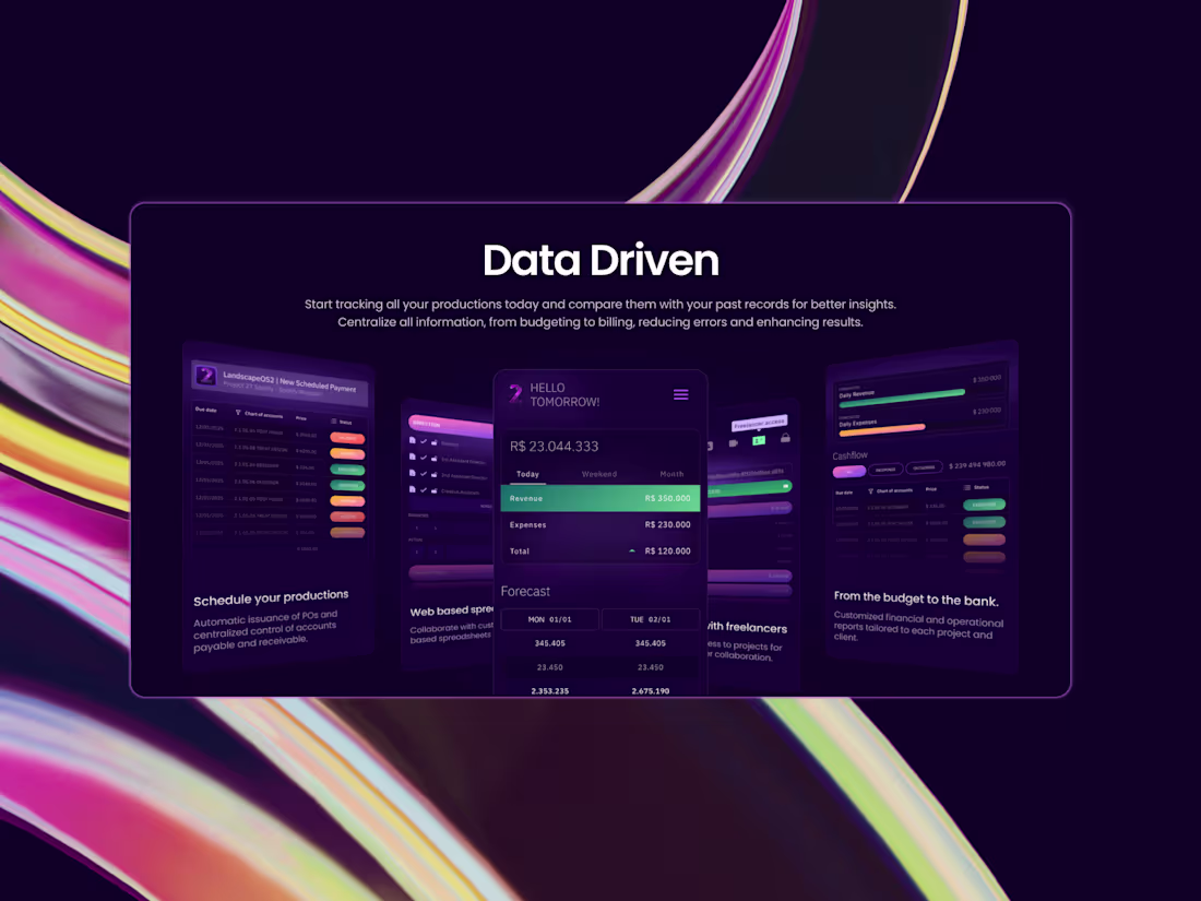
I design and develop websites that combine aesthetics, functionality, and performance. From structure and visual design to implementation, I create responsive and scalable experiences that communicate your brand clearly and engage your audience across all devices.
What's included
Research and benchmark analysis.
This phase focuses on understanding the context of the project. I analyze the brand, target audience, competitors, and market references to identify opportunities and best practices. The insights gathered here guide design decisions and help ensure the website aligns with both business goals and user expectations.
The research findings are presented in a clear and visual format, organized in slides and delivered as a PDF.
Website design and visual identity alignment.
Based on the research, I design the website with strong alignment to the brand’s visual identity. This includes typography, color palette, spacing, and overall visual language, ensuring consistency across all pages.
The goal is to translate the brand’s essence into a cohesive digital experience that feels intentional, professional, and recognizable.
Modular Layout Creation in Figma (when applicable)
When necessary and within the project scope, I create modular layouts in Figma. These modules are flexible components that can be reused and adapted across different pages, ensuring visual consistency and scalability.
This step helps streamline future updates and provides a clear structural system for the website. The layouts are documented and presented as part of the design delivery.
Design Focused on Clarity, Balance, and Scalability
All design decisions are guided by clarity and usability. I prioritize clean layouts, balanced compositions, and clear information hierarchy to create an intuitive user experience.
The design is also built to scale, allowing the website to grow or evolve without losing consistency or visual quality.
Development in Framer with Animations and Responsive Layouts
After the design approval, the website is developed in Framer. This includes responsive layouts for different screen sizes and carefully applied animations to enhance interaction without compromising performance or usability.
The final result is a modern, high-quality website that feels smooth, engaging, and aligned with the approved design.
Creating good experiences to show your services to the world!Rafaela Oyas
Starting at$25 /hr
I design and develop websites that combine aesthetics, functionality, and performance. From structure and visual design to implementation, I create responsive and scalable experiences that communicate your brand clearly and engage your audience across all devices.
What's included
Research and benchmark analysis.
This phase focuses on understanding the context of the project. I analyze the brand, target audience, competitors, and market references to identify opportunities and best practices. The insights gathered here guide design decisions and help ensure the website aligns with both business goals and user expectations.
The research findings are presented in a clear and visual format, organized in slides and delivered as a PDF.
Website design and visual identity alignment.
Based on the research, I design the website with strong alignment to the brand’s visual identity. This includes typography, color palette, spacing, and overall visual language, ensuring consistency across all pages.
The goal is to translate the brand’s essence into a cohesive digital experience that feels intentional, professional, and recognizable.
Modular Layout Creation in Figma (when applicable)
When necessary and within the project scope, I create modular layouts in Figma. These modules are flexible components that can be reused and adapted across different pages, ensuring visual consistency and scalability.
This step helps streamline future updates and provides a clear structural system for the website. The layouts are documented and presented as part of the design delivery.
Design Focused on Clarity, Balance, and Scalability
All design decisions are guided by clarity and usability. I prioritize clean layouts, balanced compositions, and clear information hierarchy to create an intuitive user experience.
The design is also built to scale, allowing the website to grow or evolve without losing consistency or visual quality.
Development in Framer with Animations and Responsive Layouts
After the design approval, the website is developed in Framer. This includes responsive layouts for different screen sizes and carefully applied animations to enhance interaction without compromising performance or usability.
The final result is a modern, high-quality website that feels smooth, engaging, and aligned with the approved design.
$25 /hr