
Frontend DevelopmentJaved Bloch
Javed specializes in frontend development, providing clients with responsive and functional websites. As a skilled frontend engineer, he ensures that the websites he builds are optimized for performance and deliver an exceptional user experience. Javed's commitment to delivering quality work on time differentiates him from other freelancers in his field.
What's included
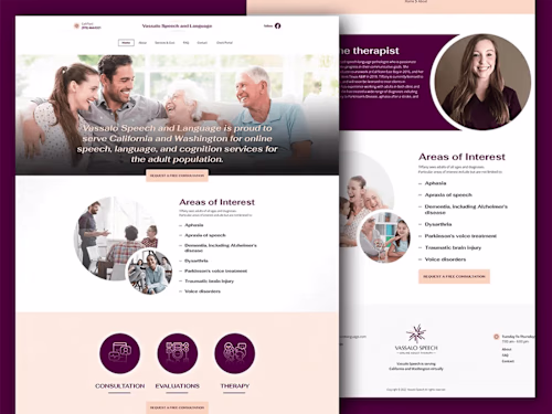
Home Page Design:
Home Page Design is the art of crafting the front-facing layout of a website. As a designer, I create visually appealing, user-friendly designs that make a strong first impression. By blending aesthetics, brand identity, and strategic placement of content, I ensure that visitors quickly understand the site's purpose and are encouraged to explore further.
Inner Page Design:
Inner Page Design involves creating captivating and functional layouts for the secondary pages of a website. As a designer, I focus on maintaining consistency with the home page while presenting specific content, such as services, products, or information. With attention to user experience and visual harmony, I ensure seamless navigation and engagement across the entire site.
Contact Page Design:
A Contact Page is a vital component of a website that provides visitors with a direct means of communication. As a web designer, I skillfully design and organize contact pages, incorporating contact forms, relevant information, maps, and clear calls-to-action. By optimizing user experience and facilitating easy communication, I enhance visitor engagement and encourage meaningful interactions.
Responsiveness:
Mobile and iPad responsiveness is a critical aspect of web design that ensures websites adapt and function seamlessly on various handheld devices and tablets. As a web designer, you specialize in crafting layouts and interfaces that dynamically adjust to different screen sizes, resolutions, and orientations. Your expertise in responsive design guarantees that users enjoy optimal browsing experiences, regardless of the device they use. Through strategic design choices, fluid layouts, and flexible elements, you create websites that maintain usability, readability, and functionality, contributing to enhanced user satisfaction and engagement.
Compatibility across various browsers:
Compatibility across various browsers is a crucial consideration in web design to ensure consistent and optimal user experiences on different web browsers. As a web designer, your role involves creating websites that function seamlessly and display correctly on popular browsers such as Chrome, Firefox, Safari, and Edge. Your expertise in cross-browser testing and troubleshooting ensures that users can access and interact with websites without encountering layout discrepancies or functionality issues. By addressing compatibility challenges, you enhance usability, accessibility, and user satisfaction across a diverse range of browsing environments.
Example work


Contact for pricing
Tags
Squarespace
Unbounce
Webflow
Weebly
WixVibe
Frontend Engineer
Graphic Designer
Web Designer
Service provided by
Javed Bloch Rajkot, India
Frontend DevelopmentJaved Bloch
Contact for pricing
Tags
Squarespace
Unbounce
Webflow
Weebly
WixVibe
Frontend Engineer
Graphic Designer
Web Designer
Javed specializes in frontend development, providing clients with responsive and functional websites. As a skilled frontend engineer, he ensures that the websites he builds are optimized for performance and deliver an exceptional user experience. Javed's commitment to delivering quality work on time differentiates him from other freelancers in his field.
What's included
Home Page Design:
Home Page Design is the art of crafting the front-facing layout of a website. As a designer, I create visually appealing, user-friendly designs that make a strong first impression. By blending aesthetics, brand identity, and strategic placement of content, I ensure that visitors quickly understand the site's purpose and are encouraged to explore further.
Inner Page Design:
Inner Page Design involves creating captivating and functional layouts for the secondary pages of a website. As a designer, I focus on maintaining consistency with the home page while presenting specific content, such as services, products, or information. With attention to user experience and visual harmony, I ensure seamless navigation and engagement across the entire site.
Contact Page Design:
A Contact Page is a vital component of a website that provides visitors with a direct means of communication. As a web designer, I skillfully design and organize contact pages, incorporating contact forms, relevant information, maps, and clear calls-to-action. By optimizing user experience and facilitating easy communication, I enhance visitor engagement and encourage meaningful interactions.
Responsiveness:
Mobile and iPad responsiveness is a critical aspect of web design that ensures websites adapt and function seamlessly on various handheld devices and tablets. As a web designer, you specialize in crafting layouts and interfaces that dynamically adjust to different screen sizes, resolutions, and orientations. Your expertise in responsive design guarantees that users enjoy optimal browsing experiences, regardless of the device they use. Through strategic design choices, fluid layouts, and flexible elements, you create websites that maintain usability, readability, and functionality, contributing to enhanced user satisfaction and engagement.
Compatibility across various browsers:
Compatibility across various browsers is a crucial consideration in web design to ensure consistent and optimal user experiences on different web browsers. As a web designer, your role involves creating websites that function seamlessly and display correctly on popular browsers such as Chrome, Firefox, Safari, and Edge. Your expertise in cross-browser testing and troubleshooting ensures that users can access and interact with websites without encountering layout discrepancies or functionality issues. By addressing compatibility challenges, you enhance usability, accessibility, and user satisfaction across a diverse range of browsing environments.
Example work
Contact for pricing