
Dashboard DesignIsmail Ibrahim
I design clean, intuitive dashboards that turn complex data into clear, actionable insights for your users. What sets me apart is my focus on usability and clarity, I design with real users in mind, ensuring each chart, table, and interaction supports decision-making without overwhelming the interface. I combine thoughtful UX with modern visuals to help your team work smarter, not harder.
What's included
1. Final Visual Design
1. High-Fidelity Desktop & Mobile Designs
• Fully designed layout optimised for responsiveness
• Includes all sections: hero, features, CTA, testimonials, FAQs, etc.
2. Multiple Versions (if applicable)
• Variants for A/B testing or different user segments
2. Design Assets
1. Design File (Figma, Adobe XD, Sketch)
• Organised with components, layers, and styles
2. Exported Assets
• Optimised images, icons, logos (PNG, SVG, WebP, etc.)
3. Custom Illustrations or Graphics (if included)
3. Style Guide / Mini Design System
• Colour palette and typography
• Button styles, form fields, cards, etc.
• Icon usage and visual hierarchy
4. Data Visualization Components
1. Custom-designed charts, graphs, and KPIs
• (e.g., line graphs, bar charts, pie charts, tables, metrics cards)
2. Tooltip styles and filter interactions
5. Developer Handoff Package
1. Annotated Design File
•Layout specs, padding, spacing, font sizes, color codes
2. Design Tokens or CSS Snippets (if provided)
3. Collaboration via tools like Zeplin, Figma Inspect, or PDF spec sheet
6. Optional Deliverables
1. Design Rationale / Notes
• Explaining key UX decisions (e.g., why certain charts, layouts, or filters were chosen)
2. Component Behavior Guide
• Describes interactive behavior for devs (e.g., sidebar collapse, filter logic)
3. Accessibility Considerations (if included)
7. Optional Deliverables
• Dark Mode Design
• Responsive Layouts (tablet and mobile)
• User Persona or Use Case Mapping
• Usability Testing Summary
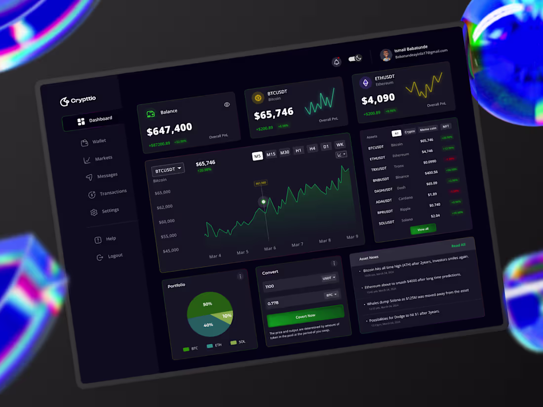
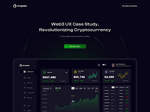
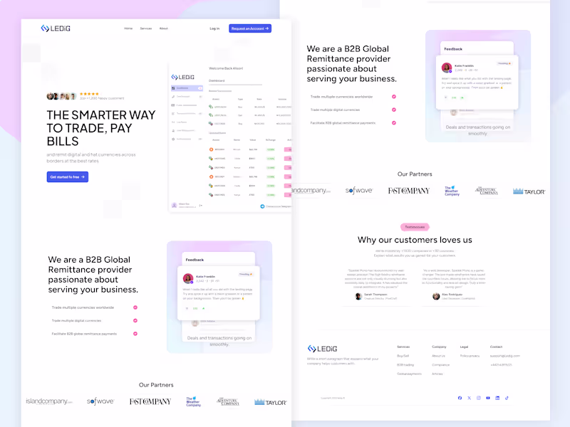
Example work
Ismail's other services

Starting at$550
Duration1 week
Tags
Adobe Illustrator
Adobe Photoshop
FigJam
Figma
Framer
Iconography Designer
UI Designer
UX Designer
Service provided by
Ismail Ibrahim Ibadan, Nigeria
- 5.00
- Rating
- 7
- Followers
Dashboard DesignIsmail Ibrahim
Starting at$550
Duration1 week
Tags
Adobe Illustrator
Adobe Photoshop
FigJam
Figma
Framer
Iconography Designer
UI Designer
UX Designer
I design clean, intuitive dashboards that turn complex data into clear, actionable insights for your users. What sets me apart is my focus on usability and clarity, I design with real users in mind, ensuring each chart, table, and interaction supports decision-making without overwhelming the interface. I combine thoughtful UX with modern visuals to help your team work smarter, not harder.
What's included
1. Final Visual Design
1. High-Fidelity Desktop & Mobile Designs
• Fully designed layout optimised for responsiveness
• Includes all sections: hero, features, CTA, testimonials, FAQs, etc.
2. Multiple Versions (if applicable)
• Variants for A/B testing or different user segments
2. Design Assets
1. Design File (Figma, Adobe XD, Sketch)
• Organised with components, layers, and styles
2. Exported Assets
• Optimised images, icons, logos (PNG, SVG, WebP, etc.)
3. Custom Illustrations or Graphics (if included)
3. Style Guide / Mini Design System
• Colour palette and typography
• Button styles, form fields, cards, etc.
• Icon usage and visual hierarchy
4. Data Visualization Components
1. Custom-designed charts, graphs, and KPIs
• (e.g., line graphs, bar charts, pie charts, tables, metrics cards)
2. Tooltip styles and filter interactions
5. Developer Handoff Package
1. Annotated Design File
•Layout specs, padding, spacing, font sizes, color codes
2. Design Tokens or CSS Snippets (if provided)
3. Collaboration via tools like Zeplin, Figma Inspect, or PDF spec sheet
6. Optional Deliverables
1. Design Rationale / Notes
• Explaining key UX decisions (e.g., why certain charts, layouts, or filters were chosen)
2. Component Behavior Guide
• Describes interactive behavior for devs (e.g., sidebar collapse, filter logic)
3. Accessibility Considerations (if included)
7. Optional Deliverables
• Dark Mode Design
• Responsive Layouts (tablet and mobile)
• User Persona or Use Case Mapping
• Usability Testing Summary
Example work
Ismail's other services
$550