
Creative, minimalist web design that brings your brand to lifeMeidina Pratami
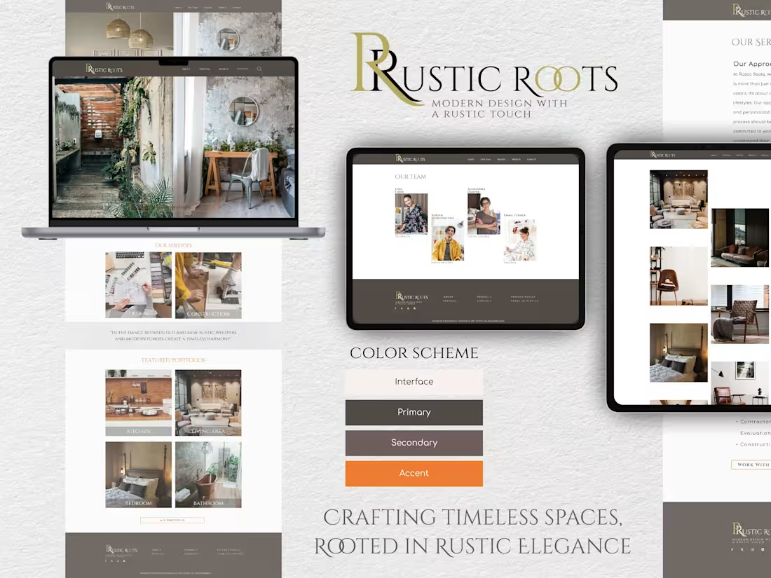
I offer clean, modern, and human-centric design solutions that prioritize both aesthetics and usability. With a strong focus on creating intuitive, engaging user experiences, I ensure every project is tailored to resonate with users while aligning with the client's brand vision. My approach emphasizes simplicity, making complex concepts accessible and visually appealing.
What's included
Complete Figma Design Package
1. Design Files: Fully organized and editable Figma files containing all design assets and layout components for easy reference and updates.
2. Prototype Links: Interactive prototype links allowing clients to navigate and test the design flow. This is especially useful for visualizing user journeys and finalizing interactions before development.
3. Style Guide: A comprehensive style guide covering typography, color palette, button styles, iconography, and other UI elements to maintain consistency across the project.
4. Responsive Design Variants: Screens for different device resolutions (desktop, tablet, mobile) to ensure the design is adaptable and optimized for various screen sizes.
5. Exported Assets: Export-ready images, icons, and other graphical elements in required formats (e.g., PNG, SVG) for direct use by developers or in marketing materials.
6. Annotations and Documentation: Notes within the Figma file (or an external document) explaining specific design choices, component usage, and guidelines, making it easier for developers to implement the design accurately.
7. Handoff Documentation: A structured document summarizing the project's key elements, including brand guidelines, key components, and any additional information needed to transition smoothly from design to development.
Meidina's other services
Starting at$25 /hr
Tags
Figma
UI Designer
UX Designer
Web Designer
Service provided by
Meidina Pratami Bogor, Indonesia
Creative, minimalist web design that brings your brand to lifeMeidina Pratami
Starting at$25 /hr
Tags
Figma
UI Designer
UX Designer
Web Designer
I offer clean, modern, and human-centric design solutions that prioritize both aesthetics and usability. With a strong focus on creating intuitive, engaging user experiences, I ensure every project is tailored to resonate with users while aligning with the client's brand vision. My approach emphasizes simplicity, making complex concepts accessible and visually appealing.
What's included
Complete Figma Design Package
1. Design Files: Fully organized and editable Figma files containing all design assets and layout components for easy reference and updates.
2. Prototype Links: Interactive prototype links allowing clients to navigate and test the design flow. This is especially useful for visualizing user journeys and finalizing interactions before development.
3. Style Guide: A comprehensive style guide covering typography, color palette, button styles, iconography, and other UI elements to maintain consistency across the project.
4. Responsive Design Variants: Screens for different device resolutions (desktop, tablet, mobile) to ensure the design is adaptable and optimized for various screen sizes.
5. Exported Assets: Export-ready images, icons, and other graphical elements in required formats (e.g., PNG, SVG) for direct use by developers or in marketing materials.
6. Annotations and Documentation: Notes within the Figma file (or an external document) explaining specific design choices, component usage, and guidelines, making it easier for developers to implement the design accurately.
7. Handoff Documentation: A structured document summarizing the project's key elements, including brand guidelines, key components, and any additional information needed to transition smoothly from design to development.
Meidina's other services
$25 /hr