
Be Your Timeless Modern Minimalist Logo designer M Tech
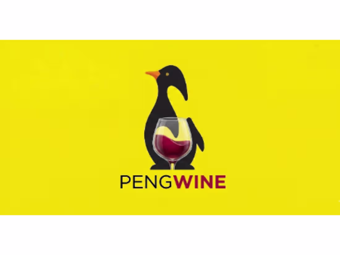
Development of a distinct, memorable visual identity for PENGWINE. The design seamlessly blends two distinct elements—a penguin silhouette and a classic wine glass—into a single, cohesive graphic.
Key Design Elements
Negative Space & Graphic Integration: The white belly of the penguin is cleverly substituted by a realistic glass of red wine, using negative space to create a striking "double entendre" visual effect.
Color Psychology: Set against a vibrant, high-contrast yellow background that commands attention, the logo utilizes a bold black silhouette paired with deep, rich tones of red/burgundy for the wine.
Typography: A clean, modern sans-serif typeface. The brand name is visually split (PENG in black, WINE in burgundy) to reinforce the clever wordplay and enhance brand recall.
Deliverables & Applications
This versatile identity is engineered for high impact across multiple touchpoints, making it ideal for:
Product packaging and wine bottle labels.
Digital branding (websites, social media icons, and mobile apps).
Corporate stationery, menus, and hospitality signage.
FAQs
Contact for pricing
Duration1 week
Tags
Brand Design
Flat Minimalist design
icon design
Logo design
Virtual design
Visual Design
Service provided by
M Tech Karachi, Pakistan
- 9
- Followers
Be Your Timeless Modern Minimalist Logo designer M Tech
Contact for pricing
Duration1 week
Tags
Brand Design
Flat Minimalist design
icon design
Logo design
Virtual design
Visual Design
Development of a distinct, memorable visual identity for PENGWINE. The design seamlessly blends two distinct elements—a penguin silhouette and a classic wine glass—into a single, cohesive graphic.
Key Design Elements
Negative Space & Graphic Integration: The white belly of the penguin is cleverly substituted by a realistic glass of red wine, using negative space to create a striking "double entendre" visual effect.
Color Psychology: Set against a vibrant, high-contrast yellow background that commands attention, the logo utilizes a bold black silhouette paired with deep, rich tones of red/burgundy for the wine.
Typography: A clean, modern sans-serif typeface. The brand name is visually split (PENG in black, WINE in burgundy) to reinforce the clever wordplay and enhance brand recall.
Deliverables & Applications
This versatile identity is engineered for high impact across multiple touchpoints, making it ideal for:
Product packaging and wine bottle labels.
Digital branding (websites, social media icons, and mobile apps).
Corporate stationery, menus, and hospitality signage.
FAQs
Contact for pricing