
Mobile Application UI DesignFarid Ahmed
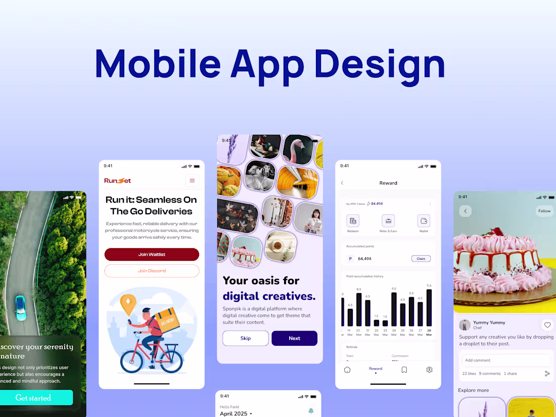
I design experiences and visually appealing mobile interfaces that help users navigate with ease and help businesses scale through strategic, user-centered design. With experience across various industries, I bring a unique ability to turn complex ideas into simple, high-converting digital products. My goal is to create designs that not only look great but also drive real results for both users and businesses.
What's included
Wireframes
Basic layouts that define the structure of each screen before visual styling, to clarify functionality and layout.
High-Fidelity UI Designs
Pixel-perfect, visually polished screens for each user interface—optimized for both iOS and Android (if applicable), including variations for different device sizes.
Interactive Prototype
A clickable mockup built in Figma to simulate the real user experience and demonstrate app flow.
Design System / UI Kit
A reusable set of design components (buttons, icons, colors, typography, form elements) ensuring visual consistency and development efficiency.
Developer Handoff Files
Final designs prepared in Figma (or your preferred tool), with components labeled, grouped, and marked for development—plus specs and assets exported in appropriate formats (SVG, PNG, etc.)
Usage Guidelines
Short documentation walkthrough to help the development team understand how to implement the designs.
Revision
Up to 5 rounds of revisions are included based on your feedback at each major milestone (wireframe, high-fidelity, prototype). This ensures we align closely with your vision without dragging the timeline.
Farid's other services
Contact for pricing
Tags
Figma
Sketch
Mobile Designer
UI Designer
User Researcher
Service provided by
Farid Ahmed Lagos, Nigeria
- 9
- Followers
Mobile Application UI DesignFarid Ahmed
Contact for pricing
Tags
Figma
Sketch
Mobile Designer
UI Designer
User Researcher
I design experiences and visually appealing mobile interfaces that help users navigate with ease and help businesses scale through strategic, user-centered design. With experience across various industries, I bring a unique ability to turn complex ideas into simple, high-converting digital products. My goal is to create designs that not only look great but also drive real results for both users and businesses.
What's included
Wireframes
Basic layouts that define the structure of each screen before visual styling, to clarify functionality and layout.
High-Fidelity UI Designs
Pixel-perfect, visually polished screens for each user interface—optimized for both iOS and Android (if applicable), including variations for different device sizes.
Interactive Prototype
A clickable mockup built in Figma to simulate the real user experience and demonstrate app flow.
Design System / UI Kit
A reusable set of design components (buttons, icons, colors, typography, form elements) ensuring visual consistency and development efficiency.
Developer Handoff Files
Final designs prepared in Figma (or your preferred tool), with components labeled, grouped, and marked for development—plus specs and assets exported in appropriate formats (SVG, PNG, etc.)
Usage Guidelines
Short documentation walkthrough to help the development team understand how to implement the designs.
Revision
Up to 5 rounds of revisions are included based on your feedback at each major milestone (wireframe, high-fidelity, prototype). This ensures we align closely with your vision without dragging the timeline.
Farid's other services
Contact for pricing