
Webdesign / UI DesignCynthia Jego
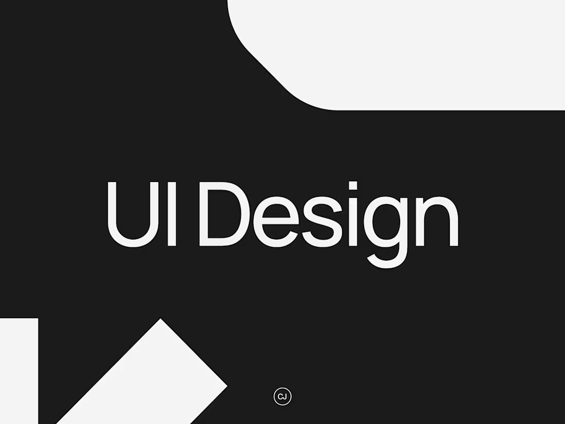
Minimal, bold and Swiss-design inspired user interfaces built for clarity and impact.
I combine clean typographic grids with subtle, immersive interactions to craft digital experiences that are both visually striking and highly functional.
What's included
Complete Figma UI Mock-ups
A full set of high-fidelity page designs in Figma, structured on a Swiss-inspired grid system with clean, bold layouts and space for immersive interactions.
Responsive Mock-ups
All key pages designed for desktop, tablet and mobile, ensuring a seamless and consistent experience across every screen size.
Design System
A detailed style guide and reusable components (colors, typography, grids, buttons, UI patterns) to keep the interface consistent and scalable.
Developer Handoff Documentation
Figma developer notes, animation guidelines and comments to ensure smooth implementation by your in-house or external development team.
FAQs
Cynthia's other services


Starting at$2,000
Duration3 weeks
Tags
Figma
UI Designer
Web Developer
Service provided by
Cynthia Jego Toulouse, France
- 14
- Followers
Webdesign / UI DesignCynthia Jego
Starting at$2,000
Duration3 weeks
Tags
Figma
UI Designer
Web Developer
Minimal, bold and Swiss-design inspired user interfaces built for clarity and impact.
I combine clean typographic grids with subtle, immersive interactions to craft digital experiences that are both visually striking and highly functional.
What's included
Complete Figma UI Mock-ups
A full set of high-fidelity page designs in Figma, structured on a Swiss-inspired grid system with clean, bold layouts and space for immersive interactions.
Responsive Mock-ups
All key pages designed for desktop, tablet and mobile, ensuring a seamless and consistent experience across every screen size.
Design System
A detailed style guide and reusable components (colors, typography, grids, buttons, UI patterns) to keep the interface consistent and scalable.
Developer Handoff Documentation
Figma developer notes, animation guidelines and comments to ensure smooth implementation by your in-house or external development team.
FAQs
Cynthia's other services
$2,000