
Design SystemAndres Luna
Hello, I'm Andres, a Product Designer with 8+ years in UX/UI field, I've worked for various companies and startups in the USA, remotely.
By hiring my design services you will get word-class, top-quality, modern and intuitive UX flows and well-crafted UI designs, that will make your users love your product and also will bring the best results for your business.
What's included
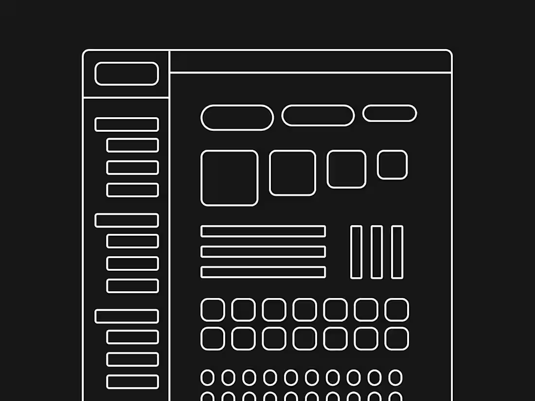
UI Component Library
A collection of reusable UI components (e.g., buttons, cards, forms, modals) that can be used across multiple projects.
Deliverables:
• Buttons (various states: normal, hover, disabled)
• Input fields (text, dropdowns, checkboxes, radio buttons)
• Navigation components (headers, footers, sidebars, tabs)
• Interactive elements (sliders, toggles, accordions)
• Custom components (specific to the client’s brand needs)
Typography Guidelines
A clear system of typography rules and styles to ensure consistency in font usage.
Deliverables:
• Primary and secondary fonts
• Font sizes, weights, and styles (H1, H2, H3, body text, captions)
• Spacing guidelines for headers, paragraphs, and lists
• Line heights, letter spacing, and character counts for readability
Color Palette
A cohesive color scheme that reflects the client’s brand and ensures accessibility.
Deliverables:
• Primary and secondary color palettes
• Accent colors for buttons, links, and call-to-action elements
• Color usage rules (e.g., background vs. text colors)
• Accessible color contrast guidelines
• Visual representation of color combinations for specific use cases
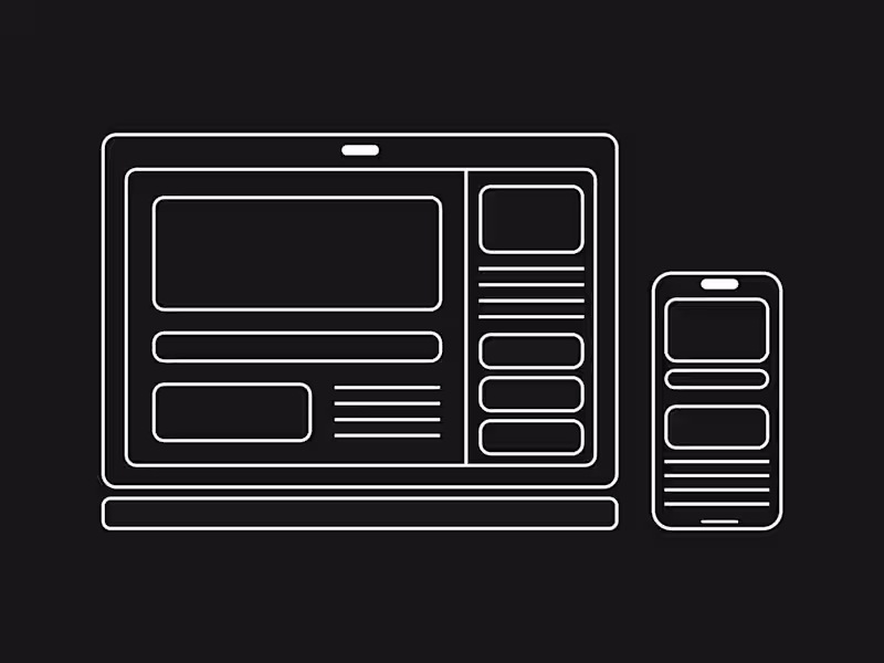
Grid System & Layout Guidelines
A standardized grid system that ensures design layouts are consistent and flexible.
Deliverables:
• Grid structures (12-column grid, baseline grid for web)
• Margins, padding, and spacing guidelines
• Breakpoints for responsive design (desktop, tablet, mobile)
• Layout examples for common use cases (content sections, sidebars, image placements)
Iconography
A library of icons tailored to the brand’s visual identity.
Deliverables:
• A set of custom or pre-existing icons, standardized in style and size
• Icon grid and spacing rules
• Guidelines for icon usage (when and how to use each icon)
• Exported files in multiple formats (SVG, PNG, etc.)
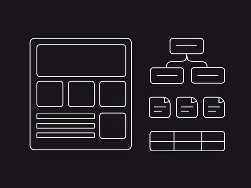
Documentation & Usage Guidelines
Comprehensive documentation that explains how to use the design system effectively.
Deliverables:
• Guidelines for implementing components and patterns
• Best practices for maintaining design consistency
• Example pages showing how to apply components and styles
• Developer handoff documentation with code snippets or links to code repositories (if applicable)
Andres's other services
Starting at$50 /hr
Tags
FigJam
Figma
Design Systems Specialist
UI Designer
UX Designer
Service provided by
Andres Luna Bogota, Colombia
- 1
- Followers
Design SystemAndres Luna
Starting at$50 /hr
Tags
FigJam
Figma
Design Systems Specialist
UI Designer
UX Designer
Hello, I'm Andres, a Product Designer with 8+ years in UX/UI field, I've worked for various companies and startups in the USA, remotely.
By hiring my design services you will get word-class, top-quality, modern and intuitive UX flows and well-crafted UI designs, that will make your users love your product and also will bring the best results for your business.
What's included
UI Component Library
A collection of reusable UI components (e.g., buttons, cards, forms, modals) that can be used across multiple projects.
Deliverables:
• Buttons (various states: normal, hover, disabled)
• Input fields (text, dropdowns, checkboxes, radio buttons)
• Navigation components (headers, footers, sidebars, tabs)
• Interactive elements (sliders, toggles, accordions)
• Custom components (specific to the client’s brand needs)
Typography Guidelines
A clear system of typography rules and styles to ensure consistency in font usage.
Deliverables:
• Primary and secondary fonts
• Font sizes, weights, and styles (H1, H2, H3, body text, captions)
• Spacing guidelines for headers, paragraphs, and lists
• Line heights, letter spacing, and character counts for readability
Color Palette
A cohesive color scheme that reflects the client’s brand and ensures accessibility.
Deliverables:
• Primary and secondary color palettes
• Accent colors for buttons, links, and call-to-action elements
• Color usage rules (e.g., background vs. text colors)
• Accessible color contrast guidelines
• Visual representation of color combinations for specific use cases
Grid System & Layout Guidelines
A standardized grid system that ensures design layouts are consistent and flexible.
Deliverables:
• Grid structures (12-column grid, baseline grid for web)
• Margins, padding, and spacing guidelines
• Breakpoints for responsive design (desktop, tablet, mobile)
• Layout examples for common use cases (content sections, sidebars, image placements)
Iconography
A library of icons tailored to the brand’s visual identity.
Deliverables:
• A set of custom or pre-existing icons, standardized in style and size
• Icon grid and spacing rules
• Guidelines for icon usage (when and how to use each icon)
• Exported files in multiple formats (SVG, PNG, etc.)
Documentation & Usage Guidelines
Comprehensive documentation that explains how to use the design system effectively.
Deliverables:
• Guidelines for implementing components and patterns
• Best practices for maintaining design consistency
• Example pages showing how to apply components and styles
• Developer handoff documentation with code snippets or links to code repositories (if applicable)
Andres's other services
$50 /hr