
Honey Isolation – Premium Luxury Honey Brand IdentityAneetha Khan
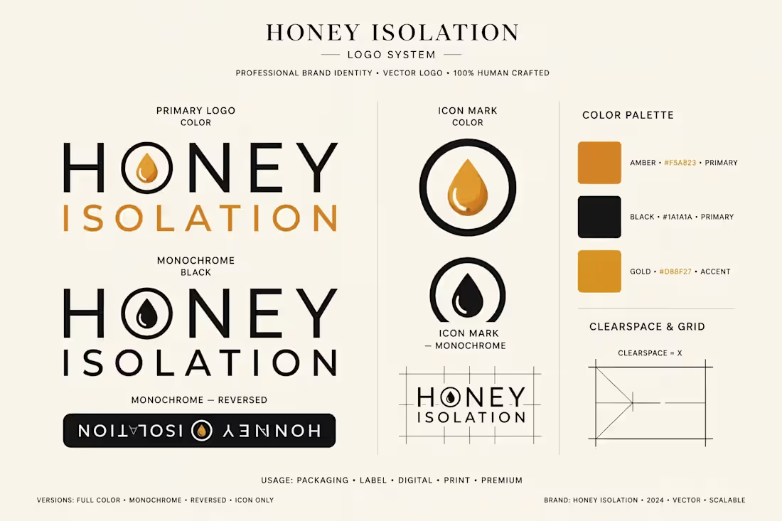
Honey Isolation is a premium honey brand identity concept inspired by the purity of nature and the golden richness of authentic honey. The design combines elegant typography with a distinctive honey-drop emblem to create a sophisticated, memorable, and timeless visual identity.
The warm amber and golden tones represent natural sweetness, quality, and authenticity, while the clean black typography adds a luxurious and professional touch. Designed for honey jars, product labels, packaging, business cards, and digital branding, this concept brings together simplicity, elegance, and natural beauty.
The identity is designed to maintain a consistent appearance across different brand applications, including light and dark backgrounds, promotional materials, and product packaging.
FAQs
Aneetha's other services


Starting at$150
Duration2 days
Tags
Brand Designer
Graphic Designer
Logo Designer
Service provided by
Aneetha Khan Peshawar, Pakistan
- 5
- Followers
Honey Isolation – Premium Luxury Honey Brand IdentityAneetha Khan
Starting at$150
Duration2 days
Tags
Brand Designer
Graphic Designer
Logo Designer
Honey Isolation is a premium honey brand identity concept inspired by the purity of nature and the golden richness of authentic honey. The design combines elegant typography with a distinctive honey-drop emblem to create a sophisticated, memorable, and timeless visual identity.
The warm amber and golden tones represent natural sweetness, quality, and authenticity, while the clean black typography adds a luxurious and professional touch. Designed for honey jars, product labels, packaging, business cards, and digital branding, this concept brings together simplicity, elegance, and natural beauty.
The identity is designed to maintain a consistent appearance across different brand applications, including light and dark backgrounds, promotional materials, and product packaging.
FAQs
Aneetha's other services
$150