
Figma | Design System CreationKeara Meehan
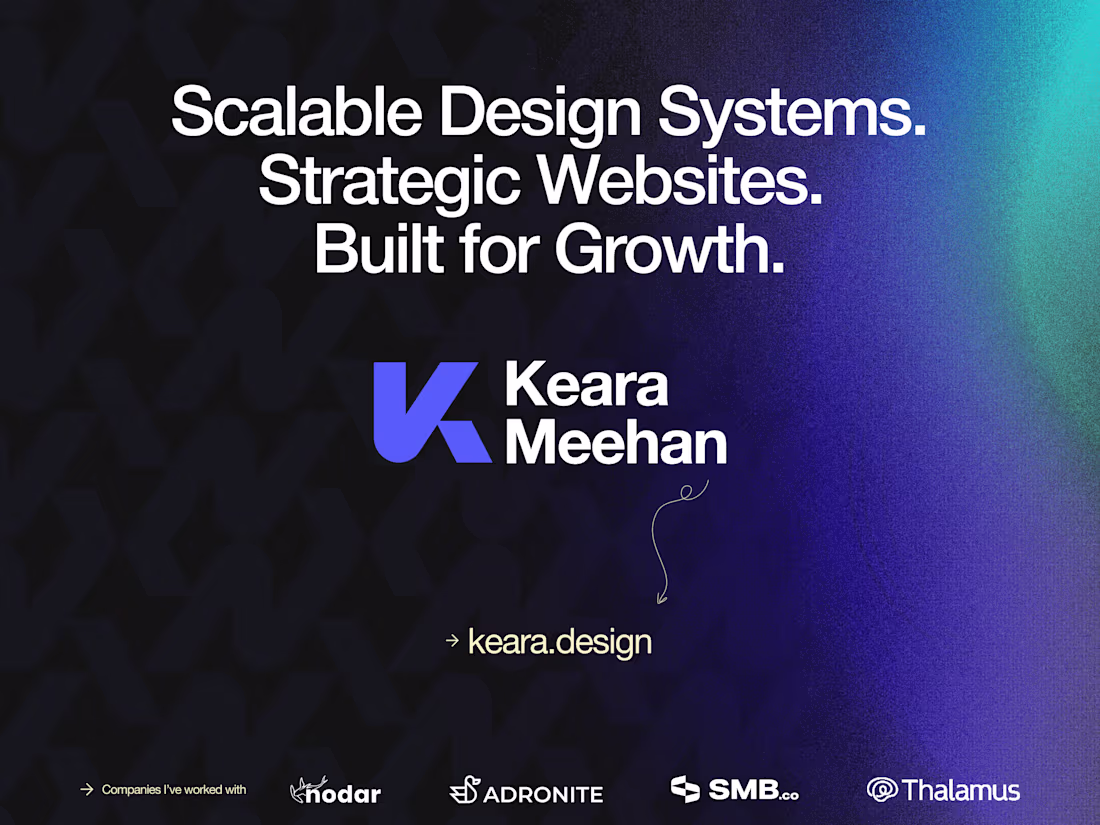
I build design systems that reduce your team's dependency on designers while maintaining quality at scale. Series A-C companies use my systems to ship faster, onboard designers quickly, and eliminate the "design bottleneck" as they grow. You'll receive a fully documented, developer-ready system that serves as your single source of truth; not just a Figma file, but operational infrastructure.
What's included
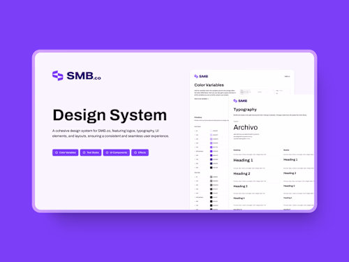
Complete Component Library
Organized Figma file containing reusable UI components, including buttons, forms, cards, navigation elements, and modals, all built with proper variants and auto-layout for maximum flexibility.
Typography & Color System
Comprehensive text styles hierarchy and semantic color palette with defined tokens, ensuring consistent visual language across all digital products and platforms.
Spacing & Layout Framework
Standardized grid system and spacing tokens that create visual harmony and enable designers to build layouts quickly while maintaining consistency.
Documentation & Governance
Clear usage guidelines and component documentation that reduce designer dependency and enable your team to move faster independently.
FAQs
Example work


Contact for pricing
Tags
Figma
Design Systems Specialist
Product Designer
UI Designer
Service provided by
Keara Meehan proChicago, USA
- $50k+
- Earned
- 12
- Paid projects
- 4.91
- Rating
- 786
- Followers
Figma | Design System CreationKeara Meehan
I build design systems that reduce your team's dependency on designers while maintaining quality at scale. Series A-C companies use my systems to ship faster, onboard designers quickly, and eliminate the "design bottleneck" as they grow. You'll receive a fully documented, developer-ready system that serves as your single source of truth; not just a Figma file, but operational infrastructure.
What's included
Complete Component Library
Organized Figma file containing reusable UI components, including buttons, forms, cards, navigation elements, and modals, all built with proper variants and auto-layout for maximum flexibility.
Typography & Color System
Comprehensive text styles hierarchy and semantic color palette with defined tokens, ensuring consistent visual language across all digital products and platforms.
Spacing & Layout Framework
Standardized grid system and spacing tokens that create visual harmony and enable designers to build layouts quickly while maintaining consistency.
Documentation & Governance
Clear usage guidelines and component documentation that reduce designer dependency and enable your team to move faster independently.
FAQs
Example work
Contact for pricing