
Scalable Design System and Figma Component LibraryChirag Patel
Scattered design files and inconsistent user interfaces create significant design debt and slow down development teams. I build scalable design systems that provide a single source of truth for your entire product ecosystem. As a Staff Product Designer I ensure your Figma component library is built for long term efficiency allowing your startup to ship new features with total consistency and speed.
What's included
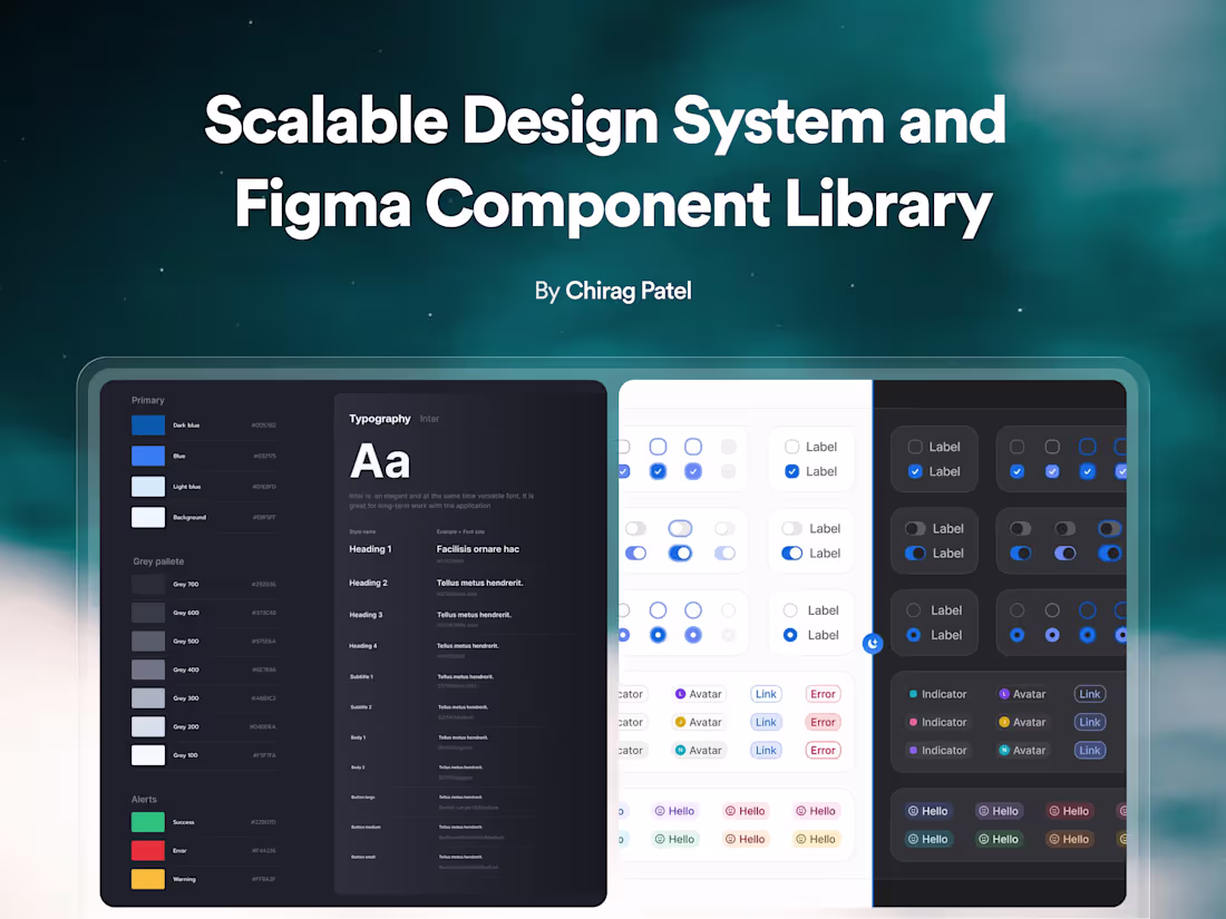
Visual Foundation and Style Guide
Comprehensive definitions for colors and typography and spacing that establish a professional visual language for your brand.
Reusable Figma Component Library
A collection of fully responsive and organized UI elements including buttons and inputs and navigation menus built with the latest Figma features.
Complete Usage Documentation
Detailed instructions hosted in Figma or Notion explaining when and how to use each component to maintain visual quality across different teams.
Developer Handoff Framework
Clear organization of styles and tokens that helps engineers build interfaces faster while reducing design-related questions.
FAQs


Starting at$6,000
Duration7 weeks
Tags
ChatGPT
FigJam
Figma
Google Gemini
Pinterest
Design Systems Specialist
Product Designer
UI Designer
Service provided by
Chirag Patel Surat, India
- 4
- Followers
Scalable Design System and Figma Component LibraryChirag Patel
Starting at$6,000
Duration7 weeks
Tags
ChatGPT
FigJam
Figma
Google Gemini
Pinterest
Design Systems Specialist
Product Designer
UI Designer
Scattered design files and inconsistent user interfaces create significant design debt and slow down development teams. I build scalable design systems that provide a single source of truth for your entire product ecosystem. As a Staff Product Designer I ensure your Figma component library is built for long term efficiency allowing your startup to ship new features with total consistency and speed.
What's included
Visual Foundation and Style Guide
Comprehensive definitions for colors and typography and spacing that establish a professional visual language for your brand.
Reusable Figma Component Library
A collection of fully responsive and organized UI elements including buttons and inputs and navigation menus built with the latest Figma features.
Complete Usage Documentation
Detailed instructions hosted in Figma or Notion explaining when and how to use each component to maintain visual quality across different teams.
Developer Handoff Framework
Clear organization of styles and tokens that helps engineers build interfaces faster while reducing design-related questions.
FAQs
$6,000