
Bespoke Branding PackageDaniel Cordwell
I have been branding busiensses for over 10 years to a very high level of detail.
What's included
Branding Kit for SaaS or Fintech Startup
This branding kit provides a comprehensive suite of assets to help a SaaS or Fintech startup maintain a cohesive identity across all digital and physical touchpoints, especially focused on the tech-forward nature of their businesses.
Following a Discovery stage via a workshop or detailed questionnaire.
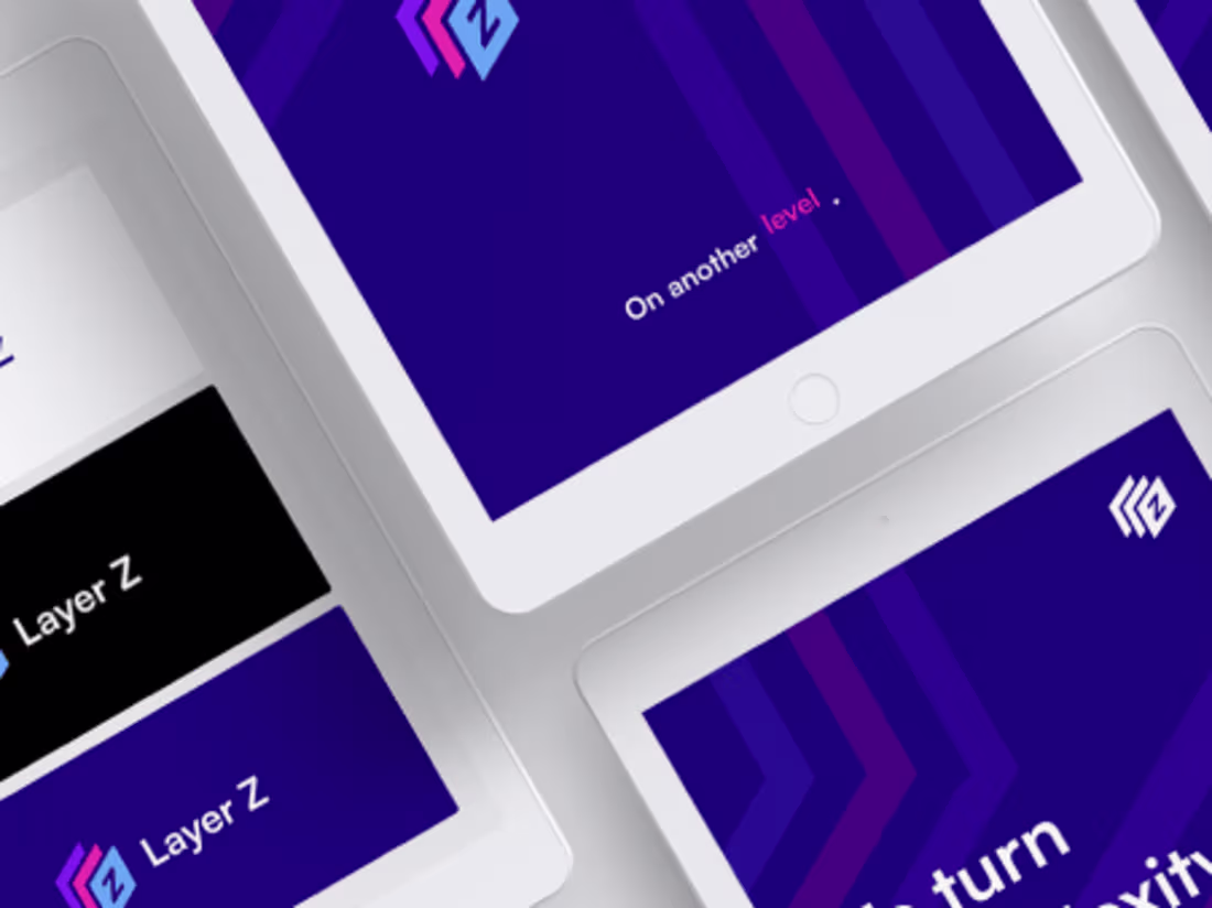
1. Logo Suite
Primary Logo: Designing the main logo that represents the brand.
Secondary Logo/Alternative Logos: Variants for different uses (horizontal/vertical versions, simpler versions, etc.).
Logo Mark/Brand Icon: A standalone mark (symbol or icon) that can be used in compact spaces like favicons, app icons, etc.
2. Typography
Primary Typeface: Main font for headers and branding.
Secondary Typeface: Supporting font for body text.
Web-Safe Fonts: Fonts optimized for digital use to ensure brand consistency across platforms.
3. Color Palette
Primary Colors: Core brand colors (usually 2-4 colors).
Secondary Colors: Supporting shades for accents, backgrounds, etc.
Gradients and Accents: Any additional color treatments used in backgrounds or other design elements.
4. Brand Guidelines
Usage Guidelines: Instructions on how to use logos, fonts, and colors properly across different mediums.
Do’s and Don’ts: Rules on how not to use the brand assets (e.g., distorted logos, improper colors).
Tone and Voice: Guidelines for brand messaging, including how to write for specific audiences (friendly, professional, technical, etc.).
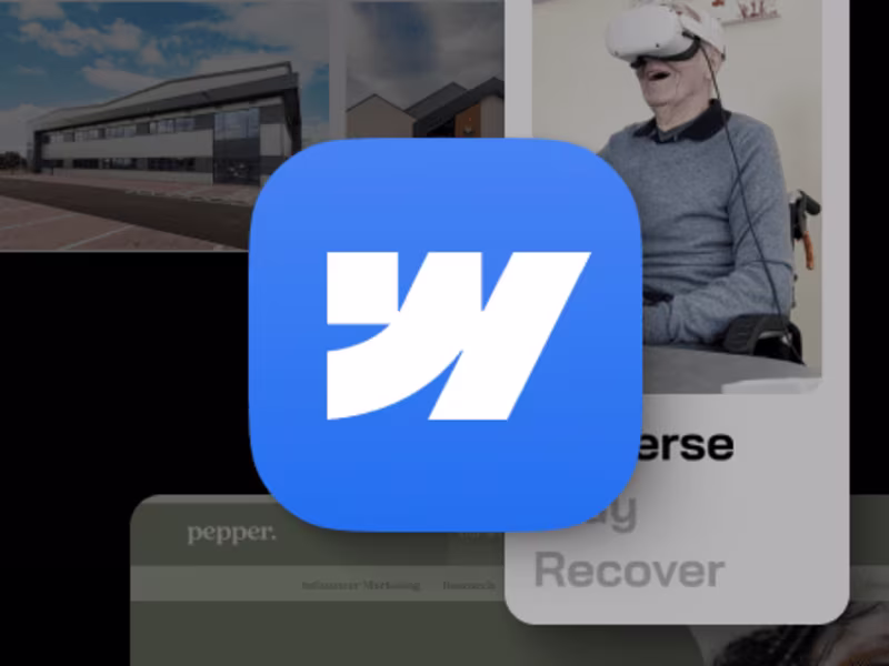
5. Digital Assets
Social Media Profile Graphics: Custom headers, profile images, and post templates for platforms like LinkedIn, Twitter, Facebook, etc.
App Icons: For mobile or web applications (Apple and Android standards).
Favicon: Icon to be used in web browsers.
Presentation Templates: Branded PowerPoint/Google Slides decks for client meetings, investor pitches, or team collaboration.
Daniel's other services
Starting at$10,000
Duration10 weeks
Tags
Adobe Illustrator
Adobe InDesign
Adobe Photoshop
Adobe XD
Figma
Brand Designer
Brand Strategist
Web Designer
Service provided by
Daniel Cordwell proLymm, UK
- 8
- Followers
Bespoke Branding PackageDaniel Cordwell
Starting at$10,000
Duration10 weeks
Tags
Adobe Illustrator
Adobe InDesign
Adobe Photoshop
Adobe XD
Figma
Brand Designer
Brand Strategist
Web Designer
I have been branding busiensses for over 10 years to a very high level of detail.
What's included
Branding Kit for SaaS or Fintech Startup
This branding kit provides a comprehensive suite of assets to help a SaaS or Fintech startup maintain a cohesive identity across all digital and physical touchpoints, especially focused on the tech-forward nature of their businesses.
Following a Discovery stage via a workshop or detailed questionnaire.
1. Logo Suite
Primary Logo: Designing the main logo that represents the brand.
Secondary Logo/Alternative Logos: Variants for different uses (horizontal/vertical versions, simpler versions, etc.).
Logo Mark/Brand Icon: A standalone mark (symbol or icon) that can be used in compact spaces like favicons, app icons, etc.
2. Typography
Primary Typeface: Main font for headers and branding.
Secondary Typeface: Supporting font for body text.
Web-Safe Fonts: Fonts optimized for digital use to ensure brand consistency across platforms.
3. Color Palette
Primary Colors: Core brand colors (usually 2-4 colors).
Secondary Colors: Supporting shades for accents, backgrounds, etc.
Gradients and Accents: Any additional color treatments used in backgrounds or other design elements.
4. Brand Guidelines
Usage Guidelines: Instructions on how to use logos, fonts, and colors properly across different mediums.
Do’s and Don’ts: Rules on how not to use the brand assets (e.g., distorted logos, improper colors).
Tone and Voice: Guidelines for brand messaging, including how to write for specific audiences (friendly, professional, technical, etc.).
5. Digital Assets
Social Media Profile Graphics: Custom headers, profile images, and post templates for platforms like LinkedIn, Twitter, Facebook, etc.
App Icons: For mobile or web applications (Apple and Android standards).
Favicon: Icon to be used in web browsers.
Presentation Templates: Branded PowerPoint/Google Slides decks for client meetings, investor pitches, or team collaboration.
Daniel's other services
$10,000