
Design systemAakash Goel
A design system is a comprehensive set of guidelines, components, and tools for a consistent user experience. It consists of design principles, visual style, reusable components, and documentation.
Some of the benefits of having a design system:
Consistency: Ensures a predictable and user-friendly experience.
Efficiency: Promotes time-saving through reusable components.
Scalability: Adapts as the product or brand grows, maintaining design consistency.
Collaboration: Facilitates better communication between design and development teams.
Faster Development: Speeds up processes with pre-built components.
Brand Identity: Strengthens and maintains brand identity for recognition and trust.
Accessibility: Integrates guidelines for inclusive design.
Easier Maintenance: Comes with documentation and version control for updates.
A design system is a valuable asset, streamlining design, ensuring consistency, and contributing to an efficient and user-friendly experience, serving as a foundation for a successful digital presence.
What's included
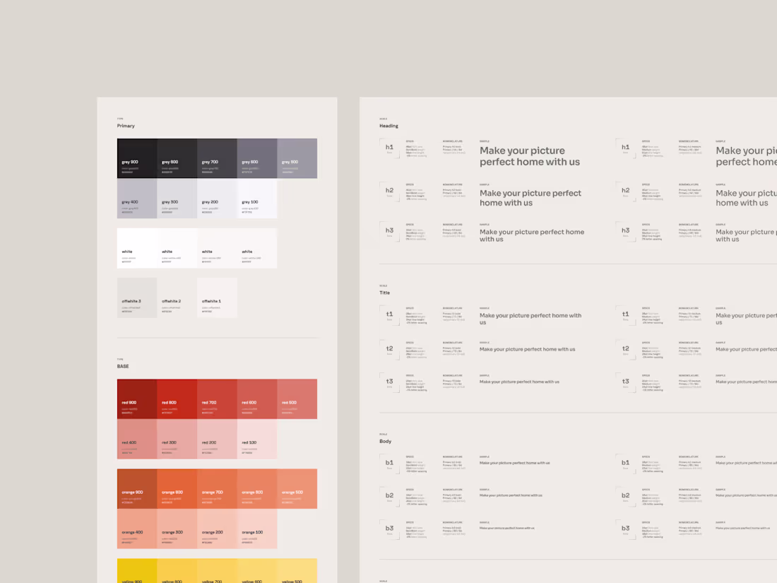
Style Guide
A comprehensive document outlining design principles, color schemes, typography, iconography, and other visual elements to maintain a consistent look and feel.
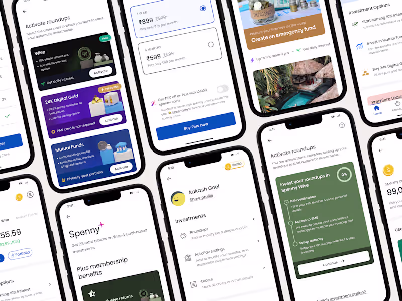
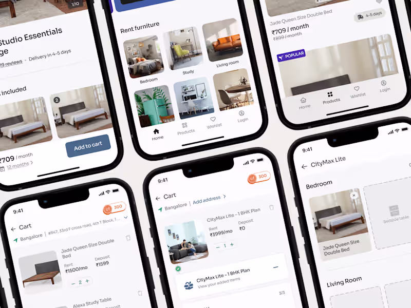
Pattern Library + Component Library
A collection of reusable UI components or design patterns with guidelines on how to implement them. This ensures consistency across different parts of a product or across various products.
Design Tokens + Variables
Abstracted values for design elements, such as colors, fonts, spacing, and more, facilitating easy maintenance and global changes across the design system.
Documentation
Detailed documentation on how to use and implement various elements of the design system, including code snippets, usage guidelines, and best practices.
Interaction Guidelines
Guidelines on how different UI components behave and interact, including animations, transitions, and micro-interactions for a consistent user experience.
Code Components or UI Kits
Pre-built code components that align with the design system, allowing developers to easily integrate them into their projects (Depends on the scope of the project)
Design Assets
Raw design files, such as Sketch or Figma files, containing the source designs for the UI components and patterns.
Version control and governance documentation
A system for managing updates, changes, and versions to ensure that all teams are using the latest and consistent design assets.
Guidelines and processes for maintaining and evolving the design system over time, including roles and responsibilities for contributors, updates, and approvals.
Aakash's other services
Starting at$1,200
Duration2 weeks
Tags
Figma
Framer
Notion
Design Systems Specialist
Design Token
UX Designer
Service provided by
Aakash Goel Bengaluru, India
- 1
- Followers
Design systemAakash Goel
Starting at$1,200
Duration2 weeks
Tags
Figma
Framer
Notion
Design Systems Specialist
Design Token
UX Designer
A design system is a comprehensive set of guidelines, components, and tools for a consistent user experience. It consists of design principles, visual style, reusable components, and documentation.
Some of the benefits of having a design system:
Consistency: Ensures a predictable and user-friendly experience.
Efficiency: Promotes time-saving through reusable components.
Scalability: Adapts as the product or brand grows, maintaining design consistency.
Collaboration: Facilitates better communication between design and development teams.
Faster Development: Speeds up processes with pre-built components.
Brand Identity: Strengthens and maintains brand identity for recognition and trust.
Accessibility: Integrates guidelines for inclusive design.
Easier Maintenance: Comes with documentation and version control for updates.
A design system is a valuable asset, streamlining design, ensuring consistency, and contributing to an efficient and user-friendly experience, serving as a foundation for a successful digital presence.
What's included
Style Guide
A comprehensive document outlining design principles, color schemes, typography, iconography, and other visual elements to maintain a consistent look and feel.
Pattern Library + Component Library
A collection of reusable UI components or design patterns with guidelines on how to implement them. This ensures consistency across different parts of a product or across various products.
Design Tokens + Variables
Abstracted values for design elements, such as colors, fonts, spacing, and more, facilitating easy maintenance and global changes across the design system.
Documentation
Detailed documentation on how to use and implement various elements of the design system, including code snippets, usage guidelines, and best practices.
Interaction Guidelines
Guidelines on how different UI components behave and interact, including animations, transitions, and micro-interactions for a consistent user experience.
Code Components or UI Kits
Pre-built code components that align with the design system, allowing developers to easily integrate them into their projects (Depends on the scope of the project)
Design Assets
Raw design files, such as Sketch or Figma files, containing the source designs for the UI components and patterns.
Version control and governance documentation
A system for managing updates, changes, and versions to ensure that all teams are using the latest and consistent design assets.
Guidelines and processes for maintaining and evolving the design system over time, including roles and responsibilities for contributors, updates, and approvals.
Aakash's other services
$1,200