
Level Up Your Brand: Sleek UI/UX and Logo Designs for the Nowpushkar thakur
I offer professional UI/UX and logo design services that combine creativity, functionality, and strategy to bring your brand and digital products to life. From stunning, versatile logos to seamless user experiences, I ensure every design aligns with your vision and engages your audience. What sets me apart is my focus on blending cutting-edge design trends with a deep understanding of user needs, creating solutions that are not just visually striking but also purpose-driven
What's included
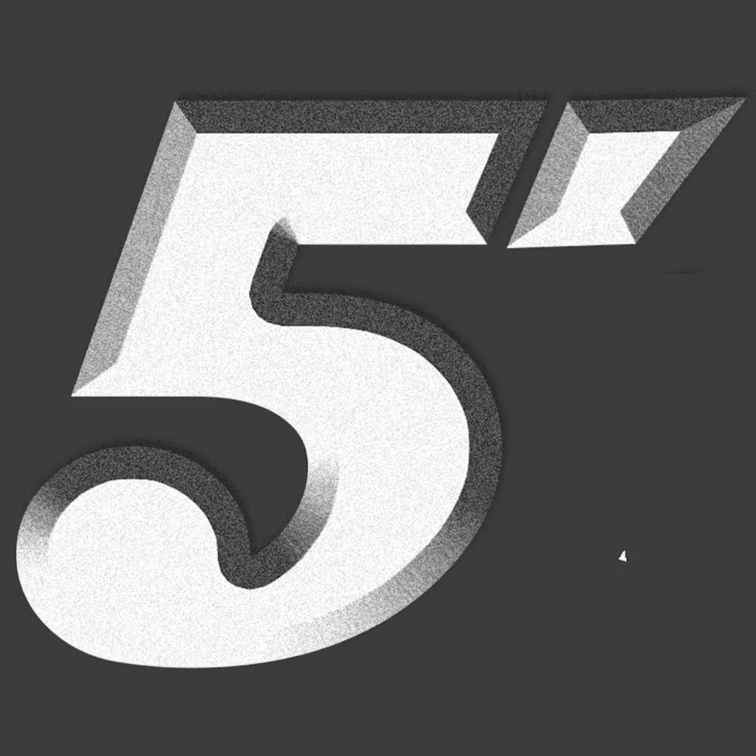
logo designing
Primary Logo
A high-resolution logo design that serves as the core representation of your brand. Delivered in multiple formats (JPG, PNG with a transparent background, SVG, PDF, and AI), it ensures flexibility for digital and print use.
Logo Variations
Customized alternate versions of your logo to suit various applications. This includes horizontal, vertical, monochrome, and icon-only options, offering adaptability for diverse branding needs.
Color Palette
A professionally curated selection of brand colors, complete with detailed HEX, RGB, and CMYK codes. This ensures consistent color application across all digital platforms and printed materials.
Typography Guidelines
A carefully chosen combination of primary and secondary fonts, with clear instructions on usage. This helps maintain a cohesive and visually appealing text style across your branding materials.
Brand Style Guide
A comprehensive guide outlining the proper use of your logo, colors, typography, and spacing. It ensures consistency across all branding efforts, empowering your team to uphold the brand's identity.
Mockups
Real-world visualizations of your logo applied to business cards, websites, packaging, merchandise, and other mediums. These help demonstrate how your logo will appear in practical use cases.
Social Media Assets
Ready-to-use branding materials designed for social media platforms, including profile pictures, cover banners, and post templates tailored for Instagram, Facebook, LinkedIn, Twitter, and more.
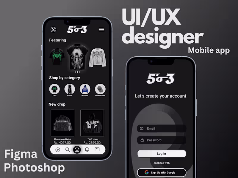
UI/UX
Wireframes
Low-fidelity layouts that outline the basic structure, navigation, and element placement on your website or app. These serve as the blueprint for your digital product.
Mockups
High-fidelity visual designs that showcase the final appearance of your product, complete with selected fonts, colors, images, and overall styling.
Interactive Prototypes
A clickable version of your design that simulates user interactions and workflows, allowing you to experience the product before it enters development.
Design System
A comprehensive library of reusable components, styles, icons, and design guidelines that ensures consistency and scalability throughout your product.
Responsive Designs
Customized layouts optimized for various devices, including desktops, tablets, and smartphones, ensuring your product functions flawlessly on any screen size.
User Flow Diagrams
Visual representations of user journeys through your product, highlighting how users navigate and interact with its features for clarity and optimization.
Final UI Screens
Pixel-perfect designs for every page or screen of your product, prepared with detailed specifications for margins, padding, and styles, ensuring accuracy in development.
Developer Handoff
Organized delivery of design files (Figma, Adobe XD, or Sketch) with detailed specifications, annotations, and export-ready assets for smooth collaboration with developers.
Usability Testing Reports
A detailed report summarizing findings from user testing, identifying pain points, user feedback, and actionable recommendations for improvement.
Branding Integration
A seamless incorporation of your branding into the UI/UX design, aligning colors, typography, and logos to create a cohesive and professional product experience.
pushkar's other services
Starting at$25 /hr
Tags
Adobe Illustrator
Adobe Photoshop
Figma
Graphic Designer
Logo Designer
UI Designer
Service provided by
pushkar thakur Ghaziabad, India
Level Up Your Brand: Sleek UI/UX and Logo Designs for the Nowpushkar thakur
Starting at$25 /hr
Tags
Adobe Illustrator
Adobe Photoshop
Figma
Graphic Designer
Logo Designer
UI Designer
I offer professional UI/UX and logo design services that combine creativity, functionality, and strategy to bring your brand and digital products to life. From stunning, versatile logos to seamless user experiences, I ensure every design aligns with your vision and engages your audience. What sets me apart is my focus on blending cutting-edge design trends with a deep understanding of user needs, creating solutions that are not just visually striking but also purpose-driven
What's included
logo designing
Primary Logo
A high-resolution logo design that serves as the core representation of your brand. Delivered in multiple formats (JPG, PNG with a transparent background, SVG, PDF, and AI), it ensures flexibility for digital and print use.
Logo Variations
Customized alternate versions of your logo to suit various applications. This includes horizontal, vertical, monochrome, and icon-only options, offering adaptability for diverse branding needs.
Color Palette
A professionally curated selection of brand colors, complete with detailed HEX, RGB, and CMYK codes. This ensures consistent color application across all digital platforms and printed materials.
Typography Guidelines
A carefully chosen combination of primary and secondary fonts, with clear instructions on usage. This helps maintain a cohesive and visually appealing text style across your branding materials.
Brand Style Guide
A comprehensive guide outlining the proper use of your logo, colors, typography, and spacing. It ensures consistency across all branding efforts, empowering your team to uphold the brand's identity.
Mockups
Real-world visualizations of your logo applied to business cards, websites, packaging, merchandise, and other mediums. These help demonstrate how your logo will appear in practical use cases.
Social Media Assets
Ready-to-use branding materials designed for social media platforms, including profile pictures, cover banners, and post templates tailored for Instagram, Facebook, LinkedIn, Twitter, and more.
UI/UX
Wireframes
Low-fidelity layouts that outline the basic structure, navigation, and element placement on your website or app. These serve as the blueprint for your digital product.
Mockups
High-fidelity visual designs that showcase the final appearance of your product, complete with selected fonts, colors, images, and overall styling.
Interactive Prototypes
A clickable version of your design that simulates user interactions and workflows, allowing you to experience the product before it enters development.
Design System
A comprehensive library of reusable components, styles, icons, and design guidelines that ensures consistency and scalability throughout your product.
Responsive Designs
Customized layouts optimized for various devices, including desktops, tablets, and smartphones, ensuring your product functions flawlessly on any screen size.
User Flow Diagrams
Visual representations of user journeys through your product, highlighting how users navigate and interact with its features for clarity and optimization.
Final UI Screens
Pixel-perfect designs for every page or screen of your product, prepared with detailed specifications for margins, padding, and styles, ensuring accuracy in development.
Developer Handoff
Organized delivery of design files (Figma, Adobe XD, or Sketch) with detailed specifications, annotations, and export-ready assets for smooth collaboration with developers.
Usability Testing Reports
A detailed report summarizing findings from user testing, identifying pain points, user feedback, and actionable recommendations for improvement.
Branding Integration
A seamless incorporation of your branding into the UI/UX design, aligning colors, typography, and logos to create a cohesive and professional product experience.
pushkar's other services
$25 /hr