
Custom Mobile-First Design for Seamless User ExperiencesKiersten Zundel
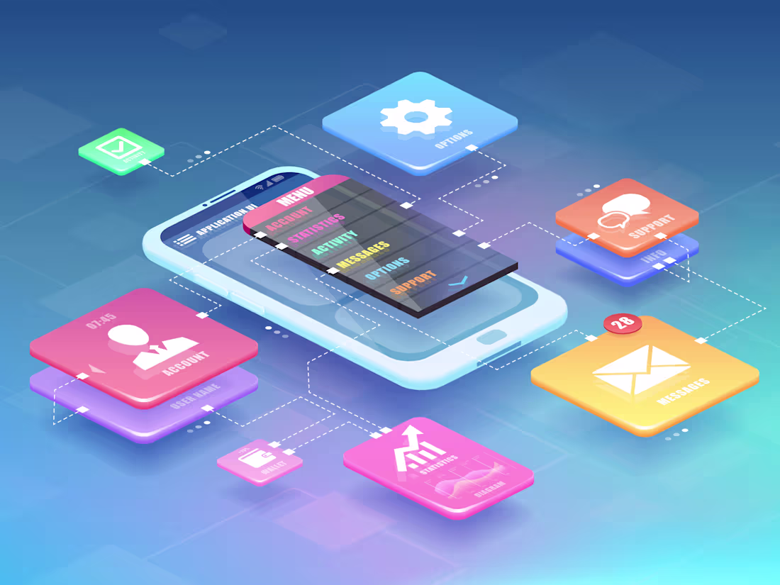
I offer custom mobile-first designs that prioritize seamless user experiences, ensuring your app or website is both visually appealing and highly functional on any device. My approach combines user-centered design principles with cutting-edge aesthetics, delivering interfaces that engage and convert. What sets me apart is my commitment to understanding your audience and crafting tailored solutions that enhance usability and drive results in a mobile-centric world.
What's included
Custom Mobile-First Design
A fully tailored, responsive mobile design that prioritizes user experience and engagement.
Wireframes & Prototypes
Detailed wireframes and interactive prototypes that illustrate the layout and functionality of the mobile interface before the final design.
User-Centered Design Elements
Design elements that focus on user needs and behaviors, ensuring intuitive navigation and accessibility.
High-Quality Visuals & Graphics
Custom graphics, icons, and images that enhance the visual appeal of the mobile design while aligning with your brand identity.
Responsive Design for Multiple Devices
Optimized layouts that ensure a consistent experience across various mobile devices and screen sizes.
Loading Speed Optimization
Design techniques implemented to enhance loading times and improve overall performance on mobile devices.
Delivery of Design Assets
Final design files provided in preferred formats (e.g., Figma, Adobe XD, Sketch) along with style guides for consistency.
User Experience Review & Recommendations
A summary of user experience considerations and design decisions made during the project, highlighting key features and functionality.
Post-Launch Support (Optional)
An option for ongoing support to address any design-related issues or updates after the project completion.
FAQs
Kiersten's other services

Contact for pricing
Tags
Adobe XD
Figma
Sketch
Interaction Designer
Mobile Designer
Service provided by
Kiersten Zundel Austin, USA
Custom Mobile-First Design for Seamless User ExperiencesKiersten Zundel
I offer custom mobile-first designs that prioritize seamless user experiences, ensuring your app or website is both visually appealing and highly functional on any device. My approach combines user-centered design principles with cutting-edge aesthetics, delivering interfaces that engage and convert. What sets me apart is my commitment to understanding your audience and crafting tailored solutions that enhance usability and drive results in a mobile-centric world.
What's included
Custom Mobile-First Design
A fully tailored, responsive mobile design that prioritizes user experience and engagement.
Wireframes & Prototypes
Detailed wireframes and interactive prototypes that illustrate the layout and functionality of the mobile interface before the final design.
User-Centered Design Elements
Design elements that focus on user needs and behaviors, ensuring intuitive navigation and accessibility.
High-Quality Visuals & Graphics
Custom graphics, icons, and images that enhance the visual appeal of the mobile design while aligning with your brand identity.
Responsive Design for Multiple Devices
Optimized layouts that ensure a consistent experience across various mobile devices and screen sizes.
Loading Speed Optimization
Design techniques implemented to enhance loading times and improve overall performance on mobile devices.
Delivery of Design Assets
Final design files provided in preferred formats (e.g., Figma, Adobe XD, Sketch) along with style guides for consistency.
User Experience Review & Recommendations
A summary of user experience considerations and design decisions made during the project, highlighting key features and functionality.
Post-Launch Support (Optional)
An option for ongoing support to address any design-related issues or updates after the project completion.
FAQs
Kiersten's other services
Contact for pricing