
Digital marketing contentSher Ali
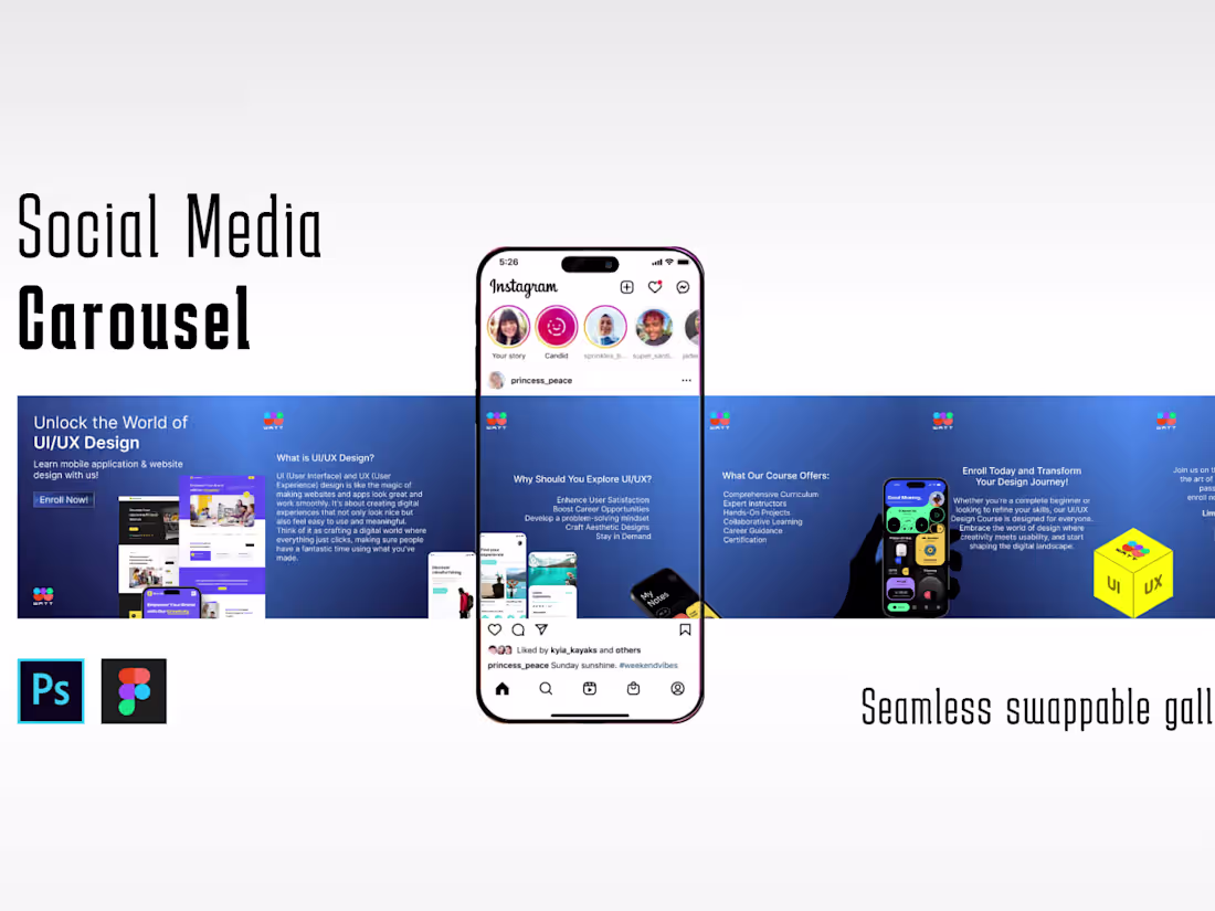
Carousel Mockups: High-fidelity designs showcasing the carousel layout, including each slide's content, visuals, and transitions.
Design Specifications: Detailed documentation outlining dimensions, image sizes, text lengths, and any specific guidelines for implementing the carousel.
Interactive Prototypes: Functional prototypes showcasing the carousel's behavior, transitions, and user interactions, usually created using tools like Figma or Adobe XD.
Asset Libraries: All design assets (images, icons, graphics) used in the carousel, organized and delivered in a usable format for development.
Style Guides or UI Kits: Documentation defining the carousel's visual elements (color palettes, typography, button styles) to ensure design consistency.
Development Support: Collaboration during the handoff phase, offering guidance or answering queries from developers for smooth implementation.
What's included
carousel design
High-fidelity designs showcasing the carousel layout, including each slide's content, visuals, and transitions.
Example work

Sher's other services
Starting at$10 /hr
Tags
Adobe Illustrator
Adobe InDesign
Adobe Photoshop
Canva
Figma
Advertisement Designer
Brand Designer
Graphic Designer
Service provided by
Sher Ali Pakistan
Digital marketing contentSher Ali
Starting at$10 /hr
Tags
Adobe Illustrator
Adobe InDesign
Adobe Photoshop
Canva
Figma
Advertisement Designer
Brand Designer
Graphic Designer
Carousel Mockups: High-fidelity designs showcasing the carousel layout, including each slide's content, visuals, and transitions.
Design Specifications: Detailed documentation outlining dimensions, image sizes, text lengths, and any specific guidelines for implementing the carousel.
Interactive Prototypes: Functional prototypes showcasing the carousel's behavior, transitions, and user interactions, usually created using tools like Figma or Adobe XD.
Asset Libraries: All design assets (images, icons, graphics) used in the carousel, organized and delivered in a usable format for development.
Style Guides or UI Kits: Documentation defining the carousel's visual elements (color palettes, typography, button styles) to ensure design consistency.
Development Support: Collaboration during the handoff phase, offering guidance or answering queries from developers for smooth implementation.
What's included
carousel design
High-fidelity designs showcasing the carousel layout, including each slide's content, visuals, and transitions.
Example work
Sher's other services
$10 /hr