
🎛️ Custom Design SystemAkash Tyagi
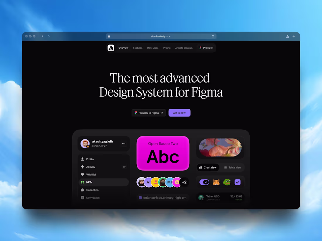
A UI design system is a comprehensive toolkit of reusable design elements, guidelines, and components. It serves as the foundation for creating consistent and user-friendly digital interfaces across various products.
You'll receive a custom Design System tailored to your brand and project needs. This includes an extensive collection of UI components and a well-defined foundation — colors, typography, spacing, and other essential design elements.
What's included
📂 Ready-to-use Figma design file:
Over 1,400 components, including fully tokenized components and UI elements, plus seamless integration with your brand.
🎛️ Product-specific component library:
Collection of reusable UI components tailored to your product's needs.
🎨 Style Guide:
Comprehensive documentation of visual elements, including fonts, color schemes, layout guidelines, and design tokens for effortless development implementation.
🧬 Design Patterns
Collection of common UI patterns including various layouts, authentication interfaces (login/signup, password recovery), dashboard components, and other frequently used interface elements.
Starting at$2,500
Duration2 weeks
Tags
Figma
Design Systems Specialist
UI Designer
Service provided by
Akash Tyagi Gurugram, India
- 5.00
- Rating
- 1
- Followers
🎛️ Custom Design SystemAkash Tyagi
A UI design system is a comprehensive toolkit of reusable design elements, guidelines, and components. It serves as the foundation for creating consistent and user-friendly digital interfaces across various products.
You'll receive a custom Design System tailored to your brand and project needs. This includes an extensive collection of UI components and a well-defined foundation — colors, typography, spacing, and other essential design elements.
What's included
📂 Ready-to-use Figma design file:
Over 1,400 components, including fully tokenized components and UI elements, plus seamless integration with your brand.
🎛️ Product-specific component library:
Collection of reusable UI components tailored to your product's needs.
🎨 Style Guide:
Comprehensive documentation of visual elements, including fonts, color schemes, layout guidelines, and design tokens for effortless development implementation.
🧬 Design Patterns
Collection of common UI patterns including various layouts, authentication interfaces (login/signup, password recovery), dashboard components, and other frequently used interface elements.
$2,500