
Sharp and scalable design systemsJulie Andria
I create scalable design systems that are built on a deep understanding of the brand. By developing the brand book first, I fully capture the brand’s essence—its principles, tone, and visual logic—before translating it into a detailed, cohesive design system. This approach ensures every component, rule, and decision is intentional, consistent, and aligned with the brand’s identity, not just visually correct but strategically grounded.
What's included
1. Brand Foundations
The strategic backbone of the system—defining how the brand should look, feel, and behave across all touchpoints.
- Brand principles & design rationale
- Visual tone and personality
- Usage rules that guide future decisions
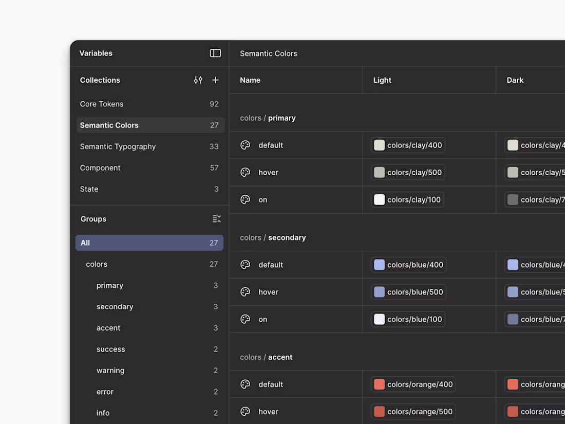
2. Color System
A structured, accessible color palette designed for flexibility and long-term use.
- Primary, secondary, and accent colors
- Functional colors (success, warning, error, etc.)
- Accessibility contrast guidelines
3. Typography System
A clear hierarchy for type that works across platforms and use cases.
- Primary and secondary typefaces
- Font scales (headlines, body, captions, UI text)
- Line height, spacing, and usage rules
4. Spacing & Layout System
A standardized approach to spacing, grids, and layout structure.
- Spacing scale (padding, margins, gaps-
- Grid systems and layout patterns
- Responsive behavior guidelines
5. UI Components Library
A reusable set of core interface components built to be consistent and adaptable.
- Buttons, inputs, forms, navigation elements
- Component states (hover, active, disabled, error)
- Variants and usage rules
6. Component Documentation
Clear documentation explaining how and when to use each component.
- Usage guidelines
- Do’s and don’ts
- Interaction and behavior notes
7. Iconography & Visual Assets
A cohesive visual language for icons and supporting assets.
- Icon style and grid
- Stroke, fill, and sizing rules
- Export formats and usage guidance
8. Design Tokens
A systemized way to translate design decisions into code-ready values.
- Color, spacing, typography tokens
- Naming conventions aligned with development workflows
9. Design System Delivery & Handoff
A clean, usable system delivered in tools your team already uses.
- Figma (or equivalent) design system file
- Organized libraries and styles
- Handoff walkthrough or training session
Example work


Contact for pricing
Tags
Figma
Brand Designer
UI Designer
Service provided by
Julie Andria proBordeaux, France
- $10k+
- Earned
- 8
- Paid projects
- 5.00
- Rating
- 266
- Followers
Sharp and scalable design systemsJulie Andria
I create scalable design systems that are built on a deep understanding of the brand. By developing the brand book first, I fully capture the brand’s essence—its principles, tone, and visual logic—before translating it into a detailed, cohesive design system. This approach ensures every component, rule, and decision is intentional, consistent, and aligned with the brand’s identity, not just visually correct but strategically grounded.
What's included
1. Brand Foundations
The strategic backbone of the system—defining how the brand should look, feel, and behave across all touchpoints.
- Brand principles & design rationale
- Visual tone and personality
- Usage rules that guide future decisions
2. Color System
A structured, accessible color palette designed for flexibility and long-term use.
- Primary, secondary, and accent colors
- Functional colors (success, warning, error, etc.)
- Accessibility contrast guidelines
3. Typography System
A clear hierarchy for type that works across platforms and use cases.
- Primary and secondary typefaces
- Font scales (headlines, body, captions, UI text)
- Line height, spacing, and usage rules
4. Spacing & Layout System
A standardized approach to spacing, grids, and layout structure.
- Spacing scale (padding, margins, gaps-
- Grid systems and layout patterns
- Responsive behavior guidelines
5. UI Components Library
A reusable set of core interface components built to be consistent and adaptable.
- Buttons, inputs, forms, navigation elements
- Component states (hover, active, disabled, error)
- Variants and usage rules
6. Component Documentation
Clear documentation explaining how and when to use each component.
- Usage guidelines
- Do’s and don’ts
- Interaction and behavior notes
7. Iconography & Visual Assets
A cohesive visual language for icons and supporting assets.
- Icon style and grid
- Stroke, fill, and sizing rules
- Export formats and usage guidance
8. Design Tokens
A systemized way to translate design decisions into code-ready values.
- Color, spacing, typography tokens
- Naming conventions aligned with development workflows
9. Design System Delivery & Handoff
A clean, usable system delivered in tools your team already uses.
- Figma (or equivalent) design system file
- Organized libraries and styles
- Handoff walkthrough or training session
Example work
Contact for pricing