
Crafting High-Converting & Visual Stunning Landing Page Designs mohamed sheik
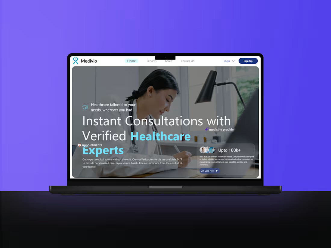
I design high-converting, visually compelling landing pages that capture attention and drive user engagement. My approach focuses on blending creativity with strategic UX principles to ensure seamless navigation and optimal conversions. What sets me apart is my ability to craft tailored, brand-aligned designs that not only look stunning but also deliver measurable results for your business."
What's included
high fidelity prototype, responsive design, Revision Rounds, Design System/Style Guide
High-Fidelity Wireframes: Detailed layouts showcasing the structure and flow of the design.
Interactive Prototypes: Clickable prototypes for user testing and visualizing the final product's functionality.
Custom UI Design: Pixel-perfect and responsive UI design tailored to your brand's identity.
UX Design Documentation: User flow diagrams, personas, and journey maps to ensure a user-friendly experience.
Design Assets: All icons, images, and graphic elements optimized for web or app development.
Design System/Style Guide: A comprehensive guide including typography, color palette, and UI components for consistency.
Developer Handoff: Organized design files (e.g., Figma, Sketch, Zeplin) ready for seamless handoff to developers.
Responsive Design: Ensuring compatibility across devices (desktop, tablet, and mobile).
Revision Rounds: Iterative updates based on your feedback to refine the design.
Support & Guidance: Post-project support for implementing the design and addressing queries
Example work
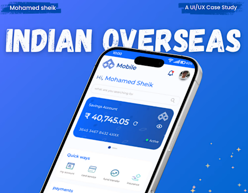
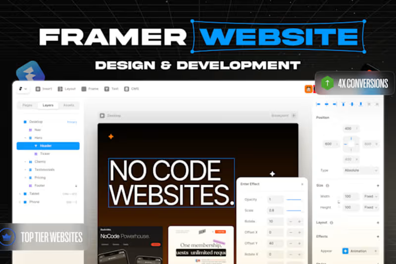
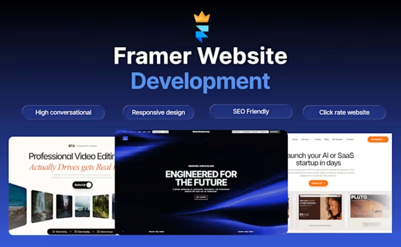
Starting at$20
Duration3 weeks
Tags
Adobe XD

Canva

Figma

Sketch

Zeplin

Mobile Designer
UI Designer
Web Designer
Service provided by
mohamed sheik Chennai, India
Crafting High-Converting & Visual Stunning Landing Page Designs mohamed sheik
Starting at$20
Duration3 weeks
Tags
Adobe XD
Canva
Figma
Sketch
Zeplin
Mobile Designer
UI Designer
Web Designer
I design high-converting, visually compelling landing pages that capture attention and drive user engagement. My approach focuses on blending creativity with strategic UX principles to ensure seamless navigation and optimal conversions. What sets me apart is my ability to craft tailored, brand-aligned designs that not only look stunning but also deliver measurable results for your business."
What's included
high fidelity prototype, responsive design, Revision Rounds, Design System/Style Guide
High-Fidelity Wireframes: Detailed layouts showcasing the structure and flow of the design.
Interactive Prototypes: Clickable prototypes for user testing and visualizing the final product's functionality.
Custom UI Design: Pixel-perfect and responsive UI design tailored to your brand's identity.
UX Design Documentation: User flow diagrams, personas, and journey maps to ensure a user-friendly experience.
Design Assets: All icons, images, and graphic elements optimized for web or app development.
Design System/Style Guide: A comprehensive guide including typography, color palette, and UI components for consistency.
Developer Handoff: Organized design files (e.g., Figma, Sketch, Zeplin) ready for seamless handoff to developers.
Responsive Design: Ensuring compatibility across devices (desktop, tablet, and mobile).
Revision Rounds: Iterative updates based on your feedback to refine the design.
Support & Guidance: Post-project support for implementing the design and addressing queries
Example work
$20