
Responsive Fix & Mobile OptimizationVijay Sonkar
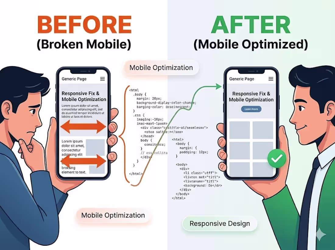
Is your website breaking on mobile devices? Let’s fix that.
A site that doesn't work on mobile isn't just annoying—it’s costing you customers and SEO rankings. I will audit your existing site and write custom CSS to ensure it looks and functions perfectly across all screen sizes, from ultra-wide monitors to the smallest smartphones.
What I will do:
Layout Correction: Fix overlapping elements, broken grids, and "sideways scrolling" issues.
Mobile-First UX: Optimize navigation menus, buttons, and forms for touch-screen users.
Cross-Browser Testing: Ensure consistency across Safari, Chrome, and Firefox.
Speed Check: Minor tweaks to ensure responsive elements don't slow down your load times.
The result: A seamless, professional experience for every visitor, no matter what device they use.
FAQs
Contact for pricing
Duration1 week
Tags
Frontend Engineer
Mobile Optimization
Responsive Design
Web Developer
Service provided by
Vijay Sonkar Patna, India
- 2
- Followers
Responsive Fix & Mobile OptimizationVijay Sonkar
Contact for pricing
Duration1 week
Tags
Frontend Engineer
Mobile Optimization
Responsive Design
Web Developer
Is your website breaking on mobile devices? Let’s fix that.
A site that doesn't work on mobile isn't just annoying—it’s costing you customers and SEO rankings. I will audit your existing site and write custom CSS to ensure it looks and functions perfectly across all screen sizes, from ultra-wide monitors to the smallest smartphones.
What I will do:
Layout Correction: Fix overlapping elements, broken grids, and "sideways scrolling" issues.
Mobile-First UX: Optimize navigation menus, buttons, and forms for touch-screen users.
Cross-Browser Testing: Ensure consistency across Safari, Chrome, and Firefox.
Speed Check: Minor tweaks to ensure responsive elements don't slow down your load times.
The result: A seamless, professional experience for every visitor, no matter what device they use.
FAQs
Contact for pricing