
Mobile Application and Website DesignKhushi Agarwal
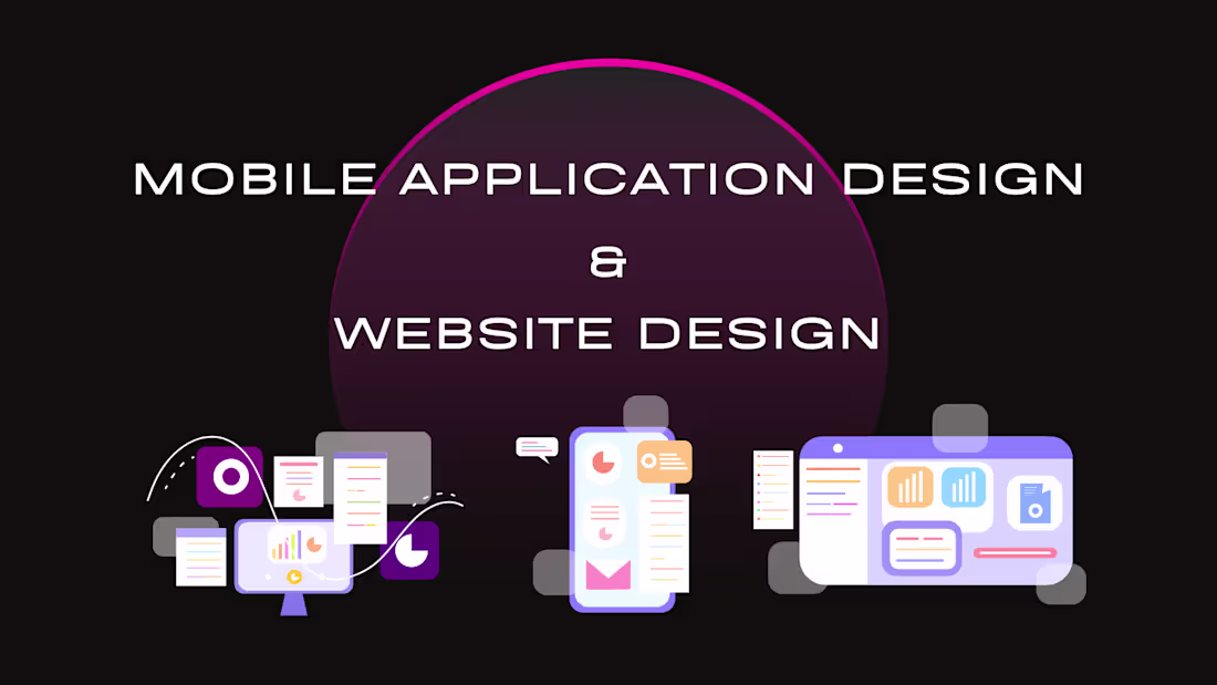
Mobile Application Design
"Crafting Intuitive Experiences for the Palm of Your Hand"
Mobile design is more than just a small-scale website; it is an intimate interaction between the user and the device. My approach focuses on:
User-Centric Interfaces (UI): Creating visually stunning, high-fidelity screens that prioritize clarity and ease of use.
Seamless Navigation (UX): Mapping out logical user journeys that minimize friction and maximize engagement through "thumb-friendly" layouts.
Performance & Responsiveness: Ensuring fluid transitions and micro-interactions that make the app feel alive and responsive on both iOS and Android platforms.
Website Design
"Building a Digital Home for Modern Brands"
A website is often the first point of contact for a brand. My design philosophy blends storytelling with technical precision to create a lasting impression:
Responsive Architecture: Designing flexible layouts that adapt perfectly to desktops, tablets, and everything in between.
Visual Storytelling: Using clean typography, balanced white space, and strategic imagery to guide the viewer’s eye toward your key message.
Conversion-Focused Layouts: Strategically placing Calls to Action (CTAs) and optimizing page flow to turn casual visitors into loyal customers.
Khushi's other services

Starting at$400
Duration14 days
Tags
UI Designer
UX Designer
UX Researcher
Service provided by
Khushi Agarwal Surat, India
Mobile Application and Website DesignKhushi Agarwal
Starting at$400
Duration14 days
Tags
UI Designer
UX Designer
UX Researcher
Mobile Application Design
"Crafting Intuitive Experiences for the Palm of Your Hand"
Mobile design is more than just a small-scale website; it is an intimate interaction between the user and the device. My approach focuses on:
User-Centric Interfaces (UI): Creating visually stunning, high-fidelity screens that prioritize clarity and ease of use.
Seamless Navigation (UX): Mapping out logical user journeys that minimize friction and maximize engagement through "thumb-friendly" layouts.
Performance & Responsiveness: Ensuring fluid transitions and micro-interactions that make the app feel alive and responsive on both iOS and Android platforms.
Website Design
"Building a Digital Home for Modern Brands"
A website is often the first point of contact for a brand. My design philosophy blends storytelling with technical precision to create a lasting impression:
Responsive Architecture: Designing flexible layouts that adapt perfectly to desktops, tablets, and everything in between.
Visual Storytelling: Using clean typography, balanced white space, and strategic imagery to guide the viewer’s eye toward your key message.
Conversion-Focused Layouts: Strategically placing Calls to Action (CTAs) and optimizing page flow to turn casual visitors into loyal customers.
Khushi's other services
$400