
Design Systems Specialist: Streamlined SolutionsSooraj Shetty
I specialize in creating Design Systems that ensure consistency, scalability, and efficiency across all your digital products. From building reusable components and design tokens to crafting detailed documentation and style guides, I streamline collaboration between designers and developers. My goal is to deliver a unified design framework that saves time, maintains brand integrity, and enhances user experiences.
What's included
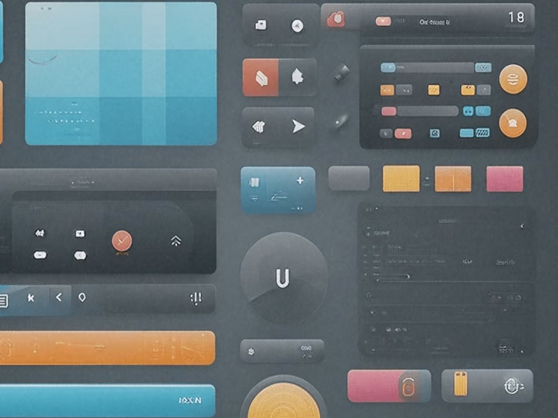
Component Library
Standardized UI components (buttons, cards, forms, etc.)
Design Tokens
Definitions for colors, typography, spacing, shadows, etc
Style Guide
Visual guidelines for branding (colors, typography, imagery)
Interaction guideline
Animations, transitions, and hover states
Accessibility Guidelines
WCAG-compliant design principles
Documentation
Usage rules for components, patterns, and standards.
Icon library
Scalable icons with usage specifications
Design Templates
Reusable page or component templates
Responsive Guidelines
Adaptations for various devices (mobile, tablet, desktop)
Sooraj's other services

Contact for pricing
Tags
Figma
Framer
LottieFiles
Storybook
Zeplin
Design Systems Specialist
Design Token
UI Designer
Service provided by
Sooraj Shetty India
- 2
- Followers
Design Systems Specialist: Streamlined SolutionsSooraj Shetty
Contact for pricing
Tags
Figma
Framer
LottieFiles
Storybook
Zeplin
Design Systems Specialist
Design Token
UI Designer
I specialize in creating Design Systems that ensure consistency, scalability, and efficiency across all your digital products. From building reusable components and design tokens to crafting detailed documentation and style guides, I streamline collaboration between designers and developers. My goal is to deliver a unified design framework that saves time, maintains brand integrity, and enhances user experiences.
What's included
Component Library
Standardized UI components (buttons, cards, forms, etc.)
Design Tokens
Definitions for colors, typography, spacing, shadows, etc
Style Guide
Visual guidelines for branding (colors, typography, imagery)
Interaction guideline
Animations, transitions, and hover states
Accessibility Guidelines
WCAG-compliant design principles
Documentation
Usage rules for components, patterns, and standards.
Icon library
Scalable icons with usage specifications
Design Templates
Reusable page or component templates
Responsive Guidelines
Adaptations for various devices (mobile, tablet, desktop)
Sooraj's other services
Contact for pricing