
Title: "Crafting Experiences: Your Path to Digital Brilliance"Abhishek k
"Crafting Experiences: Your Path to Digital Brilliance"
What's included
Quality design solution
Wireframes: Blueprint-like sketches or digital representations outlining the structure and layout of each screen or page in the user interface.
Prototypes: Interactive models of the final product, allowing stakeholders to navigate through the user flow and experience the functionality firsthand.
High-Fidelity Mockups: Detailed visual designs depicting the final look and feel of the user interface, including colors, typography, imagery, and interactive elements.
Style Guide or Design System: A comprehensive document outlining design principles, standards, and guidelines to maintain consistency across different screens and components.
User Flows: Visual representations of the paths users take to accomplish specific tasks within the interface, helping to streamline navigation and improve usability.
Clickable Demo or Presentation: A polished presentation or clickable demo showcasing key features, interactions, and design decisions to stakeholders for feedback and approval.
Usability Testing Reports: Documentation of usability test findings, insights, and recommendations for improvements based on user feedback and observations.
Final Design Assets: Exported assets and files ready for handoff to developers, including icons, images, CSS stylesheets, and other resources needed for implementation.
Documentation: Comprehensive documentation outlining design decisions, rationale, and specifications to guide development and future iterations of the product.
Support and Maintenance Plan: Recommendations or provisions for ongoing support, maintenance, and iteration of the design post-launch, ensuring continued success and improvement of the product.
By providing these deliverables, the client can confidently move forward with development, knowing that the UI/UX design has been meticulously crafted to meet their objectives and exceed user expectations.
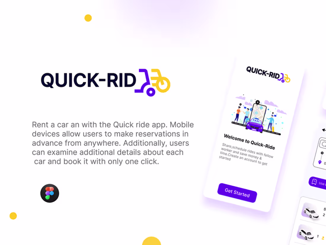
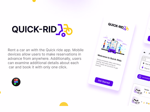
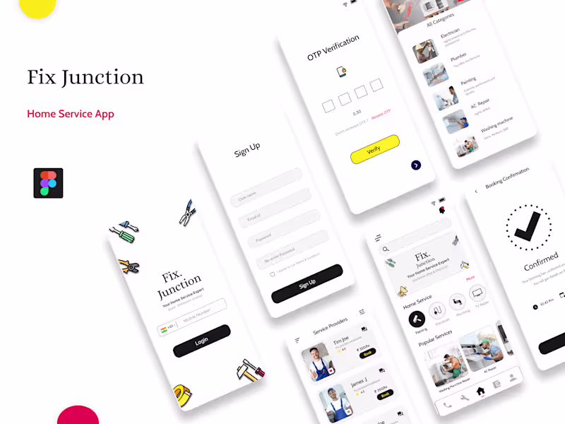
Example work
Abhishek 's other services
Starting at$500
Duration1 week
Tags
Adobe Illustrator
Autodesk Maya
Figma
Sketch
Mobile Designer
Product Designer
UX Designer
Service provided by
Abhishek k Pune, India
Title: "Crafting Experiences: Your Path to Digital Brilliance"Abhishek k
Starting at$500
Duration1 week
Tags
Adobe Illustrator
Autodesk Maya
Figma
Sketch
Mobile Designer
Product Designer
UX Designer
"Crafting Experiences: Your Path to Digital Brilliance"
What's included
Quality design solution
Wireframes: Blueprint-like sketches or digital representations outlining the structure and layout of each screen or page in the user interface.
Prototypes: Interactive models of the final product, allowing stakeholders to navigate through the user flow and experience the functionality firsthand.
High-Fidelity Mockups: Detailed visual designs depicting the final look and feel of the user interface, including colors, typography, imagery, and interactive elements.
Style Guide or Design System: A comprehensive document outlining design principles, standards, and guidelines to maintain consistency across different screens and components.
User Flows: Visual representations of the paths users take to accomplish specific tasks within the interface, helping to streamline navigation and improve usability.
Clickable Demo or Presentation: A polished presentation or clickable demo showcasing key features, interactions, and design decisions to stakeholders for feedback and approval.
Usability Testing Reports: Documentation of usability test findings, insights, and recommendations for improvements based on user feedback and observations.
Final Design Assets: Exported assets and files ready for handoff to developers, including icons, images, CSS stylesheets, and other resources needed for implementation.
Documentation: Comprehensive documentation outlining design decisions, rationale, and specifications to guide development and future iterations of the product.
Support and Maintenance Plan: Recommendations or provisions for ongoing support, maintenance, and iteration of the design post-launch, ensuring continued success and improvement of the product.
By providing these deliverables, the client can confidently move forward with development, knowing that the UI/UX design has been meticulously crafted to meet their objectives and exceed user expectations.
Example work
Abhishek 's other services
$500