
Custom Website Design: Responsive, Modern, and User-FriendlyAdekunle Akintola
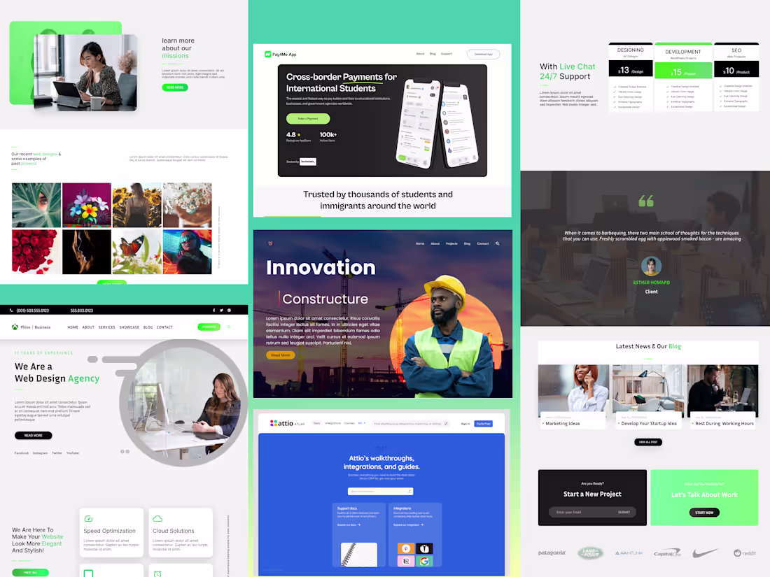
Transform your online presence with a stunning, custom website designed to grow your business. I specialize in creating modern, responsive, and user-friendly websites tailored to your brand. Whether you need a simple portfolio site or a full e-commerce platform, I’ll deliver a website that looks great and works seamlessly across all devices.
Perfect for: Small businesses, startups, and entrepreneurs in every industry looking to establish or upgrade their online presence.
You're not just another client; I’m dedicated to elevating your website with precision, creativity, and results-driven design.
What's included
Wireframes
These are simple, low-fidelity sketches of your web pages, outlining the layout and positioning of key elements with minimal detail. They serve as a foundation for structuring the page.
Prototypes
Interactive prototypes enable you to evaluate the website's functionality and flow before development starts. They illustrate the user journey and facilitate user testing.
Mobile-First, Responsive Design
A website that looks and works perfectly on all devices—desktops, tablets, and phones.
Why It Matters: Over 50% of web traffic comes from mobile devices. A responsive design ensures you don’t lose potential customers.
User Testing Insights
Feedback from real users to refine the design.
Site map and Information Architecture (IA)
A clear, logical structure for your website, including a site map and information architecture.
Site Map: A visual blueprint of your website’s pages and how they connect. This ensures your site is organized and easy to navigate, both for users and search engines.
Information Architecture (IA): The backbone of your website’s content structure. It organizes information in a way that makes sense to users, helping them find what they need quickly and effortlessly.
Without a solid IA and site map, your website can feel chaotic and confusing, leading to frustrated users and lost opportunities. A well-structured site improves user experience, boosts SEO, and ensures your content aligns with your business goals.
Stunning Visual Design
A modern, visually appealing layout that reflects your brand’s personality.
First impressions matter, and a beautiful design builds trust and credibility with your audience.
Adekunle 's other services
Starting at$550
Duration1 week
Tags
Figma
Miro
ProtoPie
Product Designer
UI Designer
UX Designer
Service provided by
Adekunle Akintola Ibadan, Nigeria
- 1
- Followers
Custom Website Design: Responsive, Modern, and User-FriendlyAdekunle Akintola
Starting at$550
Duration1 week
Tags
Figma
Miro
ProtoPie
Product Designer
UI Designer
UX Designer
Transform your online presence with a stunning, custom website designed to grow your business. I specialize in creating modern, responsive, and user-friendly websites tailored to your brand. Whether you need a simple portfolio site or a full e-commerce platform, I’ll deliver a website that looks great and works seamlessly across all devices.
Perfect for: Small businesses, startups, and entrepreneurs in every industry looking to establish or upgrade their online presence.
You're not just another client; I’m dedicated to elevating your website with precision, creativity, and results-driven design.
What's included
Wireframes
These are simple, low-fidelity sketches of your web pages, outlining the layout and positioning of key elements with minimal detail. They serve as a foundation for structuring the page.
Prototypes
Interactive prototypes enable you to evaluate the website's functionality and flow before development starts. They illustrate the user journey and facilitate user testing.
Mobile-First, Responsive Design
A website that looks and works perfectly on all devices—desktops, tablets, and phones.
Why It Matters: Over 50% of web traffic comes from mobile devices. A responsive design ensures you don’t lose potential customers.
User Testing Insights
Feedback from real users to refine the design.
Site map and Information Architecture (IA)
A clear, logical structure for your website, including a site map and information architecture.
Site Map: A visual blueprint of your website’s pages and how they connect. This ensures your site is organized and easy to navigate, both for users and search engines.
Information Architecture (IA): The backbone of your website’s content structure. It organizes information in a way that makes sense to users, helping them find what they need quickly and effortlessly.
Without a solid IA and site map, your website can feel chaotic and confusing, leading to frustrated users and lost opportunities. A well-structured site improves user experience, boosts SEO, and ensures your content aligns with your business goals.
Stunning Visual Design
A modern, visually appealing layout that reflects your brand’s personality.
First impressions matter, and a beautiful design builds trust and credibility with your audience.
Adekunle 's other services
$550