
Responsive & Modern Websites | Web DeveloperBhagaban Paul
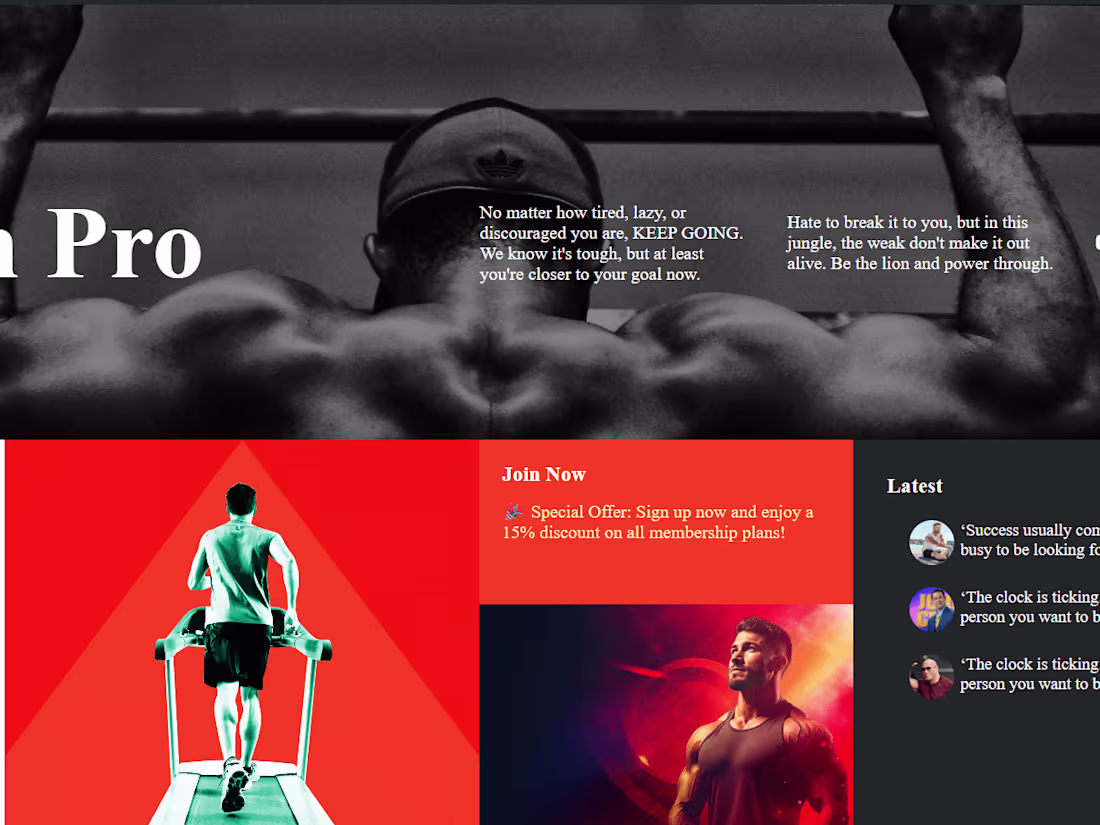
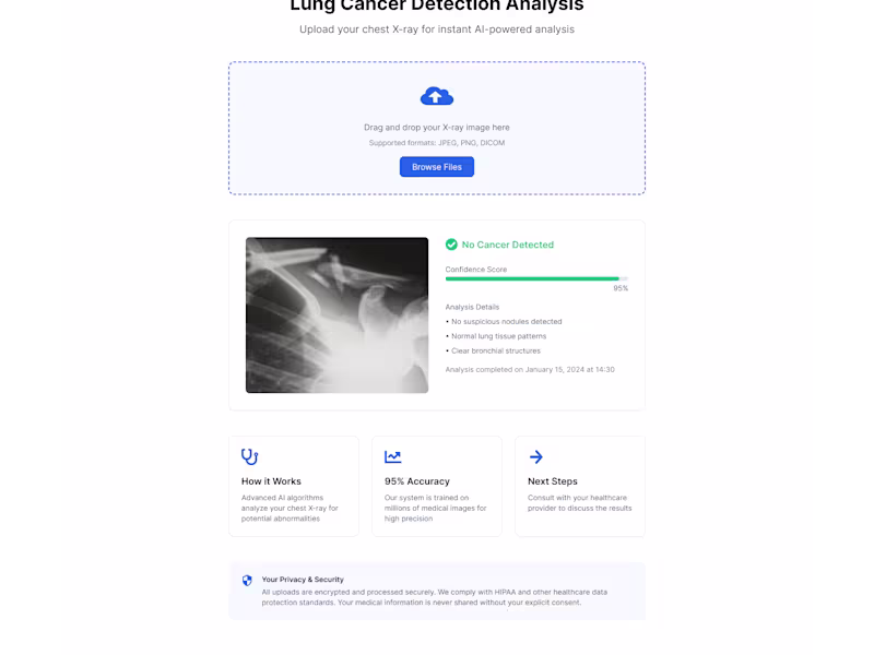
I will design and develop a fully responsive, high-performance website using the latest technologies like React, Tailwind CSS, and Next.js for a seamless frontend experience. The backend will be built with Node.js and Express, ensuring scalability, security, and efficiency. With a focus on clean code, optimized performance, and modern UI/UX, I deliver fast, SEO-friendly, and user-centric web solutions. 🚀
What's included
Fully Responsive Website (Mobile, Tablet & Desktop Friendly)
Fully Responsive Website (Mobile, Tablet & Desktop Friendly) – A website built with flexible layouts (CSS Flexbox/Grid), media queries, and viewport-based scaling to ensure seamless adaptability across all screen sizes. Optimized for performance (lazy loading, minification), accessibility (ARIA roles, semantic HTML), and cross-browser compatibility. 🚀
Bhagaban's other services
Contact for pricing
Tags
CSS
ExpressJS
HTML5
Node.js
React
Frontend Engineer
UX Engineer
Web Developer
Service provided by
Bhagaban Paul Kolkata, India
Responsive & Modern Websites | Web DeveloperBhagaban Paul
Contact for pricing
Tags
CSS
ExpressJS
HTML5
Node.js
React
Frontend Engineer
UX Engineer
Web Developer
I will design and develop a fully responsive, high-performance website using the latest technologies like React, Tailwind CSS, and Next.js for a seamless frontend experience. The backend will be built with Node.js and Express, ensuring scalability, security, and efficiency. With a focus on clean code, optimized performance, and modern UI/UX, I deliver fast, SEO-friendly, and user-centric web solutions. 🚀
What's included
Fully Responsive Website (Mobile, Tablet & Desktop Friendly)
Fully Responsive Website (Mobile, Tablet & Desktop Friendly) – A website built with flexible layouts (CSS Flexbox/Grid), media queries, and viewport-based scaling to ensure seamless adaptability across all screen sizes. Optimized for performance (lazy loading, minification), accessibility (ARIA roles, semantic HTML), and cross-browser compatibility. 🚀
Bhagaban's other services
Contact for pricing