
Data VisualizationHammad Ali Shah

I design interactive dashboards tailored to your needs using tools like Power BI, Tableau, Looker Studio, and Python (Matplotlib, Seaborn, Plotly, Dash).
I ensure your data is clean, structured, and optimized for accurate visualization and analysis.
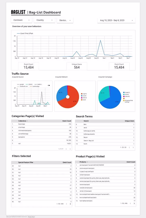
I create dashboards that display key business metrics, performance trends, and real-time analytics to help you track progress effectively.
I design dynamic charts, heatmaps, time-series analysis, and geo-maps to present your data in the most meaningful way.
I can connect your dashboard with databases, spreadsheets, APIs, cloud services (AWS, Google Cloud, Azure), and real-time data streams.
What's included
Data Visualization & Dashboard Development
At the end of the project, you will receive:
✅ Fully Interactive Dashboard – A visually compelling, user-friendly dashboard built using Power BI, Tableau, Looker Studio, Python (Plotly, Dash), or Excel.
✅ Clean & Structured Dataset – The cleaned and processed dataset used for visualization, ensuring accuracy and consistency.
✅ Source Files & Reports – The original dashboard file (.PBIX for Power BI, .TWBX for Tableau, .CSV/.XLSX for Excel, or Python scripts for custom dashboards).
✅ Custom Charts & Visuals – Interactive charts, graphs, heatmaps, time-series analysis, and geo-maps tailored to your business needs.
✅ Data Integration Setup – Connection to your databases, APIs, cloud services (AWS, Google Cloud, Azure), or spreadsheets for real-time data updates.
✅ KPI & Metric Definitions – Clear documentation of the KPIs, formulas, and business logic used in the dashboard.
✅ Automated Reports & Alerts – Scheduled reports and alerts set up for real-time updates (if required).
Hammad's other services

Contact for pricing
Tags
Looker
Looker Studio
Microsoft Power BI
Qlik
Tableau
Data Analyst
Data Visualizer
Service provided by
Hammad Ali Shah Islamabad, Pakistan
Data VisualizationHammad Ali Shah
Contact for pricing
Tags
Looker
Looker Studio
Microsoft Power BI
Qlik
Tableau
Data Analyst
Data Visualizer
I design interactive dashboards tailored to your needs using tools like Power BI, Tableau, Looker Studio, and Python (Matplotlib, Seaborn, Plotly, Dash).
I ensure your data is clean, structured, and optimized for accurate visualization and analysis.
I create dashboards that display key business metrics, performance trends, and real-time analytics to help you track progress effectively.
I design dynamic charts, heatmaps, time-series analysis, and geo-maps to present your data in the most meaningful way.
I can connect your dashboard with databases, spreadsheets, APIs, cloud services (AWS, Google Cloud, Azure), and real-time data streams.
What's included
Data Visualization & Dashboard Development
At the end of the project, you will receive:
✅ Fully Interactive Dashboard – A visually compelling, user-friendly dashboard built using Power BI, Tableau, Looker Studio, Python (Plotly, Dash), or Excel.
✅ Clean & Structured Dataset – The cleaned and processed dataset used for visualization, ensuring accuracy and consistency.
✅ Source Files & Reports – The original dashboard file (.PBIX for Power BI, .TWBX for Tableau, .CSV/.XLSX for Excel, or Python scripts for custom dashboards).
✅ Custom Charts & Visuals – Interactive charts, graphs, heatmaps, time-series analysis, and geo-maps tailored to your business needs.
✅ Data Integration Setup – Connection to your databases, APIs, cloud services (AWS, Google Cloud, Azure), or spreadsheets for real-time data updates.
✅ KPI & Metric Definitions – Clear documentation of the KPIs, formulas, and business logic used in the dashboard.
✅ Automated Reports & Alerts – Scheduled reports and alerts set up for real-time updates (if required).
Hammad's other services
Contact for pricing