
Website DesignAkinkunmi Ayomide
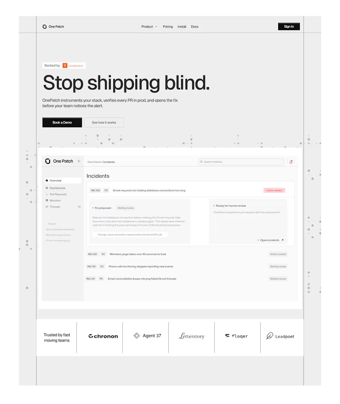
The product solves a real problem. But I felt the website could do a better job of explaining that value quickly.
So I redesigned the Hero section .
→ A clearer explanation of what OnePatch does
→ Stronger hierarchy so the important stuff gets seen first
→ Better product visuals to show the workflow
→ A clearer CTA so users know what to do next
→ Less visual noise competing with the message
The goal wasn’t just to make the website look better.
It was to help someone land on the page, understand the product, see why it matters, and take the next step.
That’s what good product design should do.
Akinkunmi's other services
Contact for pricing
Duration1 week
Tags
Claude

Figma

UI Designer
UX Designer
UX Researcher
Service provided by
Akinkunmi Ayomide Lagos, Nigeria
- 18
- Followers
Website DesignAkinkunmi Ayomide
The product solves a real problem. But I felt the website could do a better job of explaining that value quickly.
So I redesigned the Hero section .
→ A clearer explanation of what OnePatch does
→ Stronger hierarchy so the important stuff gets seen first
→ Better product visuals to show the workflow
→ A clearer CTA so users know what to do next
→ Less visual noise competing with the message
The goal wasn’t just to make the website look better.
It was to help someone land on the page, understand the product, see why it matters, and take the next step.
That’s what good product design should do.
Akinkunmi's other services
Contact for pricing