
Fix mobile responsiveness issues on your websiteOreoluwa Arowosafe
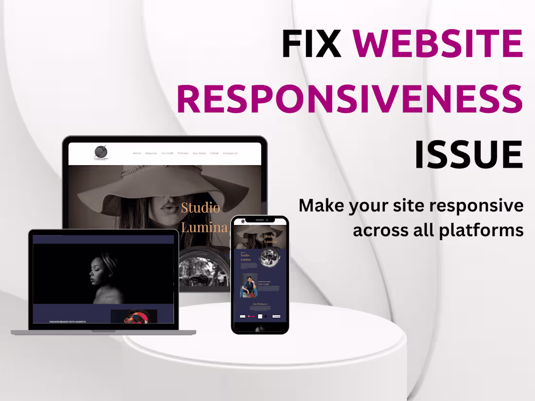
I’ll fix any mobile responsiveness issues on your website, making sure it looks and functions perfectly across all screen sizes—phones, tablets, and desktops. Whether your layout breaks, buttons overlap, or content overflows on smaller screens, I’ll make it smooth and professional. I bring a developer’s eye and a designer’s touch, so your site won’t just work—it’ll look great too.
What's included
Make your site mobile-friendly & responsive
- Fix broken layouts on mobile
- Improve responsiveness for all screen sizes
- Adjust CSS and JS for smoother mobile flow
- Test across devices
FAQs
Oreoluwa's other services

Starting at$100
Duration2 days
Tags
Visual Studio Code
WixVibe
WordPress
Frontend Engineer
UX Designer
Web Developer
Service provided by
Oreoluwa Arowosafe Abuja, Nigeria
- 11
- Followers
Fix mobile responsiveness issues on your websiteOreoluwa Arowosafe
Starting at$100
Duration2 days
Tags
Visual Studio Code
WixVibe
WordPress
Frontend Engineer
UX Designer
Web Developer
I’ll fix any mobile responsiveness issues on your website, making sure it looks and functions perfectly across all screen sizes—phones, tablets, and desktops. Whether your layout breaks, buttons overlap, or content overflows on smaller screens, I’ll make it smooth and professional. I bring a developer’s eye and a designer’s touch, so your site won’t just work—it’ll look great too.
What's included
Make your site mobile-friendly & responsive
- Fix broken layouts on mobile
- Improve responsiveness for all screen sizes
- Adjust CSS and JS for smoother mobile flow
- Test across devices
FAQs
Oreoluwa's other services
$100