Design SystemsMohammed Alyazji
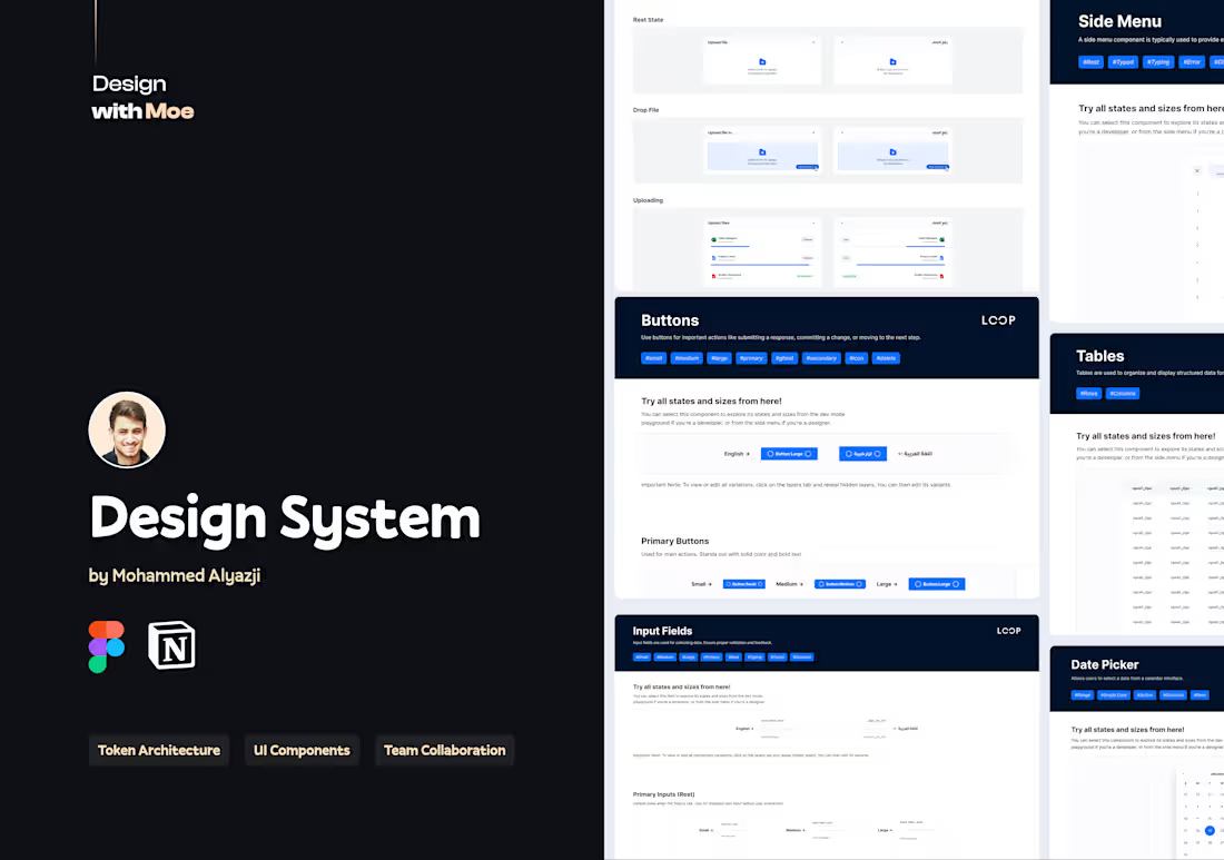
I build scalable design systems tailored to your product, starting with a comprehensive audit and continuing through token architecture, component libraries, documentation, and onboarding support to ensure consistency across your team and product ecosystem.
What's included
🎨 Design Foundations
Setup of core styles: color palette, typography, spacing, grid, radii, and elevation.
🧠 Token Architecture (3-Tier)
A fully tokenized system using Figma Variables: Primitives → Semantic Tokens → Component-Level Tokens.
🧱 Component Library
Buttons, inputs, badges, modals, forms — designed with auto layout, variants & naming logic.
🧩 Figma Organization
Clean structure using atomic methodology. Layers, pages, and components are neatly grouped.
📚 System Documentation
In-Figma usage guidelines, or optional Notion/Zeroheight handoff for dev teams.
FAQs
I build scalable, token-driven systems using atomic design principles, semantic naming, and developer-aligned structures. The goal isn’t just to create components, but to create a shared language between design and development.
Timelines vary depending on the project's size and scope. For small-to medium-sized systems, it can take 4–5 weeks. For larger platforms or enterprise-level systems, a typical timeframe is 8–12 weeks. We’ll define the exact scope during our kickoff.
Yes, I can structure your design tokens and variables to support light/dark theming — including surface layers, text tokens, and accent colors — all within Figma’s native capabilities.
Yes — I can collaborate with your dev team to ensure token structure, component logic, and naming conventions align with the codebase. This reduces friction during handoff and improves implementation accuracy.
100%. I build with clarity and long-term use in mind. I’ll also create easy-to-follow documentation and, if needed, onboard your team so they can scale the system confidently without me.
Mohammed's other services
Contact for pricing
Duration1 week
Tags
Figma
Notion
Design Token
Design Systems Specialist
UI Designer
Service provided by

Mohammed Alyazji proEgypt
- 2
- Paid projects
- 5.00
- Rating
- 28
- Followers

Design SystemsMohammed Alyazji
Contact for pricing
Duration1 week
Tags
Figma
Notion
Design Token
Design Systems Specialist
UI Designer
I build scalable design systems tailored to your product, starting with a comprehensive audit and continuing through token architecture, component libraries, documentation, and onboarding support to ensure consistency across your team and product ecosystem.
What's included
🎨 Design Foundations
Setup of core styles: color palette, typography, spacing, grid, radii, and elevation.
🧠 Token Architecture (3-Tier)
A fully tokenized system using Figma Variables: Primitives → Semantic Tokens → Component-Level Tokens.
🧱 Component Library
Buttons, inputs, badges, modals, forms — designed with auto layout, variants & naming logic.
🧩 Figma Organization
Clean structure using atomic methodology. Layers, pages, and components are neatly grouped.
📚 System Documentation
In-Figma usage guidelines, or optional Notion/Zeroheight handoff for dev teams.
FAQs
I build scalable, token-driven systems using atomic design principles, semantic naming, and developer-aligned structures. The goal isn’t just to create components, but to create a shared language between design and development.
Timelines vary depending on the project's size and scope. For small-to medium-sized systems, it can take 4–5 weeks. For larger platforms or enterprise-level systems, a typical timeframe is 8–12 weeks. We’ll define the exact scope during our kickoff.
Yes, I can structure your design tokens and variables to support light/dark theming — including surface layers, text tokens, and accent colors — all within Figma’s native capabilities.
Yes — I can collaborate with your dev team to ensure token structure, component logic, and naming conventions align with the codebase. This reduces friction during handoff and improves implementation accuracy.
100%. I build with clarity and long-term use in mind. I’ll also create easy-to-follow documentation and, if needed, onboard your team so they can scale the system confidently without me.
Mohammed's other services
Contact for pricing


