
Framer Expert Website DevelopmentChristian Garcia Scheer
Want to launch a new product or service?
I specialize in creating modern, sleek websites that are visually stunning, fast, and easy to manage. With Framer’s powerful no-code platform, I can handle complete platform development, delivering a website that’s optimized for performance and packed with beautiful interactions and transitions. From multi-page sites to portfolios and business websites, I’ll build a site that’s uniquely yours and leaves a lasting impact on your audience.
If you’re launching a product, announcing an event, or testing an idea, a clean, conversion-optimized landing page is the fastest way to make it real. This service gives you a custom-built Framer landing page that’s bold, on-brand, and responsive across all devices. Built directly in Framer, so you can go live fast and update it anytime.
Your Framer website, built for performance, and easy to scale. Ideal for growing brands, startups, creators, or anyone ready to move beyond a single page.
Each page is developed with intent, clear hierarchy, compelling structure, and smart flow. So your visitors understand who you are and what you do, quickly.
What's included
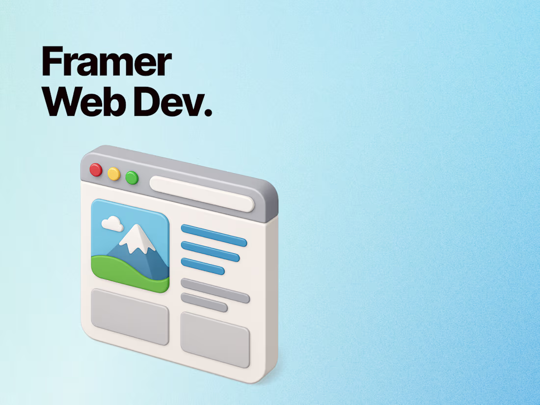
Framer Web Development
Converting creative to actual real, interactive websites that align with your business goals, fully developed in Framer with top performance and seamless functionality.
Unique Design: A landing page tailored to your brand identity and goals, avoiding templates to ensure originality and alignment with your vision.
Content Strategy: Inclusion of strategically placed headings, subheadings, images, and CTAs to drive conversions. User-Centric: Designed with a focus on user experience (UX) to guide visitors smoothly through the page.
Optimized Structure: Layout and design that enhances readability and visual hierarchy.
Reusable Components & Streamlined CMS
Custom components will de created and CMS collections to keep your website dynamic and easy to manage.
Animations: Scroll-triggered animations that create a dynamic and interactive browsing experience, such as fade-ins, parallax effects, or element reveals.
Micro-Interactions: Subtle effects like button hover states, icon animations, or form input highlights to make the interface feel alive and intuitive.
Performance Optimized: Ensuring animations are lightweight and won’t hinder loading speed or performance.
Fully Responsive Design Across All Devices
Your website will look stunning and perform flawlessly on desktops, tablets, and smartphones.
The design process begins with mobile users in mind to ensure seamless usability on small screens before adapting to larger devices. Cross-Device Compatibility: The layout is tested and optimized for various screen sizes, including tablets and desktops, to maintain consistency and accessibility.
Touch-Friendly Design: Buttons, forms, and interactive elements are sized and spaced for comfortable touch interactions. (Mobile Prioritization)
Launch & Ongoing Support
I’ll handle the entire launch process and provide two weeks of post-launch support.
FAQs
Starting at$4,999.99 /mo
Tags
Figma
Framer
Product Designer
UX Designer
Web Designer
Service provided by
Christian Garcia Scheer Chicago, USA
- 14
- Followers
Framer Expert Website DevelopmentChristian Garcia Scheer
Want to launch a new product or service?
I specialize in creating modern, sleek websites that are visually stunning, fast, and easy to manage. With Framer’s powerful no-code platform, I can handle complete platform development, delivering a website that’s optimized for performance and packed with beautiful interactions and transitions. From multi-page sites to portfolios and business websites, I’ll build a site that’s uniquely yours and leaves a lasting impact on your audience.
If you’re launching a product, announcing an event, or testing an idea, a clean, conversion-optimized landing page is the fastest way to make it real. This service gives you a custom-built Framer landing page that’s bold, on-brand, and responsive across all devices. Built directly in Framer, so you can go live fast and update it anytime.
Your Framer website, built for performance, and easy to scale. Ideal for growing brands, startups, creators, or anyone ready to move beyond a single page.
Each page is developed with intent, clear hierarchy, compelling structure, and smart flow. So your visitors understand who you are and what you do, quickly.
What's included
Framer Web Development
Converting creative to actual real, interactive websites that align with your business goals, fully developed in Framer with top performance and seamless functionality.
Unique Design: A landing page tailored to your brand identity and goals, avoiding templates to ensure originality and alignment with your vision.
Content Strategy: Inclusion of strategically placed headings, subheadings, images, and CTAs to drive conversions. User-Centric: Designed with a focus on user experience (UX) to guide visitors smoothly through the page.
Optimized Structure: Layout and design that enhances readability and visual hierarchy.
Reusable Components & Streamlined CMS
Custom components will de created and CMS collections to keep your website dynamic and easy to manage.
Animations: Scroll-triggered animations that create a dynamic and interactive browsing experience, such as fade-ins, parallax effects, or element reveals.
Micro-Interactions: Subtle effects like button hover states, icon animations, or form input highlights to make the interface feel alive and intuitive.
Performance Optimized: Ensuring animations are lightweight and won’t hinder loading speed or performance.
Fully Responsive Design Across All Devices
Your website will look stunning and perform flawlessly on desktops, tablets, and smartphones.
The design process begins with mobile users in mind to ensure seamless usability on small screens before adapting to larger devices. Cross-Device Compatibility: The layout is tested and optimized for various screen sizes, including tablets and desktops, to maintain consistency and accessibility.
Touch-Friendly Design: Buttons, forms, and interactive elements are sized and spaced for comfortable touch interactions. (Mobile Prioritization)
Launch & Ongoing Support
I’ll handle the entire launch process and provide two weeks of post-launch support.
FAQs
$4,999.99 /mo