
UI/UX DesignVamsi Kaley
I offer comprehensive UI/UX design services that focus on creating intuitive, visually appealing, and user-centric digital experiences. What sets my service apart is my dedication to thorough user research, seamless integration of innovative design solutions, and a commitment to continuous improvement based on user feedback and analytics, ensuring that every design not only meets but exceeds user expectations.
What's included
Research and Discovery
1. User Personas: Detailed profiles representing different user types based on research.
2. User Journey Maps: Visual representations of the steps users take to achieve specific goals within the app.
3. Competitive Analysis Report: Insights and findings from analyzing competitor apps.
Information Architecture
1. Site Map: An organized layout of all the screens and the navigation structure of the app.
2. User Flows: Diagrams showing the paths users take through the app to complete various tasks.
Wireframes
1. Low-Fidelity Wireframes: Basic sketches or digital drawings outlining the layout and structure of each screen.
2. High-Fidelity Wireframes: Detailed wireframes with more precise placement of elements and a closer representation of the final design.
Prototypes
1. Interactive Prototypes: Clickable versions of the wireframes that simulate the user experience and allow for usability testing.
2. Annotated Prototypes: Prototypes with notes and explanations of the functionality and interactions for each element.
Visual Design
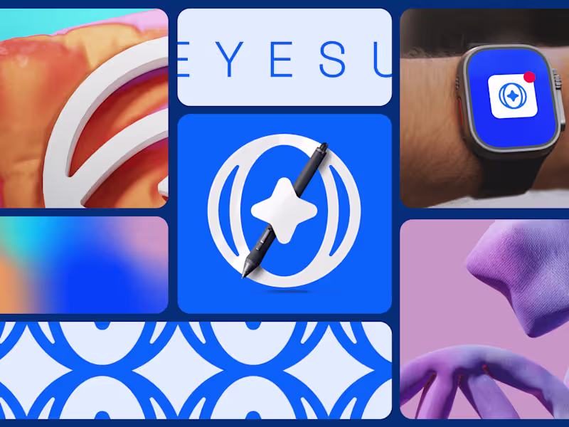
1. Mood Boards: Collections of images, colors, typography, and other visual elements that convey the intended look and feel of the app.
2. Style Guide: A comprehensive document outlining the visual standards for the app, including color palette, typography, iconography, and spacing.
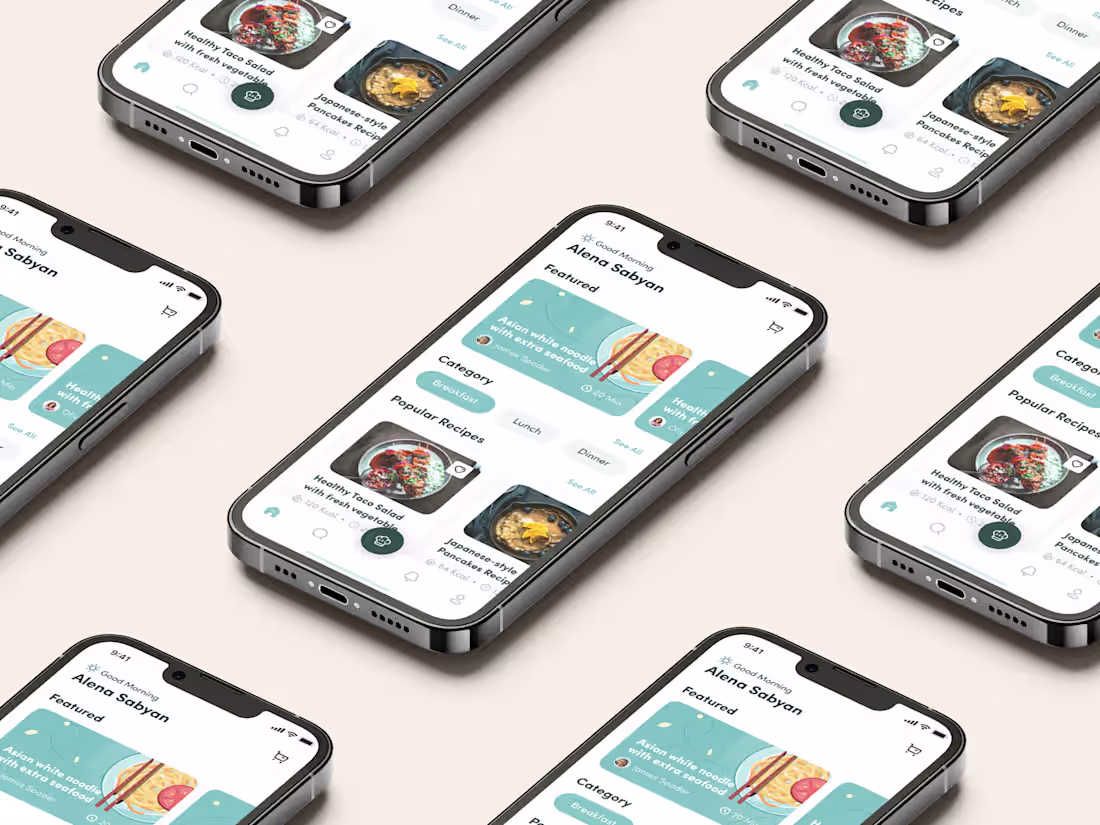
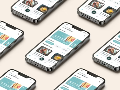
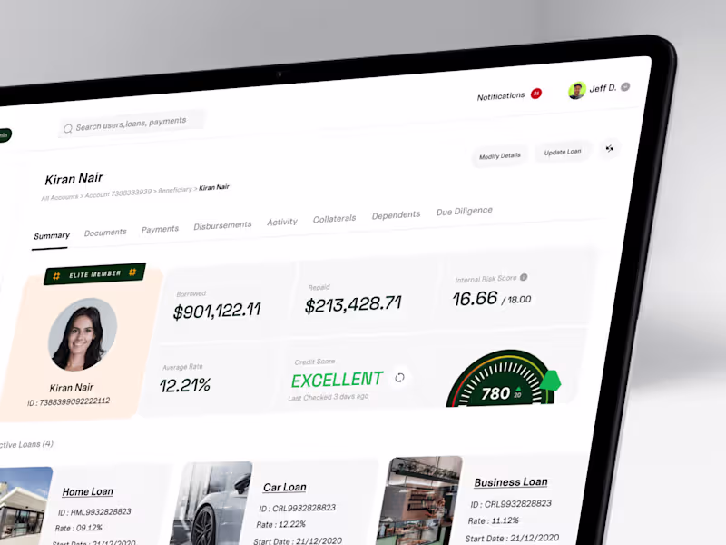
3. High-Fidelity Mockups: Detailed, polished designs of each screen that showcase the final visual style and layout.
Interaction Design
1. Micro interactions: Detailed designs and animations for small interactive elements such as buttons, toggles, and notifications.
2. Transition Animations: Designs for how screens transition from one to another, enhancing the user experience.
Documentation
1. Design Specifications: Detailed descriptions of the design elements, interactions, and behaviors for developers to reference during implementation.
2. Annotated Designs: Screenshots or mockups with annotations explaining the purpose and functionality of each element.
Example work
Vamsi's other services
Contact for pricing
Tags
Adobe Illustrator
Adobe XD
Figma
Notion
Sketch
UI Designer
User Researcher
UX Designer
Service provided by
Vamsi Kaley Bengaluru, India
UI/UX DesignVamsi Kaley
Contact for pricing
Tags
Adobe Illustrator
Adobe XD
Figma
Notion
Sketch
UI Designer
User Researcher
UX Designer
I offer comprehensive UI/UX design services that focus on creating intuitive, visually appealing, and user-centric digital experiences. What sets my service apart is my dedication to thorough user research, seamless integration of innovative design solutions, and a commitment to continuous improvement based on user feedback and analytics, ensuring that every design not only meets but exceeds user expectations.
What's included
Research and Discovery
1. User Personas: Detailed profiles representing different user types based on research.
2. User Journey Maps: Visual representations of the steps users take to achieve specific goals within the app.
3. Competitive Analysis Report: Insights and findings from analyzing competitor apps.
Information Architecture
1. Site Map: An organized layout of all the screens and the navigation structure of the app.
2. User Flows: Diagrams showing the paths users take through the app to complete various tasks.
Wireframes
1. Low-Fidelity Wireframes: Basic sketches or digital drawings outlining the layout and structure of each screen.
2. High-Fidelity Wireframes: Detailed wireframes with more precise placement of elements and a closer representation of the final design.
Prototypes
1. Interactive Prototypes: Clickable versions of the wireframes that simulate the user experience and allow for usability testing.
2. Annotated Prototypes: Prototypes with notes and explanations of the functionality and interactions for each element.
Visual Design
1. Mood Boards: Collections of images, colors, typography, and other visual elements that convey the intended look and feel of the app.
2. Style Guide: A comprehensive document outlining the visual standards for the app, including color palette, typography, iconography, and spacing.
3. High-Fidelity Mockups: Detailed, polished designs of each screen that showcase the final visual style and layout.
Interaction Design
1. Micro interactions: Detailed designs and animations for small interactive elements such as buttons, toggles, and notifications.
2. Transition Animations: Designs for how screens transition from one to another, enhancing the user experience.
Documentation
1. Design Specifications: Detailed descriptions of the design elements, interactions, and behaviors for developers to reference during implementation.
2. Annotated Designs: Screenshots or mockups with annotations explaining the purpose and functionality of each element.
Example work
Vamsi's other services
Contact for pricing