
User-friendly Figma designMurad Manafli
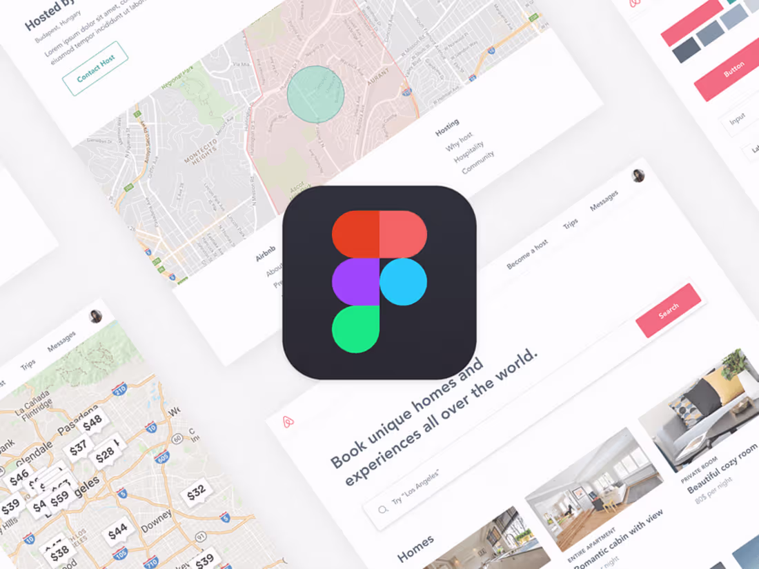
For your Figma design project, I offer a complete, high-fidelity prototype that showcases a fully responsive and interactive user experience across all devices. My process includes creating a well-structured design system, ensuring consistency, and providing a seamless developer handoff with detailed documentation. What sets me apart is my focus on delivering a polished, user-centered design that not only looks stunning but is also optimized for an efficient development process.
What's included
1. Figma Design Files
• High-Fidelity Prototype: Fully interactive Figma prototypes showcasing desktop, tablet, and mobile views, allowing you to experience the design and user flow.
• Design System: A well-organized design system within Figma, including reusable components (buttons, forms, icons), typography, and color styles for consistency throughout the project.
• Component Library: A library of scalable and reusable components, such as buttons, input fields, navigation elements, and other UI components, making future updates seamless.
• Responsive Layouts: Design variations for multiple screen sizes, including desktop, tablet, and mobile, ensuring a consistent user experience across devices.
2. Style Guide
• Typography and Color Palette: Detailed specifications of fonts, sizes, and color codes (HEX, RGB, CMYK) used in the design.
• Spacing and Layout Guidelines: Clear spacing, padding, and margin guidelines to maintain consistent visual hierarchy.
• UI Elements Guide: A reference sheet showcasing the design elements like buttons, icons, and input fields with different states (hover, active, disabled).
3. Design Assets
• Exportable Assets: All necessary assets (icons, images, illustrations) provided in optimized formats (SVG, PNG, JPG) ready for development.
• Image Library: A collection of all images used in the design, organized in folders for easy access.
• Icon Set: A complete set of icons in SVG format, aligned with the overall design theme.
4. Handoff for Developers
• Figma Handoff File: A developer-friendly Figma file, prepared for seamless handoff, with proper naming, layer organization, and component usage.
• Handoff Documentation: A comprehensive guide explaining key design decisions, responsive behaviors, and any necessary notes for the development team.
• Annotations and Comments: Clearly annotated design files with explanations of user interactions, animations, and special features.
5. Prototype Preview
• Clickable Prototype Link: A shareable Figma prototype link for stakeholders to review and test the user experience before moving to development.
• Feedback Integration: Up to 2 rounds of revisions based on your feedback to ensure the design meets your expectations.
6. Final Presentation
• Design Showcase: A presentation deck or PDF summarizing the design process, key decisions, and the final UI screens, providing a clear vision of the product.
• Demo Video (if needed): A short video walkthrough of the interactive prototype, highlighting key features and user flows.
Murad's other services
Starting at$250
Duration1 week
Tags
Adobe Photoshop
Figma
UI Designer
UX Designer
Web Designer
Service provided by
Murad Manafli Baku, Azerbaijan
- 5.00
- Rating
- 1
- Followers
User-friendly Figma designMurad Manafli
Starting at$250
Duration1 week
Tags
Adobe Photoshop
Figma
UI Designer
UX Designer
Web Designer
For your Figma design project, I offer a complete, high-fidelity prototype that showcases a fully responsive and interactive user experience across all devices. My process includes creating a well-structured design system, ensuring consistency, and providing a seamless developer handoff with detailed documentation. What sets me apart is my focus on delivering a polished, user-centered design that not only looks stunning but is also optimized for an efficient development process.
What's included
1. Figma Design Files
• High-Fidelity Prototype: Fully interactive Figma prototypes showcasing desktop, tablet, and mobile views, allowing you to experience the design and user flow.
• Design System: A well-organized design system within Figma, including reusable components (buttons, forms, icons), typography, and color styles for consistency throughout the project.
• Component Library: A library of scalable and reusable components, such as buttons, input fields, navigation elements, and other UI components, making future updates seamless.
• Responsive Layouts: Design variations for multiple screen sizes, including desktop, tablet, and mobile, ensuring a consistent user experience across devices.
2. Style Guide
• Typography and Color Palette: Detailed specifications of fonts, sizes, and color codes (HEX, RGB, CMYK) used in the design.
• Spacing and Layout Guidelines: Clear spacing, padding, and margin guidelines to maintain consistent visual hierarchy.
• UI Elements Guide: A reference sheet showcasing the design elements like buttons, icons, and input fields with different states (hover, active, disabled).
3. Design Assets
• Exportable Assets: All necessary assets (icons, images, illustrations) provided in optimized formats (SVG, PNG, JPG) ready for development.
• Image Library: A collection of all images used in the design, organized in folders for easy access.
• Icon Set: A complete set of icons in SVG format, aligned with the overall design theme.
4. Handoff for Developers
• Figma Handoff File: A developer-friendly Figma file, prepared for seamless handoff, with proper naming, layer organization, and component usage.
• Handoff Documentation: A comprehensive guide explaining key design decisions, responsive behaviors, and any necessary notes for the development team.
• Annotations and Comments: Clearly annotated design files with explanations of user interactions, animations, and special features.
5. Prototype Preview
• Clickable Prototype Link: A shareable Figma prototype link for stakeholders to review and test the user experience before moving to development.
• Feedback Integration: Up to 2 rounds of revisions based on your feedback to ensure the design meets your expectations.
6. Final Presentation
• Design Showcase: A presentation deck or PDF summarizing the design process, key decisions, and the final UI screens, providing a clear vision of the product.
• Demo Video (if needed): A short video walkthrough of the interactive prototype, highlighting key features and user flows.
Murad's other services
$250