
UI Kit Design & Setup

Contact for pricing
About this service
Summary
FAQs
What’s the difference between a UI Kit and a Design System?
A UI Kit sets your foundation, colours, typography, and components, but stops short of code integration. It’s ideal for teams not yet ready for a full system.
Can the kit evolve into a full design system later?
Yes. Every kit I create is structured to scale into a full design system with tokens and developer handoff built in from day one.
Do you include branding or visual refresh?
If you’d like, I can align or refine your existing brand styles before we begin, ensuring your UI kit fits naturally with your identity.
What's included
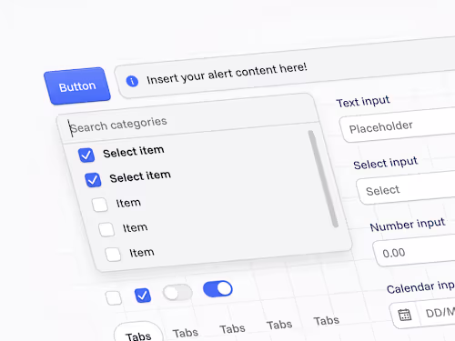
Foundations
Set up core design tokens including colour palettes, typography scales, spacing, grids, shadows, and elevation. This creates a consistent visual language across your product.
Component Library
A suite of reusable Figma components for UI essentials like buttons, inputs, form elements, navigation, and modals. Each built with Auto Layout, responsive behaviour, and variant states.
Layout & Structure
Define grid systems, spacing tokens, and responsive patterns to ensure layouts feel cohesive across viewports and platforms.
Documentation & Usage Guide
A concise guide outlining component naming conventions, usage rules, and extension principles so your team can confidently build on the system.
Walkthrough Video (Loom)
A recorded walkthrough explaining how the UI kit is structured and how to use it efficiently. Perfect for onboarding designers or developers.
Skills and tools
Design Systems Specialist
Product Designer
UI Designer

Figma