
UI Kit Design & SetupBailey White
I design and build clean, scalable UI kits in Figma that form the foundation for future design systems. Each kit is structured with auto layout, variants, and component states, ensuring consistency and speed for your team. Perfect for startups or teams wanting to refresh their visual language before scaling into a full design system
What's included
Foundations
Set up core design tokens including colour palettes, typography scales, spacing, grids, shadows, and elevation. This creates a consistent visual language across your product.
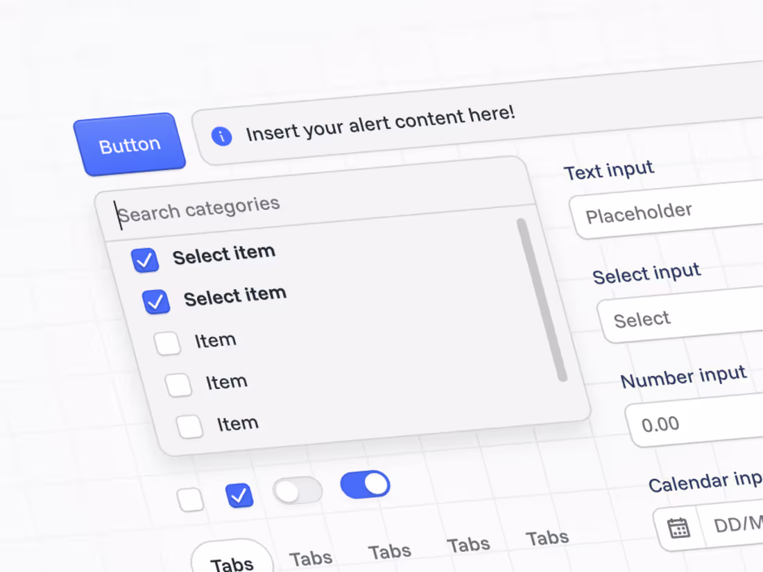
Component Library
A suite of reusable Figma components for UI essentials like buttons, inputs, form elements, navigation, and modals. Each built with Auto Layout, responsive behaviour, and variant states.
Layout & Structure
Define grid systems, spacing tokens, and responsive patterns to ensure layouts feel cohesive across viewports and platforms.
Documentation & Usage Guide
A concise guide outlining component naming conventions, usage rules, and extension principles so your team can confidently build on the system.
Walkthrough Video (Loom)
A recorded walkthrough explaining how the UI kit is structured and how to use it efficiently. Perfect for onboarding designers or developers.
FAQs
Contact for pricing
Tags
Figma
Design Systems Specialist
Product Designer
UI Designer
Service provided by
Bailey White Brisbane City QLD 4000, Australia
- 27
- Followers
UI Kit Design & SetupBailey White
Contact for pricing
Tags
Figma
Design Systems Specialist
Product Designer
UI Designer
I design and build clean, scalable UI kits in Figma that form the foundation for future design systems. Each kit is structured with auto layout, variants, and component states, ensuring consistency and speed for your team. Perfect for startups or teams wanting to refresh their visual language before scaling into a full design system
What's included
Foundations
Set up core design tokens including colour palettes, typography scales, spacing, grids, shadows, and elevation. This creates a consistent visual language across your product.
Component Library
A suite of reusable Figma components for UI essentials like buttons, inputs, form elements, navigation, and modals. Each built with Auto Layout, responsive behaviour, and variant states.
Layout & Structure
Define grid systems, spacing tokens, and responsive patterns to ensure layouts feel cohesive across viewports and platforms.
Documentation & Usage Guide
A concise guide outlining component naming conventions, usage rules, and extension principles so your team can confidently build on the system.
Walkthrough Video (Loom)
A recorded walkthrough explaining how the UI kit is structured and how to use it efficiently. Perfect for onboarding designers or developers.
FAQs
Contact for pricing