Responsive Web Design, Landing Pages & E-Commerce SitesDaisy Bell
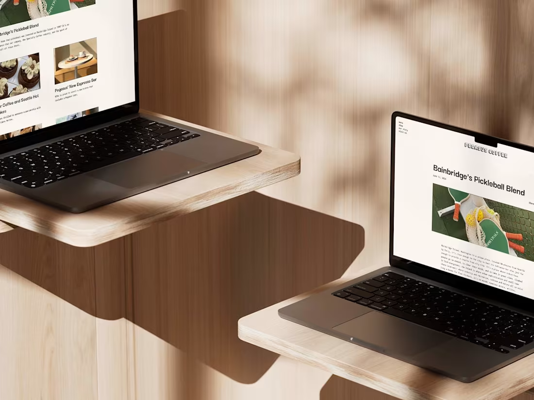
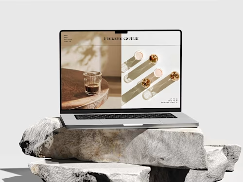
Daisy designed responsive websites ensuring optimal user experience across various devices. She creates sophisticated web elements that provide a luxurious user experience that increases web traffic and improves e-commerce sales.
What's included
Web Design for Desktop
This landing page will remain elegant and visually astounding from a laptop screen size to a wide desktop. By integrating responsive scroll elements with negative space visual theory, this landing page will provide an intuitive web experience to window shoppers and customers alike.
Web Design for Tablets
Somewhere between a desktop and a mobile phone, tablets are a great way to stay connected with the middle ground of screen sizes. While some web elements need to be adjusted similarly to a mobile phone's website, other elements require slight adjustments that primarily match up with desktop web elements. The result is a user-friendly web page that seamlessly translates an organization's web presence across numerous screen sizes.
Web Design Sized for Mobile Phone
Mobile phones are the primary method by which potential customers will interact with websites. This makes a landing page dedicated to mobile phone consumers of utmost importance. This deliverable will feature an elegant design with an intuitive user experience specifically for these smaller screen sizes.
Moodboard
This is a preliminary way to establish the "look" of the responsive website in a time-efficient manner.
Style Guide
In a classic style guide, web style elements are established before designing the website. This allows for an efficient web design process. It includes text fonts, text sizes across screens, colors, buttons, text fields, and icons.
Example work
Daisy's other services
Starting at$45 /hr
Tags
Adobe XD
Figma
Framer
Shopify
WixVibe
Mobile Designer
UX Designer
Web Designer
Service provided by
Daisy Bell proSeattle, USA
- $1k+
- Earned
- 3
- Paid projects
- 31
- Followers

Responsive Web Design, Landing Pages & E-Commerce SitesDaisy Bell
Starting at$45 /hr
Tags
Adobe XD
Figma
Framer
Shopify
WixVibe
Mobile Designer
UX Designer
Web Designer
Daisy designed responsive websites ensuring optimal user experience across various devices. She creates sophisticated web elements that provide a luxurious user experience that increases web traffic and improves e-commerce sales.
What's included
Web Design for Desktop
This landing page will remain elegant and visually astounding from a laptop screen size to a wide desktop. By integrating responsive scroll elements with negative space visual theory, this landing page will provide an intuitive web experience to window shoppers and customers alike.
Web Design for Tablets
Somewhere between a desktop and a mobile phone, tablets are a great way to stay connected with the middle ground of screen sizes. While some web elements need to be adjusted similarly to a mobile phone's website, other elements require slight adjustments that primarily match up with desktop web elements. The result is a user-friendly web page that seamlessly translates an organization's web presence across numerous screen sizes.
Web Design Sized for Mobile Phone
Mobile phones are the primary method by which potential customers will interact with websites. This makes a landing page dedicated to mobile phone consumers of utmost importance. This deliverable will feature an elegant design with an intuitive user experience specifically for these smaller screen sizes.
Moodboard
This is a preliminary way to establish the "look" of the responsive website in a time-efficient manner.
Style Guide
In a classic style guide, web style elements are established before designing the website. This allows for an efficient web design process. It includes text fonts, text sizes across screens, colors, buttons, text fields, and icons.
Example work
Daisy's other services
$45 /hr
