
Product design (UI/UX)Goutham R
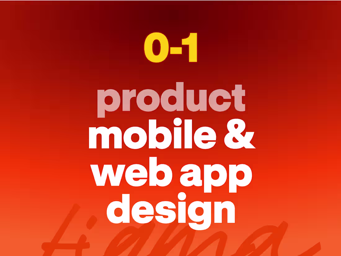
We design products that are beautiful, functional, and built to drive growth. From user flows and pixel-perfect screens to interactive prototypes, custom illustrations, and design systems, we handle it all with care and craftsmanship.
Our designs help you impress investors, convert customers, and scale with confidence.
What's included
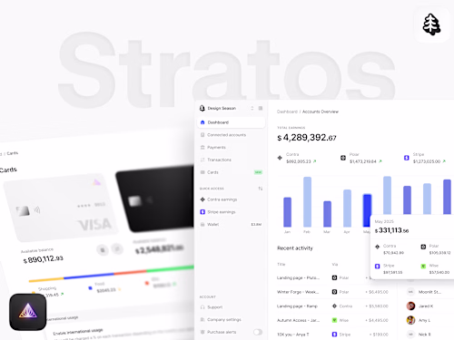
Organised Figma File
Every design file is carefully organized and structured. You’ll have 100% access to your Figma files with well-documented screens, components, and design systems for smooth collaboration and scalability.
Design System
If you choose to have us create a design system, you’ll receive a dedicated Figma file that includes:
• Foundations: Typography, color palettes, grid systems, spacing, shadows, effects, and iconography
• Base Components: Buttons, inputs, checkboxes, dropdowns, and other reusable elements
• Interactive Components: Variants with hover, active, disabled, and responsive states
• Patterns & Layouts: Navigation bars, forms, modals, cards, tables, and page templates
• Design Tokens: Standardized values for colors, typography, and spacing to ensure consistency across products
• Documentation & Guidelines: Clear usage rules, best practices, and examples for maintaining consistency at scale
This ensures your team has a complete, scalable system to design and build faster while keeping everything on-brand.
Custom Illustrations
We create all custom illustrations in-house for every project. If your product requires illustrations in specific areas, our team designs them from scratch and delivers high-quality SVGs and illustration assets tailored to your brand.
Goutham's other services
Contact for pricing
Tags
Figma
Interaction Designer
Product Designer
UX Designer
Service provided by
Goutham R proEarth, USA
- $5k+
- Earned
- 3
- Paid projects
- 5.00
- Rating
- 32
- Followers
Product design (UI/UX)Goutham R
We design products that are beautiful, functional, and built to drive growth. From user flows and pixel-perfect screens to interactive prototypes, custom illustrations, and design systems, we handle it all with care and craftsmanship.
Our designs help you impress investors, convert customers, and scale with confidence.
What's included
Organised Figma File
Every design file is carefully organized and structured. You’ll have 100% access to your Figma files with well-documented screens, components, and design systems for smooth collaboration and scalability.
Design System
If you choose to have us create a design system, you’ll receive a dedicated Figma file that includes:
• Foundations: Typography, color palettes, grid systems, spacing, shadows, effects, and iconography
• Base Components: Buttons, inputs, checkboxes, dropdowns, and other reusable elements
• Interactive Components: Variants with hover, active, disabled, and responsive states
• Patterns & Layouts: Navigation bars, forms, modals, cards, tables, and page templates
• Design Tokens: Standardized values for colors, typography, and spacing to ensure consistency across products
• Documentation & Guidelines: Clear usage rules, best practices, and examples for maintaining consistency at scale
This ensures your team has a complete, scalable system to design and build faster while keeping everything on-brand.
Custom Illustrations
We create all custom illustrations in-house for every project. If your product requires illustrations in specific areas, our team designs them from scratch and delivers high-quality SVGs and illustration assets tailored to your brand.
Goutham's other services
Contact for pricing