
BRAND DESIGN & VISUAL DIRECTIONMario Passalacqua
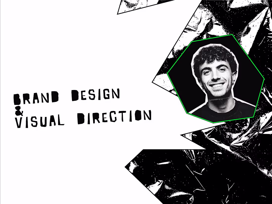
BRAND DESIGN & VISUAL DIRECTION
Your product has traction. Your brand doesn't reflect it yet.
Maybe it's inconsistent across web, product, and social. Maybe it started as a quick logo and a few colors. Whatever the case, it hasn't kept up with where you are now, and it's starting to show.
This service gives you a complete, modern identity system built specifically for SaaS and product-led companies. Logo, typography, color palette, visual language. Everything your team needs to show up consistently, without having to guess.
Who this is for
Funded or revenue-generating startups that have outgrown their early-stage brand. Teams about to relaunch a website or rethink product onboarding. Founders who have pieces of a brand but no real system holding them together. Anyone preparing to work with designers or agencies and wanting a clear visual foundation first.
How it works
1. Brand & Market Clarity
We start with your product, your audience, your competitors, and your positioning. The goal isn't just something that looks good, it's a brand that supports how you sell and grow.
2. Visual Direction
I develop one or two distinct visual routes: moodboards, references, type and color explorations. You choose a direction, we refine it together until it feels right and inevitable.
3. Identity Design
Logo or wordmark, typography system, color palette, layout language, basic graphic elements. Built to work across every surface your brand touches.
4. Applied to the Real World
The system gets tested on the things you actually use: website hero, social posts, thumbnails, email header, ad creative. You see how it holds up before handoff.
5. Brand Kit & Handoff
A concise brand guide and organized asset folder, so your designers, developers, and marketers all work from the same playbook, without back-and-forth.
What's included
Brand moodboard and visual strategy — one chosen direction with notes on positioning, tone, and intended feel.
Logo and wordmark — primary mark plus key lockups (horizontal and stacked) in vector and export-ready formats.
Typography system — primary and secondary fonts with clear examples for headings, body copy, CTAs, and UI.
Color palette — primary, secondary, neutral, and accent colors with guidance on usage, backgrounds, and accessibility.
Basic graphic system — shapes, dividers, or patterns that give your brand recognizable structure without overcomplicating it.
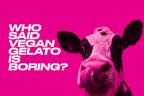
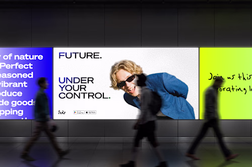
Application mockups — homepage hero, three to five social posts or thumbnails, and optionally a slide or email header.
Brand kit — a practical PDF or Figma guide covering logo use, spacing, color, typography, and do and don't examples. Not a 60-page manual. Something your team will actually open.
FAQs

Mario's other services

Starting at$2,000
Duration3 weeks
Tags
Adobe Illustrator
Adobe Photoshop
Figma
Higgsfield AI
Brand Designer
Brand Strategist
Graphic Designer
Logo design
Service provided by
Mario Passalacqua Rome, Italy
BRAND DESIGN & VISUAL DIRECTIONMario Passalacqua
Starting at$2,000
Duration3 weeks
Tags
Adobe Illustrator
Adobe Photoshop
Figma
Higgsfield AI
Brand Designer
Brand Strategist
Graphic Designer
Logo design
BRAND DESIGN & VISUAL DIRECTION
Your product has traction. Your brand doesn't reflect it yet.
Maybe it's inconsistent across web, product, and social. Maybe it started as a quick logo and a few colors. Whatever the case, it hasn't kept up with where you are now, and it's starting to show.
This service gives you a complete, modern identity system built specifically for SaaS and product-led companies. Logo, typography, color palette, visual language. Everything your team needs to show up consistently, without having to guess.
Who this is for
Funded or revenue-generating startups that have outgrown their early-stage brand. Teams about to relaunch a website or rethink product onboarding. Founders who have pieces of a brand but no real system holding them together. Anyone preparing to work with designers or agencies and wanting a clear visual foundation first.
How it works
1. Brand & Market Clarity
We start with your product, your audience, your competitors, and your positioning. The goal isn't just something that looks good, it's a brand that supports how you sell and grow.
2. Visual Direction
I develop one or two distinct visual routes: moodboards, references, type and color explorations. You choose a direction, we refine it together until it feels right and inevitable.
3. Identity Design
Logo or wordmark, typography system, color palette, layout language, basic graphic elements. Built to work across every surface your brand touches.
4. Applied to the Real World
The system gets tested on the things you actually use: website hero, social posts, thumbnails, email header, ad creative. You see how it holds up before handoff.
5. Brand Kit & Handoff
A concise brand guide and organized asset folder, so your designers, developers, and marketers all work from the same playbook, without back-and-forth.
What's included
Brand moodboard and visual strategy — one chosen direction with notes on positioning, tone, and intended feel.
Logo and wordmark — primary mark plus key lockups (horizontal and stacked) in vector and export-ready formats.
Typography system — primary and secondary fonts with clear examples for headings, body copy, CTAs, and UI.
Color palette — primary, secondary, neutral, and accent colors with guidance on usage, backgrounds, and accessibility.
Basic graphic system — shapes, dividers, or patterns that give your brand recognizable structure without overcomplicating it.
Application mockups — homepage hero, three to five social posts or thumbnails, and optionally a slide or email header.
Brand kit — a practical PDF or Figma guide covering logo use, spacing, color, typography, and do and don't examples. Not a 60-page manual. Something your team will actually open.
FAQs
Mario's other services
$2,000