
Website DesignAshiat Abdulkadir
I design modern, user-centered websites that balance visual clarity with clear conversion paths. From structure and user flows to polished, responsive UI, every page is intentionally designed to guide users toward meaningful actions.
What sets me apart is my focus on strategic UX—not just aesthetics, so your website works as well as it looks.
What's included
UX Discovery & Structure
This phase ensures the website is built around clear goals and user intent, not just visuals.
What’s included:
Review of business goals (e.g. conversions, sign-ups, bookings, sales)
Understanding target users and key use cases
Review of competitor or inspiration websites (if provided)
Definition of core pages (e.g. Home, About, Services, Pricing, Contact)
Sitemap outlining page hierarchy and content structure
Client receives:
A clear website structure and page list
Alignment on what each page is meant to achieve
User Flows (When Applicable)
This defines how users move through the website to complete key actions.
What’s included:
Entry points (landing page, homepage, ads, referrals)
Step-by-step flow for key actions:
Contacting you
Signing up
Booking a service
Purchasing a product (for simple e-commerce)
Identification of friction points and simplification opportunities
Client receives:
Visual user flow diagrams (Figma)
Clear logic developers can follow during implementation
Note: User flows are especially useful for service-based websites, SaaS marketing sites, and conversion-focused pages.
Wireframes (Low-Fidelity Layouts)
Wireframes focus on structure and content placement, not colors or visuals.
What’s included:
Low-fidelity wireframes for:
Homepage
Key inner pages (e.g. Services, Pricing, Contact)
Content hierarchy (headlines, sections, CTAs)
Navigation structure (header, footer, menus)
Responsive layout planning (desktop-first with mobile considerations)
Client receives:
Clickable or static wireframes in Figma
Opportunity to validate layout and content before visual design
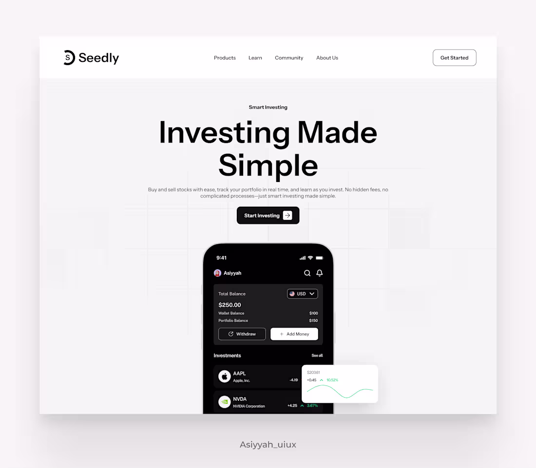
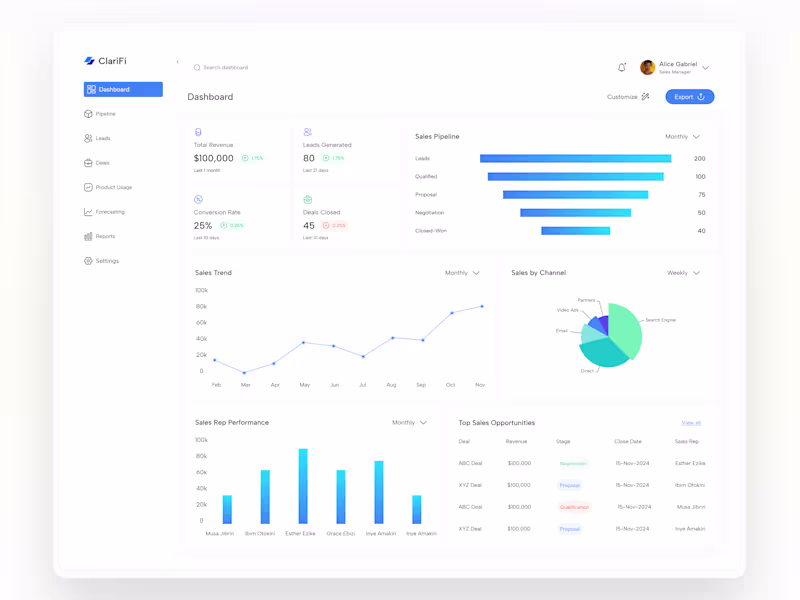
High-Fidelity UI Design
This is where the website becomes visually polished and brand-aligned.
What’s included:
Fully designed high-fidelity screens for:
Desktop
Tablet (if required)
Mobile
Visual styling:
Color palette application
Typography hierarchy
Spacing and layout system
Consistent components:
Buttons
Forms
Cards
Navigation elements
Accessibility considerations (contrast, readability)
Client receives:
Pixel-perfect UI designs in Figma
A visually cohesive website ready for development
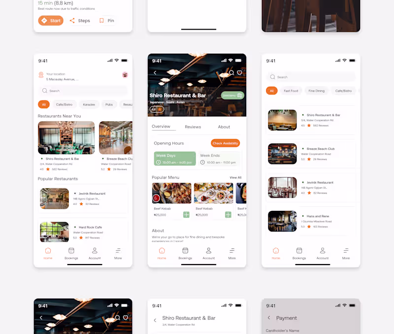
Responsive Design Variants
Ensures the website works seamlessly across devices.
What’s included:
Mobile-optimized layouts (not just scaled-down desktop)
Tablet layouts (optional, based on scope)
Responsive behavior rules:
Stacking
Spacing changes
Navigation adjustments
Client receives:
Separate responsive frames in Figma
Clear reference for developers to implement responsiveness correctly
Interactive Prototype
Allows the client to experience the website before development.
What’s included:
Clickable navigation between pages
Simulated interactions (hover states, button clicks)
Scroll behavior where relevant
Mobile preview links
Client receives:
Shareable Figma prototype link
Ability to test the website flow on desktop and mobile
Design System & UI Guidelines (Lightweight)
This keeps the website consistent and easy to scale.
What’s included:
Reusable UI components:
Buttons (primary, secondary, states)
Inputs and forms
Cards and sections
Typography styles
Color styles
Spacing and grid rules
Client receives:
Organized Figma components and styles
A mini design system developers can reuse
Developer-Ready Handoff
Ensures smooth transition from design to build.
What’s included:
Clean, well-structured Figma file
Layer naming and grouping for easy inspection
Auto-layout usage where applicable
Design specs (spacing, fonts, colors)
Asset export (icons, images)
Client receives:
A developer-ready Figma file
Reduced back-and-forth during development
Revision Rounds
Feedback and refinement are part of the process.
What’s included:
Up to 2 structured revision rounds
Iterations based on consolidated client feedback
UI refinements (layout, spacing, hierarchy)
Client receives:
A refined final design aligned with expectations
FAQs
Ashiat's other services
Starting at$2,500
Duration2 weeks
Tags
FigJam
Figma
Framer
Google Docs
Mobile Designer
UX Designer
Web Designer
Service provided by
Ashiat Abdulkadir proNigeria
- 5.00
- Rating
- 7
- Followers
Website DesignAshiat Abdulkadir
Starting at$2,500
Duration2 weeks
Tags
FigJam
Figma
Framer
Google Docs
Mobile Designer
UX Designer
Web Designer
I design modern, user-centered websites that balance visual clarity with clear conversion paths. From structure and user flows to polished, responsive UI, every page is intentionally designed to guide users toward meaningful actions.
What sets me apart is my focus on strategic UX—not just aesthetics, so your website works as well as it looks.
What's included
UX Discovery & Structure
This phase ensures the website is built around clear goals and user intent, not just visuals.
What’s included:
Review of business goals (e.g. conversions, sign-ups, bookings, sales)
Understanding target users and key use cases
Review of competitor or inspiration websites (if provided)
Definition of core pages (e.g. Home, About, Services, Pricing, Contact)
Sitemap outlining page hierarchy and content structure
Client receives:
A clear website structure and page list
Alignment on what each page is meant to achieve
User Flows (When Applicable)
This defines how users move through the website to complete key actions.
What’s included:
Entry points (landing page, homepage, ads, referrals)
Step-by-step flow for key actions:
Contacting you
Signing up
Booking a service
Purchasing a product (for simple e-commerce)
Identification of friction points and simplification opportunities
Client receives:
Visual user flow diagrams (Figma)
Clear logic developers can follow during implementation
Note: User flows are especially useful for service-based websites, SaaS marketing sites, and conversion-focused pages.
Wireframes (Low-Fidelity Layouts)
Wireframes focus on structure and content placement, not colors or visuals.
What’s included:
Low-fidelity wireframes for:
Homepage
Key inner pages (e.g. Services, Pricing, Contact)
Content hierarchy (headlines, sections, CTAs)
Navigation structure (header, footer, menus)
Responsive layout planning (desktop-first with mobile considerations)
Client receives:
Clickable or static wireframes in Figma
Opportunity to validate layout and content before visual design
High-Fidelity UI Design
This is where the website becomes visually polished and brand-aligned.
What’s included:
Fully designed high-fidelity screens for:
Desktop
Tablet (if required)
Mobile
Visual styling:
Color palette application
Typography hierarchy
Spacing and layout system
Consistent components:
Buttons
Forms
Cards
Navigation elements
Accessibility considerations (contrast, readability)
Client receives:
Pixel-perfect UI designs in Figma
A visually cohesive website ready for development
Responsive Design Variants
Ensures the website works seamlessly across devices.
What’s included:
Mobile-optimized layouts (not just scaled-down desktop)
Tablet layouts (optional, based on scope)
Responsive behavior rules:
Stacking
Spacing changes
Navigation adjustments
Client receives:
Separate responsive frames in Figma
Clear reference for developers to implement responsiveness correctly
Interactive Prototype
Allows the client to experience the website before development.
What’s included:
Clickable navigation between pages
Simulated interactions (hover states, button clicks)
Scroll behavior where relevant
Mobile preview links
Client receives:
Shareable Figma prototype link
Ability to test the website flow on desktop and mobile
Design System & UI Guidelines (Lightweight)
This keeps the website consistent and easy to scale.
What’s included:
Reusable UI components:
Buttons (primary, secondary, states)
Inputs and forms
Cards and sections
Typography styles
Color styles
Spacing and grid rules
Client receives:
Organized Figma components and styles
A mini design system developers can reuse
Developer-Ready Handoff
Ensures smooth transition from design to build.
What’s included:
Clean, well-structured Figma file
Layer naming and grouping for easy inspection
Auto-layout usage where applicable
Design specs (spacing, fonts, colors)
Asset export (icons, images)
Client receives:
A developer-ready Figma file
Reduced back-and-forth during development
Revision Rounds
Feedback and refinement are part of the process.
What’s included:
Up to 2 structured revision rounds
Iterations based on consolidated client feedback
UI refinements (layout, spacing, hierarchy)
Client receives:
A refined final design aligned with expectations
FAQs
Ashiat's other services
$2,500