
Dynamic Web Design: Building User-Centric Sites to Drive ResultsSofian Redzuan
I offer end-to-end website design services, providing everything from wireframes and high-fidelity mockups to responsive designs and interactive prototypes that bring your vision to life. Each deliverable is meticulously crafted to ensure a seamless user experience and aesthetic appeal across all devices. What sets me apart is my strategic focus on creating design systems that not only look great but also streamline development, making implementation faster and more efficient.
What's included
Website Design
Wireframes: Basic layout blueprints for each page to show structure and content placement.
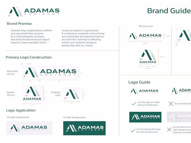
Mood Board/Style Guide: Visual references and branding elements, including color palettes, typography, and imagery.
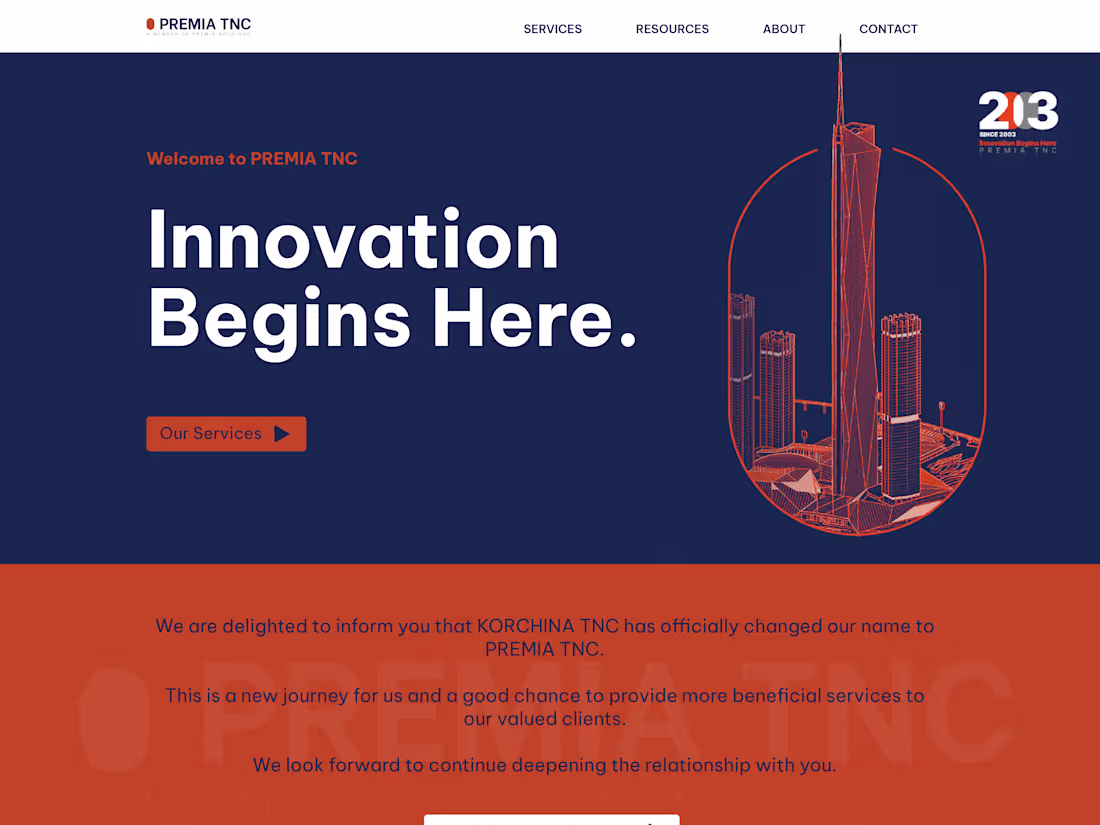
High-Fidelity Mockups: Detailed visual designs for key pages, showcasing the final look and feel.
Responsive Design Variations: Adaptations of designs for different devices (desktop, tablet, mobile).
Prototype: Interactive version of the design to demonstrate user flow and functionality.
UI Kit/Design System: Reusable components (buttons, icons, etc.) to maintain consistency.
Visual Assets: Custom graphics, icons, and imagery optimized for the web.
Style Guide: Document outlining design specifications for developers, including color codes, font sizes, and spacing.
Testing and Revisions: Adjustments based on feedback to refine the design before development.
Sofian's other services
Contact for pricing
Tags
Elementor
Figma
Webflow
Copywriter
UX Designer
Web Designer
Service provided by
Sofian Redzuan Malacca, Malaysia
Dynamic Web Design: Building User-Centric Sites to Drive ResultsSofian Redzuan
Contact for pricing
Tags
Elementor
Figma
Webflow
Copywriter
UX Designer
Web Designer
I offer end-to-end website design services, providing everything from wireframes and high-fidelity mockups to responsive designs and interactive prototypes that bring your vision to life. Each deliverable is meticulously crafted to ensure a seamless user experience and aesthetic appeal across all devices. What sets me apart is my strategic focus on creating design systems that not only look great but also streamline development, making implementation faster and more efficient.
What's included
Website Design
Wireframes: Basic layout blueprints for each page to show structure and content placement.
Mood Board/Style Guide: Visual references and branding elements, including color palettes, typography, and imagery.
High-Fidelity Mockups: Detailed visual designs for key pages, showcasing the final look and feel.
Responsive Design Variations: Adaptations of designs for different devices (desktop, tablet, mobile).
Prototype: Interactive version of the design to demonstrate user flow and functionality.
UI Kit/Design System: Reusable components (buttons, icons, etc.) to maintain consistency.
Visual Assets: Custom graphics, icons, and imagery optimized for the web.
Style Guide: Document outlining design specifications for developers, including color codes, font sizes, and spacing.
Testing and Revisions: Adjustments based on feedback to refine the design before development.
Sofian's other services
Contact for pricing