
UX/UI DesignMaryna Lytvyn
I help businesses build and launch MVPs by focusing on what matters most: the user’s "Golden Path" and market-ready visuals. My lean design process includes competitive analysis and a foundational UI kit to ensure your product is consistent, intuitive, and ready to scale from day one.
What's included
Product Strategy & Research
Includes Competitive Audit (analysing what rivals do well/poorly) and a Success Map that defines the primary problem your MVP solves and the "Golden Path" a user takes to reach their goal.
Lo-Fi Wireframes
Structural blueprints of the entire user journey. These focus on logic, information architecture, and content hierarchy without the distraction of colors or fonts.
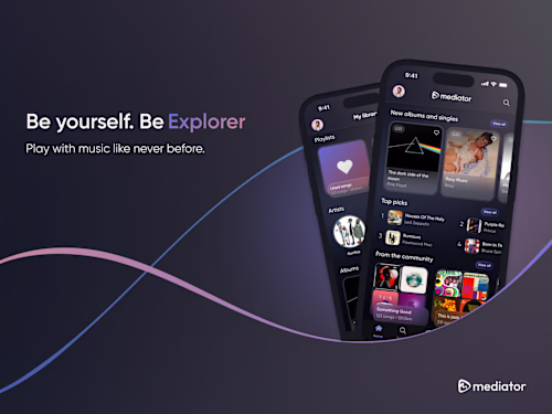
High-Fidelity UI Design
The final visual screens. This includes the application of branding, typography, iconography, and imagery that make the product market-ready.
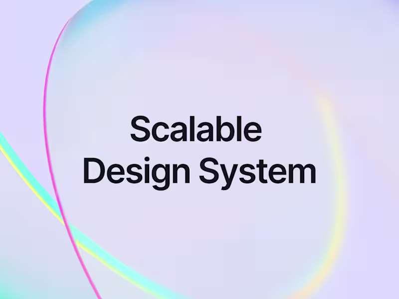
Mini Design System (UI Kit)
A library of reusable components (buttons, input fields, toggles) and style guides (colors/type). This ensures consistency and makes it easy for the client to scale the design later.
Developer Handoff Package
A clean, organized Figma file with documented redlines, assets (SVG/PNG), and "ready-to-code" specifications to ensure the engineering team builds exactly what you designed.
Maryna's other services
UX/UI DesignMaryna Lytvyn
Contact for pricing
I help businesses build and launch MVPs by focusing on what matters most: the user’s "Golden Path" and market-ready visuals. My lean design process includes competitive analysis and a foundational UI kit to ensure your product is consistent, intuitive, and ready to scale from day one.
What's included
Product Strategy & Research
Includes Competitive Audit (analysing what rivals do well/poorly) and a Success Map that defines the primary problem your MVP solves and the "Golden Path" a user takes to reach their goal.
Lo-Fi Wireframes
Structural blueprints of the entire user journey. These focus on logic, information architecture, and content hierarchy without the distraction of colors or fonts.
High-Fidelity UI Design
The final visual screens. This includes the application of branding, typography, iconography, and imagery that make the product market-ready.
Mini Design System (UI Kit)
A library of reusable components (buttons, input fields, toggles) and style guides (colors/type). This ensures consistency and makes it easy for the client to scale the design later.
Developer Handoff Package
A clean, organized Figma file with documented redlines, assets (SVG/PNG), and "ready-to-code" specifications to ensure the engineering team builds exactly what you designed.
Maryna's other services
Contact for pricing