
Spotify - Payment PageSwapna Thavidaboyna
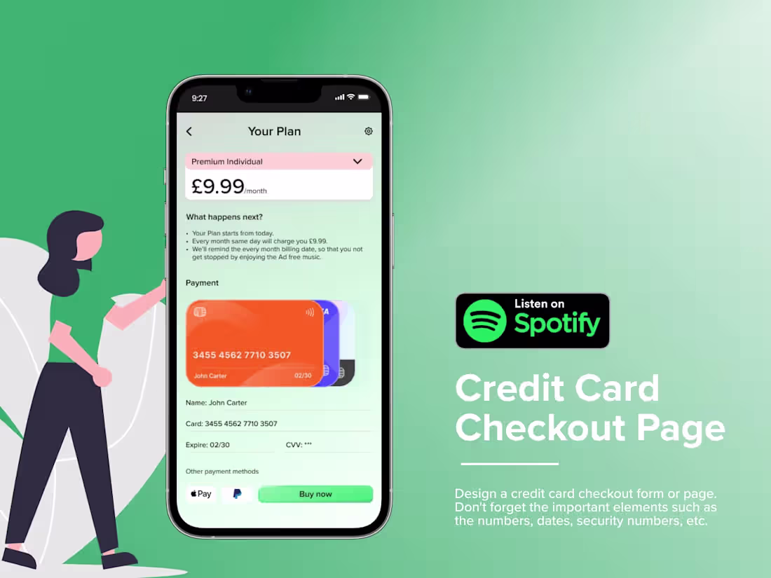
The credit card checkout page for Spotify is designed to provide a seamless and secure payment experience for users. The form features a clean, user-friendly layout with clear sections for entering card details, including the card number, expiration date, and CVV. The page uses Spotify’s brand colors and minimalistic design, ensuring consistency with the platform’s aesthetic. There are clear calls-to-action for submitting the form, along with easy-to-find options for payment methods, such as a toggle for switching between credit/debit cards or PayPal. Security is emphasized with a visible lock icon and reassurance of encrypted transactions.
What's included
✨ Wireframes and Prototypes
Low-Fidelity Wireframes: Early-stage wireframes outline the basic structure and flow of the app, created in Figma or Adobe XD.
High-Fidelity Prototypes: Interactive, detailed prototypes demonstrating the app's functionality, transitions, and interactions to give the client a realistic feel of the user experience.
✨UI Design Files
Final UI Screens: Complete and polished screen designs for all pages of the mobile app, including home, login, dashboard, payment flow, settings, etc.
Design Components: UI elements such as buttons, icons, form fields, and navigation components that are consistent across the app.
Design Assets: Final files of images, icons, fonts, and other visual assets used in the app, organized and ready for handoff.
✨Style Guide and Design System
Colour Palette: Defined primary and secondary colour schemes and colour usage guidelines.
Typography: Selection of fonts with size, weight, and usage guidelines for headings, body text, and other UI elements.
Spacing and Layout Guidelines: Specifications for padding, margins, and grid systems to ensure consistency in UI elements.
Component Library: A reusable component library (buttons, input fields, models, etc.) for future scalability and consistency.
✨User Flow and Information Architecture
User Flow Diagrams: Visual representations of how users navigate the app, from start to finish.
Site Map/Information Architecture: A structured map showing the app’s page hierarchy and organization of content.
✨Interaction and Motion Design
Micro-interactions: Design files for animations, transitions, and hover states that enhance the user experience.
App Transitions: Animations between screens to illustrate how different pages or actions flow.
✨Developer Handoff Files
Design Handoff in Figma or Adobe XD: Organized and properly labelled files with all necessary assets and annotations for the development team.
Specifications and Assets for Development: Detailed design specifications (size, margins, font sizes, colours, etc.), and all assets exported in development-friendly formats (SVG, PNG, etc.).
Styleguide for Developers: A comprehensive guide with visual details and design system elements for developers to ensure consistency across the build.
✨Usability Testing and Feedback Reports
Usability Testing Findings: Results from user testing or feedback sessions highlight areas that need improvement based on real user interactions.
Revised Designs: Updated designs based on user feedback or any identified usability issues.
✨Final Project Report
Design Rationale: A document explaining the design decisions, user-centric approach, and how the final design meets the client’s and users' needs.
User Personas: Profiles of the app’s target audience to provide context for design choices.
Post-Launch Considerations: Suggestions for future updates or iterations to improve the user experience over time.
✨Interactive Presentation
Client Walkthrough: A detailed presentation (usually in Figma, Adobe XD, or PowerPoint) that walks the client through the final design, explaining the app's flow, key features, and user experience.
Swapna's other services

Starting at$50 /hr
Tags
Adobe XD
Figma
Miro
Sketch
Interaction Designer
User Researcher
UX Designer
Service provided by
Swapna Thavidaboyna London, UK
Spotify - Payment PageSwapna Thavidaboyna
Starting at$50 /hr
Tags
Adobe XD
Figma
Miro
Sketch
Interaction Designer
User Researcher
UX Designer
The credit card checkout page for Spotify is designed to provide a seamless and secure payment experience for users. The form features a clean, user-friendly layout with clear sections for entering card details, including the card number, expiration date, and CVV. The page uses Spotify’s brand colors and minimalistic design, ensuring consistency with the platform’s aesthetic. There are clear calls-to-action for submitting the form, along with easy-to-find options for payment methods, such as a toggle for switching between credit/debit cards or PayPal. Security is emphasized with a visible lock icon and reassurance of encrypted transactions.
What's included
✨ Wireframes and Prototypes
Low-Fidelity Wireframes: Early-stage wireframes outline the basic structure and flow of the app, created in Figma or Adobe XD.
High-Fidelity Prototypes: Interactive, detailed prototypes demonstrating the app's functionality, transitions, and interactions to give the client a realistic feel of the user experience.
✨UI Design Files
Final UI Screens: Complete and polished screen designs for all pages of the mobile app, including home, login, dashboard, payment flow, settings, etc.
Design Components: UI elements such as buttons, icons, form fields, and navigation components that are consistent across the app.
Design Assets: Final files of images, icons, fonts, and other visual assets used in the app, organized and ready for handoff.
✨Style Guide and Design System
Colour Palette: Defined primary and secondary colour schemes and colour usage guidelines.
Typography: Selection of fonts with size, weight, and usage guidelines for headings, body text, and other UI elements.
Spacing and Layout Guidelines: Specifications for padding, margins, and grid systems to ensure consistency in UI elements.
Component Library: A reusable component library (buttons, input fields, models, etc.) for future scalability and consistency.
✨User Flow and Information Architecture
User Flow Diagrams: Visual representations of how users navigate the app, from start to finish.
Site Map/Information Architecture: A structured map showing the app’s page hierarchy and organization of content.
✨Interaction and Motion Design
Micro-interactions: Design files for animations, transitions, and hover states that enhance the user experience.
App Transitions: Animations between screens to illustrate how different pages or actions flow.
✨Developer Handoff Files
Design Handoff in Figma or Adobe XD: Organized and properly labelled files with all necessary assets and annotations for the development team.
Specifications and Assets for Development: Detailed design specifications (size, margins, font sizes, colours, etc.), and all assets exported in development-friendly formats (SVG, PNG, etc.).
Styleguide for Developers: A comprehensive guide with visual details and design system elements for developers to ensure consistency across the build.
✨Usability Testing and Feedback Reports
Usability Testing Findings: Results from user testing or feedback sessions highlight areas that need improvement based on real user interactions.
Revised Designs: Updated designs based on user feedback or any identified usability issues.
✨Final Project Report
Design Rationale: A document explaining the design decisions, user-centric approach, and how the final design meets the client’s and users' needs.
User Personas: Profiles of the app’s target audience to provide context for design choices.
Post-Launch Considerations: Suggestions for future updates or iterations to improve the user experience over time.
✨Interactive Presentation
Client Walkthrough: A detailed presentation (usually in Figma, Adobe XD, or PowerPoint) that walks the client through the final design, explaining the app's flow, key features, and user experience.
Swapna's other services
$50 /hr