
Mobile App UI/UX DesignMoe Talaat
I offer a Mobile Apps Design with screens for service-based applications, including reusable components, light/dark modes, and prototyping-ready flows.
My unique edge is the highly customizable modular design system, ensuring rapid, consistent, and professional mobile app development.
What's included
Figma Source File
The Figma source file includes:
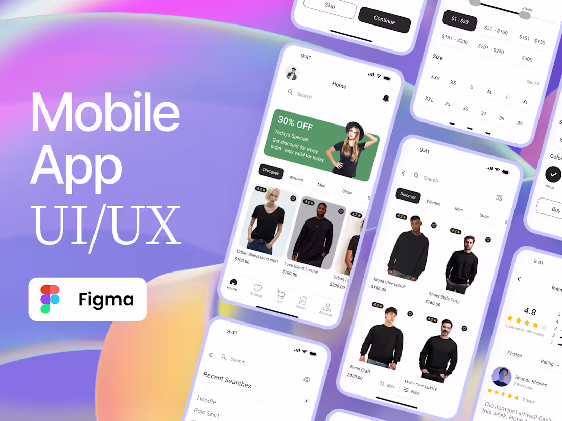
Editable Screens: Fully designed, customizable screens covering key user flows for service providers and seekers, such as onboarding, service booking, profiles, payments, and reviews.
Reusable Components: Modular UI elements (buttons, forms, cards, navigation bars) built with Figma’s Auto Layout and variables for consistent, scalable design.
Light & Dark Modes: Pre-configured color styles and global variables for seamless theme switching, ensuring accessibility and visual appeal.
Prototyping-Ready: Interactive components and user flows set up for testing navigation, interactions, and transitions on mobile devices.
Organized Layers: Clearly labeled layers and frames, optimized for collaboration, with mobile-specific frames and grid layouts for precise alignment.
Responsive Design: Components optimized for touch targets, gestures, and various mobile screen sizes, ensuring a user-friendly experience.
Starting at$2,500
Duration2 weeks
Tags
Figma
Interaction Designer
Mobile Designer
Web Designer
Service provided by
Moe Talaat proCairo, Egypt
- 5.00
- Rating
- 1
- Followers
Mobile App UI/UX DesignMoe Talaat
Starting at$2,500
Duration2 weeks
Tags
Figma
Interaction Designer
Mobile Designer
Web Designer
I offer a Mobile Apps Design with screens for service-based applications, including reusable components, light/dark modes, and prototyping-ready flows.
My unique edge is the highly customizable modular design system, ensuring rapid, consistent, and professional mobile app development.
What's included
Figma Source File
The Figma source file includes:
Editable Screens: Fully designed, customizable screens covering key user flows for service providers and seekers, such as onboarding, service booking, profiles, payments, and reviews.
Reusable Components: Modular UI elements (buttons, forms, cards, navigation bars) built with Figma’s Auto Layout and variables for consistent, scalable design.
Light & Dark Modes: Pre-configured color styles and global variables for seamless theme switching, ensuring accessibility and visual appeal.
Prototyping-Ready: Interactive components and user flows set up for testing navigation, interactions, and transitions on mobile devices.
Organized Layers: Clearly labeled layers and frames, optimized for collaboration, with mobile-specific frames and grid layouts for precise alignment.
Responsive Design: Components optimized for touch targets, gestures, and various mobile screen sizes, ensuring a user-friendly experience.
$2,500