
Design Systems & UI ConsistencyClearl io
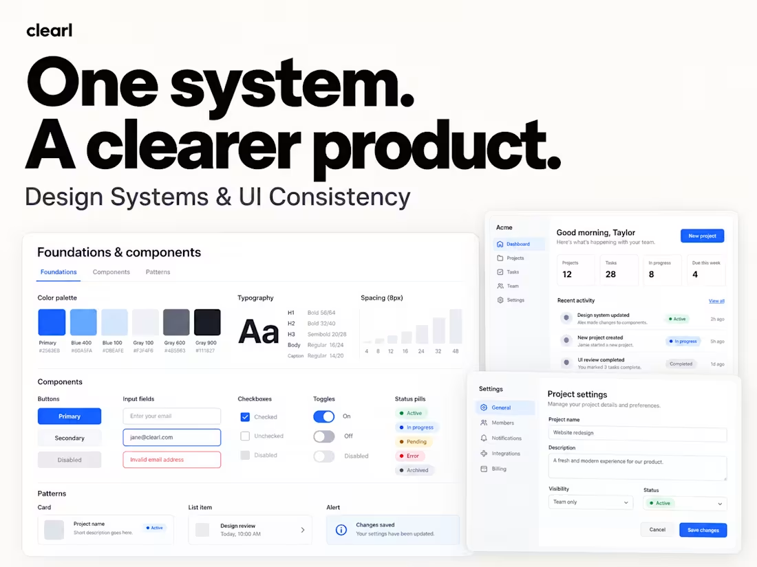
Help your team build a consistent product without solving the same design problems twice.
As products grow, small inconsistencies add up. Similar screens behave differently, components get duplicated, and routine changes take more coordination than they should.
Clearl helps product teams create and improve design systems grounded in their actual product. We bring structure to foundations, components, and interaction patterns so designers and developers can work from a shared reference.
What we can help with
• Audit existing interfaces and component libraries
• Consolidate duplicate styles and patterns
• Define typography, color, spacing, and layout foundations
• Build reusable Figma components and variants
• Cover interaction states, validation, and feedback
• Document usage and support adoption across your team
How we work
Review the current product
We examine your screens, Figma files, existing components, and team workflow to understand where inconsistency creates extra work.
Define the foundations
We agree on the system’s scope, structure, and naming conventions, building on your brand and existing technical constraints.
Build and apply
We develop the agreed components and patterns, then apply them to representative screens to check that they work together in context.
Document and hand over
We prepare practical usage guidance and walk your team through the system, including recommendations for maintaining and extending it.
What you receive
Depending on the agreed scope:
• UI audit and consolidation recommendations
• Organized Figma library
• Color, typography, spacing, and layout foundations
• Reusable components with agreed variants and states
• Variables and design tokens where appropriate
• Representative screens demonstrating the system
• Usage guidelines and developer handoff notes
• Team walkthrough and adoption recommendations
You’ll have a shared foundation that helps your team design consistently, review changes more easily, and extend the product with less repeated work.
Tell us about your product, current library, and the inconsistencies slowing your team down. We’ll recommend a focused starting point.
FAQs
Contact for pricing
Duration1 week
Tags
Design Systems Specialist
Product Designer
UI Designer
UX Designer
Service provided by
Clearl io Kharkiv, Ukraine
- 1
- Followers
Design Systems & UI ConsistencyClearl io
Contact for pricing
Duration1 week
Tags
Design Systems Specialist
Product Designer
UI Designer
UX Designer
Help your team build a consistent product without solving the same design problems twice.
As products grow, small inconsistencies add up. Similar screens behave differently, components get duplicated, and routine changes take more coordination than they should.
Clearl helps product teams create and improve design systems grounded in their actual product. We bring structure to foundations, components, and interaction patterns so designers and developers can work from a shared reference.
What we can help with
• Audit existing interfaces and component libraries
• Consolidate duplicate styles and patterns
• Define typography, color, spacing, and layout foundations
• Build reusable Figma components and variants
• Cover interaction states, validation, and feedback
• Document usage and support adoption across your team
How we work
Review the current product
We examine your screens, Figma files, existing components, and team workflow to understand where inconsistency creates extra work.
Define the foundations
We agree on the system’s scope, structure, and naming conventions, building on your brand and existing technical constraints.
Build and apply
We develop the agreed components and patterns, then apply them to representative screens to check that they work together in context.
Document and hand over
We prepare practical usage guidance and walk your team through the system, including recommendations for maintaining and extending it.
What you receive
Depending on the agreed scope:
• UI audit and consolidation recommendations
• Organized Figma library
• Color, typography, spacing, and layout foundations
• Reusable components with agreed variants and states
• Variables and design tokens where appropriate
• Representative screens demonstrating the system
• Usage guidelines and developer handoff notes
• Team walkthrough and adoption recommendations
You’ll have a shared foundation that helps your team design consistently, review changes more easily, and extend the product with less repeated work.
Tell us about your product, current library, and the inconsistencies slowing your team down. We’ll recommend a focused starting point.
FAQs
Contact for pricing