
Component Design

Starting at
$
800
About this service
Summary
What's included
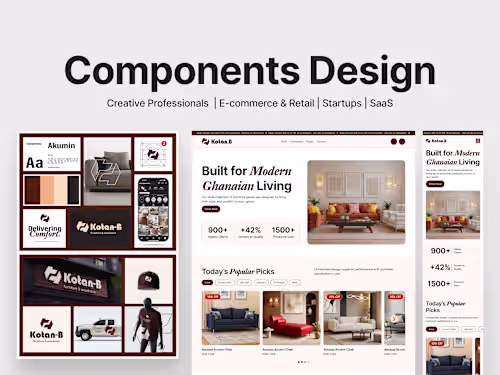
Component Library
A scalable Figma component system, buttons, inputs, cards, modals, navigation bars, icons, and reusable layouts built with Auto-Layout and smart variants for effortless updates.
Design Tokens & Styles
Centralised colour styles, typography scales, spacing system, and effect styles (shadows, gradients) to maintain brand consistency across every page and screen.
Page & Screen Templates
Ready-to-use wireframes and high-fidelity page templates (home, dashboard, product listing, contact, etc.) to speed up new page creation.
Interactive Prototypes
Clickable Figma prototypes showcasing component behaviour, hover states, and micro-interactions for stakeholder reviews or developer handoff.
Developer Handoff Package
Organised Figma file with clean layer naming, annotations, and usage guidelines to ensure a smooth build process for any development team.
Documentation Guide
A concise reference inside the Figma file explaining how to use, customise, and extend the component library for future projects.
Duration
1 week
Skills and tools
Mobile Designer
Product Designer
UX Designer

Adobe Illustrator

Figma