
Mobile App Designabhay kumar
We offer a complete mobile app design package, including user research, wireframes, high-fidelity UI designs, and a detailed design system to ensure consistency and quality. Our approach stands out by combining creative, user-centric design with seamless collaboration and a smooth developer handoff, ensuring a visually engaging and functional app experience tailored to your brand.
What's included
"Comprehensive Deliverables for Mobile App Design Projects"
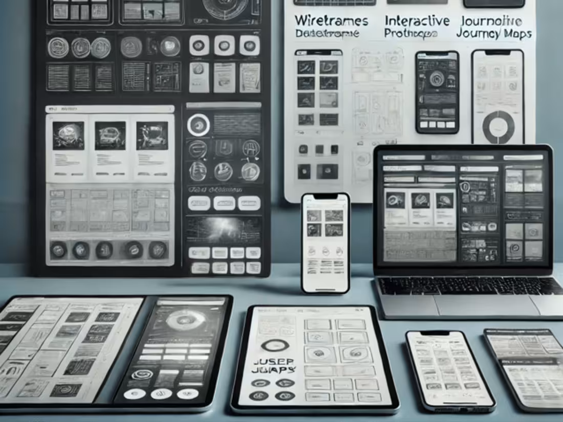
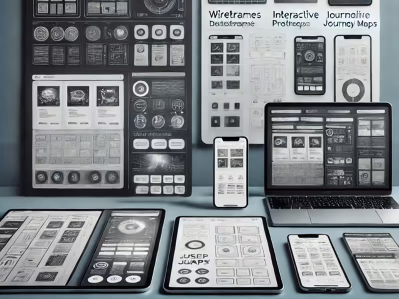
1.Wireframes:
Low-fidelity blueprints of the app’s structure, layout, and key elements to visualize the overall flow.
2.Interactive Prototypes:
Clickable, interactive versions of the app design for user testing, showcasing navigation and functionality.
3.High-Fidelity UI Designs:
Finalized, pixel-perfect screens for the app’s user interface, including visual assets, typography, and color schemes.
4.Design System / Style Guide:
A comprehensive document containing the app’s design rules, such as color palette, typography, button styles, iconography, and layout grids for consistency.
5.Icon and Logo Design:
Custom-designed app icons and branding elements that align with the overall app design and brand identity.
6.User Flow Diagrams:
Diagrams mapping out how users will navigate through the app, showing key paths and decision points.
7.Developer Handoff Files:
Organized files with assets, specifications, and style guidelines for developers to build the app efficiently. These can be shared via tools like Zeplin, Figma, or Sketch.
8.Usability Test Findings (Optional):
A report summarizing user testing feedback, including recommendations for improvement.
abhay's other services

Starting at$1,200
Duration1 week
Tags
Adobe Illustrator
Adobe Photoshop
Adobe XD
Figma
Sketch
Mobile Designer
Product Designer
UX Designer
Service provided by
abhay kumar India
Mobile App Designabhay kumar
Starting at$1,200
Duration1 week
Tags
Adobe Illustrator
Adobe Photoshop
Adobe XD
Figma
Sketch
Mobile Designer
Product Designer
UX Designer
We offer a complete mobile app design package, including user research, wireframes, high-fidelity UI designs, and a detailed design system to ensure consistency and quality. Our approach stands out by combining creative, user-centric design with seamless collaboration and a smooth developer handoff, ensuring a visually engaging and functional app experience tailored to your brand.
What's included
"Comprehensive Deliverables for Mobile App Design Projects"
1.Wireframes:
Low-fidelity blueprints of the app’s structure, layout, and key elements to visualize the overall flow.
2.Interactive Prototypes:
Clickable, interactive versions of the app design for user testing, showcasing navigation and functionality.
3.High-Fidelity UI Designs:
Finalized, pixel-perfect screens for the app’s user interface, including visual assets, typography, and color schemes.
4.Design System / Style Guide:
A comprehensive document containing the app’s design rules, such as color palette, typography, button styles, iconography, and layout grids for consistency.
5.Icon and Logo Design:
Custom-designed app icons and branding elements that align with the overall app design and brand identity.
6.User Flow Diagrams:
Diagrams mapping out how users will navigate through the app, showing key paths and decision points.
7.Developer Handoff Files:
Organized files with assets, specifications, and style guidelines for developers to build the app efficiently. These can be shared via tools like Zeplin, Figma, or Sketch.
8.Usability Test Findings (Optional):
A report summarizing user testing feedback, including recommendations for improvement.
abhay's other services
$1,200