
Trusted Brand Identity & Logo Designer | Minimal/Modern DesignsNafees Zulfiqar
I design brand identities that are instantly memorable and hard to forget. I partner with ambitious companies in finance, tech, and professional sectors (SaaS, Web3, B2B) to create brands that stand out for all the right reasons. I’m always driven to deliver creative solutions that inspire, challenge the ordinary, and exceed expectations.
✔️ Trusted by forward-thinking brands
✔️ Strategic approach to logo and brand identity design
✔️ Responsive, clear communication throughout every project
Simple is Powerful, My approach is rooted in clarity and minimalism, helping brands rise above the clutter and leave a lasting impression. Modern, timeless, and distinctly yours.
What's included
Creative Exploration
We start by exploring two high-level brand concepts, each presented as curated mood boards. These define the visual tone, color direction, typography inspiration, and overall aesthetic approach to ensure alignment before moving into design execution.
Core Identity System
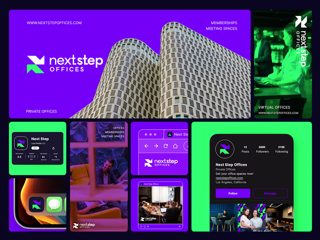
Logo Suite: A fully developed logo suite, including primary, secondary, stacked, and responsive versions, along with brand marks and favicons. This ensures flexibility across digital, print, and merchandise applications. → Color System: A strategically developed color palette, including primary, secondary, and accent colors (as applicable) designed for versatility and impact. We define how these colors interact and where they should be applied for consistency. → Typography System: A carefully selected typographic hierarchy, featuring primary and secondary fonts that align with the brand’s personality. We outline type usage for headings, body text, and stylistic treatments.
Brand Extensions
Image Direction: An imagery guide with examples that defines the style, tone, and treatment of photography, textures, and supporting visuals. This ensures that all brand imagery remains cohesive, intentional, and aligned with the brand’s identity. → Brand Elements: A customized set of brand assets, which may include patterns, icons, or illustrations, depending on what best supports the brand’s visual identity. These elements enhance the brand beyond the logo and reinforce recognition.
Guidelines & Handoff
Comprehensive Figma Brand Guidelines: A detailed, editable, and shareable brand guidelines document in Figma, covering logo usage rules, color applications, typography guidelines, imagery direction, and brand element applications. Includes dos and don’ts to ensure brand consistency. → This is where you receive all your final brand assets, ready for use. All final files are delivered in industry-standard formats for both web and print use.
Revisions
Each deliverable is open to 2 rounds of revision, allowing for refinements based on feedback.
FAQs
Nafees's other services
Contact for pricing
Tags
Adobe Illustrator


Adobe Photoshop

Figma

Brand Designer
Logo Designer
Visual Designer
Service provided by
Nafees Zulfiqar Islamabad, Pakistan
Trusted Brand Identity & Logo Designer | Minimal/Modern DesignsNafees Zulfiqar
Contact for pricing
Tags
Adobe Illustrator
Adobe Photoshop
Figma
Brand Designer
Logo Designer
Visual Designer
I design brand identities that are instantly memorable and hard to forget. I partner with ambitious companies in finance, tech, and professional sectors (SaaS, Web3, B2B) to create brands that stand out for all the right reasons. I’m always driven to deliver creative solutions that inspire, challenge the ordinary, and exceed expectations.
✔️ Trusted by forward-thinking brands
✔️ Strategic approach to logo and brand identity design
✔️ Responsive, clear communication throughout every project
Simple is Powerful, My approach is rooted in clarity and minimalism, helping brands rise above the clutter and leave a lasting impression. Modern, timeless, and distinctly yours.
What's included
Creative Exploration
We start by exploring two high-level brand concepts, each presented as curated mood boards. These define the visual tone, color direction, typography inspiration, and overall aesthetic approach to ensure alignment before moving into design execution.
Core Identity System
Logo Suite: A fully developed logo suite, including primary, secondary, stacked, and responsive versions, along with brand marks and favicons. This ensures flexibility across digital, print, and merchandise applications. → Color System: A strategically developed color palette, including primary, secondary, and accent colors (as applicable) designed for versatility and impact. We define how these colors interact and where they should be applied for consistency. → Typography System: A carefully selected typographic hierarchy, featuring primary and secondary fonts that align with the brand’s personality. We outline type usage for headings, body text, and stylistic treatments.
Brand Extensions
Image Direction: An imagery guide with examples that defines the style, tone, and treatment of photography, textures, and supporting visuals. This ensures that all brand imagery remains cohesive, intentional, and aligned with the brand’s identity. → Brand Elements: A customized set of brand assets, which may include patterns, icons, or illustrations, depending on what best supports the brand’s visual identity. These elements enhance the brand beyond the logo and reinforce recognition.
Guidelines & Handoff
Comprehensive Figma Brand Guidelines: A detailed, editable, and shareable brand guidelines document in Figma, covering logo usage rules, color applications, typography guidelines, imagery direction, and brand element applications. Includes dos and don’ts to ensure brand consistency. → This is where you receive all your final brand assets, ready for use. All final files are delivered in industry-standard formats for both web and print use.
Revisions
Each deliverable is open to 2 rounds of revision, allowing for refinements based on feedback.
FAQs
Nafees's other services
Contact for pricing