
Crypto App DesignFillip Lungu
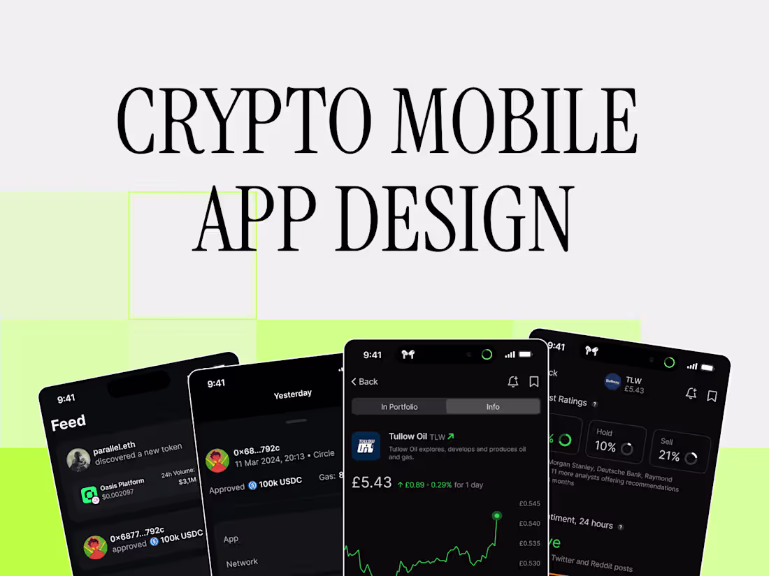
I deliver end-to-end Crypto Mobile App Design: from UX strategy and wireflows to high-fidelity prototypes and developer-ready specs—optimized for security, compliance, and seamless onboarding. My deep domain expertise in DeFi and blockchain UX ensures intuitive, trust-worthy interfaces that stand out in a crowded market. With a custom design system and hands-on collaboration, you’ll get pixel-perfect apps that drive adoption and retention.
What's included
Discovery & Strategy
– Brief competitive audit of 2–3 crypto wallet/trading apps
– Core user-journey maps (e.g. onboarding → trade → withdraw)
Information Architecture
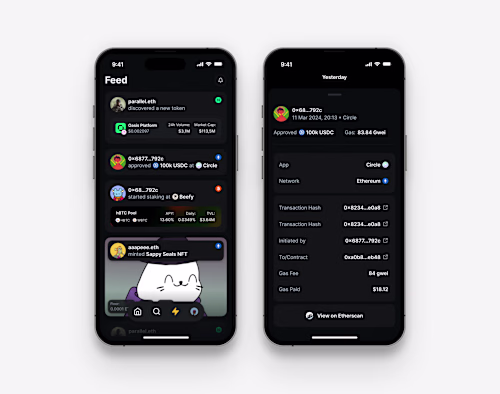
– App sitemap outlining major sections (e.g. Dashboard, Wallet, Swap, History, Settings)
– Detailed user-flow diagrams for critical paths (e.g. buy/sell, stake/unstake)
Wireframes
– Low-fidelity (B&W) wireframes for up to 8 key screens
– Annotated notes on interactions and conditional states (e.g. “insufficient balance,” “2FA required”)
Visual/UI Design
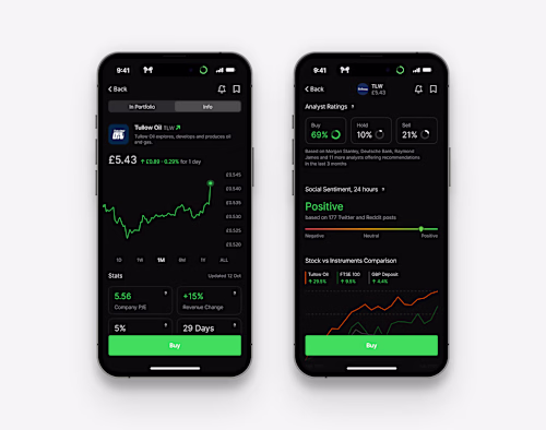
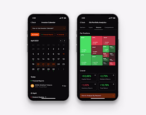
– UI design for all core user-journey screens
– Solutions for deadlocks
– All the little details (e.g. confirmation screens, error states, focus states)
Interactive Prototype
– Click-through prototype in Figma covering all core flows
Design System & Specs
– Color palette (primary, sec, neutrals, status colors)
– Typography scale + usage guidelines
– UI component library (buttons, form fields, cards, modals)
– Accessibility notes (contrast ratios, touch-target sizes)
Security & Compliance Notes
– UI patterns for secure onboarding (e.g. password creation, biometric prompts)
Developer Handoff
– Fully-annotated Figma file
– Exportable assets (SVGs, PNGs, font specs)
– Redline specs for spacing, font sizes, colors
Feedback & Iterations
– Two rounds of design revisions based on your feedback
– Minor tweaks post-handoff (up to 2 hours of support)
FAQs
Starting at$5,000 /mo
Tags
Adobe After Effects
Figma
Lottie
Rive
Sketch
Interaction Designer
Mobile Designer
Web Designer
Service provided by
Fillip Lungu Kyiv, 02000
Crypto App DesignFillip Lungu
Starting at$5,000 /mo
Tags
Adobe After Effects
Figma
Lottie
Rive
Sketch
Interaction Designer
Mobile Designer
Web Designer
I deliver end-to-end Crypto Mobile App Design: from UX strategy and wireflows to high-fidelity prototypes and developer-ready specs—optimized for security, compliance, and seamless onboarding. My deep domain expertise in DeFi and blockchain UX ensures intuitive, trust-worthy interfaces that stand out in a crowded market. With a custom design system and hands-on collaboration, you’ll get pixel-perfect apps that drive adoption and retention.
What's included
Discovery & Strategy
– Brief competitive audit of 2–3 crypto wallet/trading apps
– Core user-journey maps (e.g. onboarding → trade → withdraw)
Information Architecture
– App sitemap outlining major sections (e.g. Dashboard, Wallet, Swap, History, Settings)
– Detailed user-flow diagrams for critical paths (e.g. buy/sell, stake/unstake)
Wireframes
– Low-fidelity (B&W) wireframes for up to 8 key screens
– Annotated notes on interactions and conditional states (e.g. “insufficient balance,” “2FA required”)
Visual/UI Design
– UI design for all core user-journey screens
– Solutions for deadlocks
– All the little details (e.g. confirmation screens, error states, focus states)
Interactive Prototype
– Click-through prototype in Figma covering all core flows
Design System & Specs
– Color palette (primary, sec, neutrals, status colors)
– Typography scale + usage guidelines
– UI component library (buttons, form fields, cards, modals)
– Accessibility notes (contrast ratios, touch-target sizes)
Security & Compliance Notes
– UI patterns for secure onboarding (e.g. password creation, biometric prompts)
Developer Handoff
– Fully-annotated Figma file
– Exportable assets (SVGs, PNGs, font specs)
– Redline specs for spacing, font sizes, colors
Feedback & Iterations
– Two rounds of design revisions based on your feedback
– Minor tweaks post-handoff (up to 2 hours of support)
FAQs
$5,000 /mo